
Flow Slider for Elementor: Full Bleed Slides With Copy That Stays Readable
Build a full bleed flow slider in Elementor with a content box you can place anywhere, category labels, thumbnail navigation and Swiper controls.
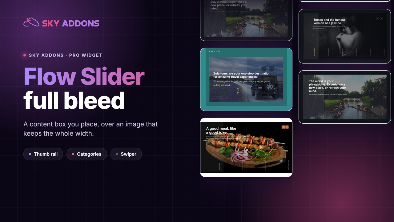
A full width slider is the easiest way to make a page feel finished and the easiest way to make it unreadable. The photograph goes edge to edge, the headline lands somewhere over the middle of it, and by the third slide the text is sitting on a bright sky.
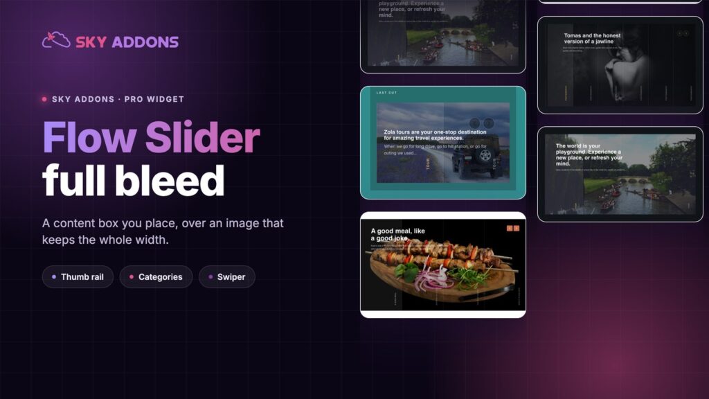
A flow slider fixes the readable part without giving up the full bleed. The copy lives in a content box you position deliberately, the box has its own background and padding, and the image keeps the whole width behind it.

| Approach | What it costs you |
|---|---|
| Elementor slides widget | Text position is limited, and styling the box means custom CSS |
| Background image plus heading | One slide only, so a second offer needs a second section |
| Plain image carousel | No copy, no category, no link per slide |
| Sky Addons flow slider | Full bleed image, positioned content box, category, link and thumbs |
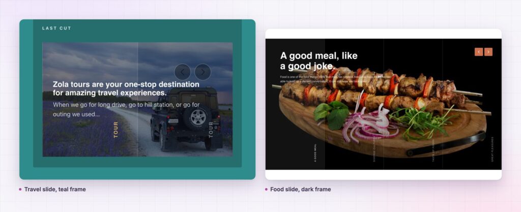
The content box is placed, not floated. Text Position, Text Alignment and Content Max Width decide exactly where the copy sits and how wide it runs. Give the box a background and padding and the contrast problem disappears for good.
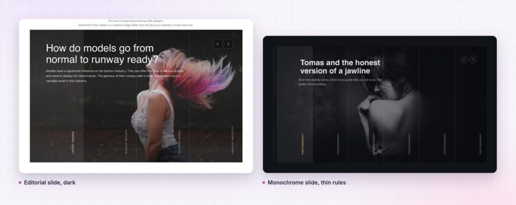
Every slide can carry a category. Show Category puts a label above the title, which is what turns a slider into an editorial rail rather than a set of pictures.
Thumbnails can navigate. Slider Thumbs gives the slider a rail underneath, with its own line style, so a reader can jump to the slide they want instead of waiting for it.
Slides come from a gallery or a query. Source switches between images you choose and posts you query, with Content Length trimming the excerpt to a set number of words.
Swiper runs the motion. Columns, Autoplay, Autoplay Speed, Slide Speed and Pause On Hover are controls, and the navigation icons are pickable rather than fixed.

The first screen has one job: say what this is and give one way forward. A flow slider does that while showing three or four versions of the promise, which suits businesses whose offer is genuinely plural. A tour operator sells destinations, not one destination.
The first screen has one job: say what this is, and give one way forward.
The content box is what makes it honest. Because the copy has a surface of its own, it can be a real sentence rather than three words chosen for contrast. The link can be a button instead of an implied click on the whole slide.
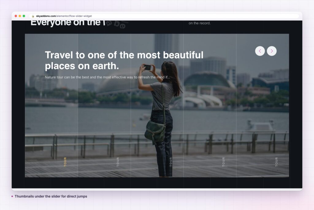
Full bleed means the browser decides the crop, and it will crop differently on every screen. A slide that looks composed on a laptop can lose its subject on a wide monitor or a phone.
Two habits keep control of that. Set a height that suits the shape of your photographs rather than a fashionable number, and keep the subject away from the edges when you shoot or choose. If the subject must be off centre, put the content box on the opposite side so the two are not fighting for the same area.
It is also worth checking the slider at a very wide viewport. Sites are usually tested at 1440 pixels and then viewed at 2560, where a fixed height turns a portrait photograph into a letterbox strip.
Autoplay moves the slider for the reader. A thumbnail rail lets the reader move it. They solve different problems and rarely belong together.
Autoplay suits a hero where the visitor is being introduced to a range and has no basis for choosing yet. Keep the rest long, the transition short, and Pause On Hover on.
A thumbnail rail suits a slider people use rather than watch: a portfolio, a property list, a menu of tours. The reader arrives knowing roughly what they want, and the rail is the fastest route to it. In that mode I would leave autoplay off entirely, because a slide that moves while someone is aiming at a thumbnail is a small betrayal.
The box is small on purpose, and that constraint is useful. A hero slide has room for one claim, one supporting line and one link, which is roughly the shape of a good advertisement.
Start with the claim and make it specific. “Travel to one of the most beautiful places on earth” is a sentence that could sit on any travel site. “Four days on the Gotland coast, from 690 euros” is one that only fits yours, and it does the qualifying work the button would otherwise have to do.
Keep the supporting line to one job: remove the obvious objection. Price, duration, availability, what is included. Readers who are interested in the claim are already asking that question, and answering it on the slide saves a click that many of them would not make.
The link text should name the destination, not the action. “See the four day route” tells a reader what happens next; “Read more” makes them find out by spending a click.
One more thing about the set as a whole. Every slide should be the same shape of argument, because a reader who learns how the first slide reads will apply that pattern to the rest. Mixing a price led slide with a mood led one makes the rail feel assembled by different people.
Because Source can be a query, a flow slider works as a dynamic feature rail: the four most recent case studies, the current promotions, the posts in one category. The category label comes from the post, so the rail labels itself.
It also works below the fold. A full bleed section halfway down a long page acts as a divider, resetting the reader’s attention before the next argument. Used that way, three slides is usually enough, and the thumbnail rail can go.
For a slider that splits text and image into columns instead of layering them, the momentum slider covers the same ground with a different layout.
No. The flow slider is part of Sky Addons Pro. The free versus Pro page shows which sliders are in the free plugin.
No. Swiper is bundled with Sky Addons.
Swiper is small and loads only where a slider exists. The images are what matter: size them for the widest slide, not for print.
Yes. The content box narrows and keeps its background, and drag works as expected. Check the crop at 390px before publishing.
Yes. Set Source to a query, and the title, excerpt, category, image and link all come from the post.
A flow slider earns a hero when the offer is genuinely plural and the photography is strong enough to carry the width. Give the copy a box with a background, set a fixed height, keep the crop safe on wide screens, and choose between autoplay and thumbnails rather than using both.
See it on the flow slider demo, read the flow slider documentation, and compare plans on the pricing page. The Swiper API documentation lists the underlying options, and MDN on object-fit explains how a full bleed image decides what to crop.



Comments are closed.