
Elementor Social Icons: Follow Buttons Worth Tapping
Social icons for Elementor with official or custom colours, labels above, below or beside, separators and a dim on hover effect. Free in Sky Addons.
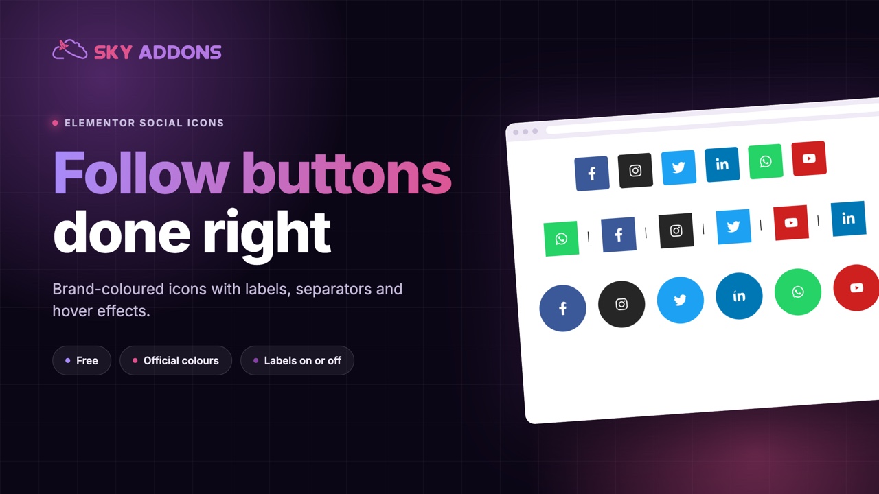
Every site has a row of social links somewhere. Most of them are an afterthought: six small icons in the footer, in whatever colour the theme chose, too small to tap on a phone. Yet these links do real work. They send visitors to the places where they will follow you, message you or watch you, and on a contact page or a link-in-bio style page they may be the main call to action.
Social icons deserve the same care as a button. Sky Addons includes a free Social Icons widget for Elementor that goes beyond a row of glyphs: square, round or plain shapes, official brand colours or your own, text labels above, below or beside each icon, separators between them and a hover effect that dims the rest so one icon stands out. This article covers where a set of social icons matters, how the widget works, and how to make yours easy to see and easy to tap.
Put them where a person would look for a way to follow or contact you.
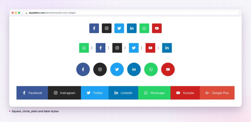
You can add social links with a theme footer, the default Elementor widget or a plugin. The table shows where each falls short.
| Theme footer links | Elementor Social Icons | Sky Addons Social Icons | |
|---|---|---|---|
| Brand icons | Fixed set | Yes | Yes, any icon from the library |
| Text labels | Rare | No | Beside, below or above each icon |
| Separators between icons | No | No | Default line or custom text |
| Dim the others on hover | No | No | One switch, with your opacity |
| Custom colours per icon | No | Yes | Yes, for icon, background, border and label |
| Vertical or horizontal | Fixed | Layout controls | Choose the direction |
Icons from the whole library. Each item has an icon and a link, so you are not limited to the big six. Add a network the theme did not think of, an email link, a phone number or a map pin, as long as there is an icon for it.
Official colours or your own. Each icon can use the official brand colour, or you can set custom colours for the icon, its background, its border and its label, plus separate hover colours. Use the official colours where recognition is the goal and your own palette where brand consistency matters more.
Labels that make links obvious. Turn on the social name for each item and choose where it appears: on the right, below or above the icon. A labelled bar reads like a set of real buttons, and it gives the link a text name for people using a screen reader.
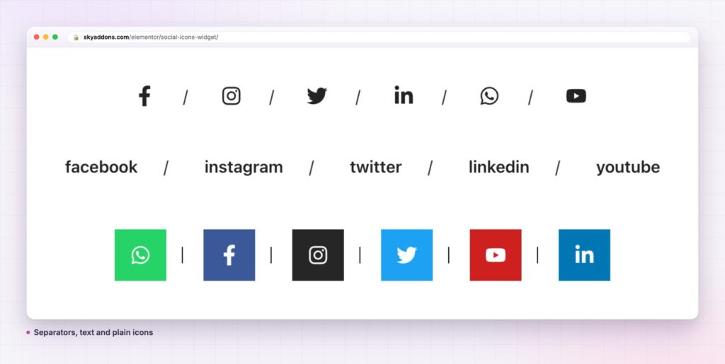
Separators between icons. Show a thin default divider or type your own, such as a slash or a dot. A row of icons with slashes looks like a considered navigation, not a pile of stickers.
Shape and size. Set padding and radius, or type an advanced radius for shapes like a leaf or a pill. The spacing between icons and the icon size are separate controls, so you can make a large tappable set for a phone.
Dim others on hover. Switch on Dim Others on Hover and set an opacity, and the rest of the row fades while the icon under the pointer stays bright. It is a small effect that makes the row feel alive, and it needs no code. Add a hover animation to the icon for extra emphasis.
Direction and alignment. Lay the icons out horizontally or vertically and align them left, centre or right, so the same widget works in a header, a sidebar or a centred bio page.
A visitor who likes what they read often wants the next step to be easy. A clear, well-placed set of icons is that step. The recognisable shapes need no explanation, and colour helps the eye find them in a footer full of text.
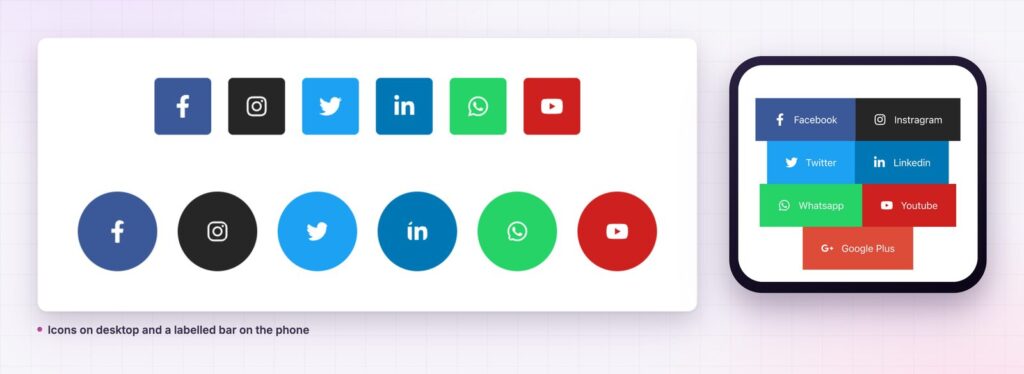
The labelled version does even more. Words next to icons remove doubt, and they give search engines and assistive technology text to read. A button that says “Instagram” is clearer than a small camera glyph, particularly for older visitors or for networks whose icons are less familiar.
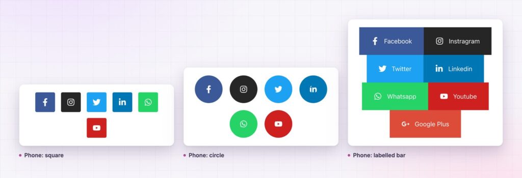
Size matters most on mobile. Small icons packed tightly are hard to hit. Generous spacing and padding turn the row into a set of proper touch targets, which lowers accidental taps.
More icons do not mean more followers. A visitor who sees eight icons has to work out which one you actually use, and often picks none. Show the two or three networks where you post regularly and reply to messages, and put them in the order of importance. If a platform is where customers contact you, such as WhatsApp for a shop or LinkedIn for a consultancy, lead with it and give it a label.
Match the style to the job. In a footer, small plain icons with separators keep the page quiet. On a contact page, a labelled bar makes each network look like a real button, and on a link-in-bio style page a vertical stack of large labelled icons is easy to tap. The widget lets you set each style separately, so the header and the footer can look different from the same starting point.
Make it easy to follow you, and make the icons big enough for a thumb.
The widget is a row of icon links, so it works for more than social networks. Add an email icon, a phone icon and a map pin and you have a contact strip. Use icons for a set of app store badges, a list of platforms a product supports or the channels of a support team. In vertical mode with labels on, it becomes a contact panel for a link-in-bio page.
Style each part separately and you can fit it into any design. A row of small dark icons with slash separators feels like an editorial site. Large coloured squares with labels feel like a portfolio or a creator page. Circles with a dim-on-hover effect feel modern and playful. All three come from the same widget.
Yes. Social Icons is part of the free Sky Addons plugin. Free vs Pro shows what the Pro plugin adds.
No. It works with Elementor and Sky Addons alone.
No. It is a set of links with a stylesheet and loads no scripts, so it is one of the lightest widgets you can add.
Yes. It is responsive. You can change the direction, alignment, spacing and icon size per breakpoint so the row stays tappable on a small screen.
The widget links to profiles and pages. If you want buttons that share the current page, Sky Addons Pro has a separate Social Share widget.
Social icons should be easy to spot and easy to tap. The Sky Addons Social Icons widget gives you brand or custom colours, labels, separators and a dim-on-hover effect, free, in a layout that adapts from a header bar to a link-in-bio page. Choose the channels you use, make the targets large and let the row do its job quietly.
Next steps: see the live demo, read the Social Icons documentation, compare plans and pricing, or read how the WhatsApp button adds a direct chat link. For a card that links out, see the card widget.

Comments are closed.