
Elementor Card Widget: One Element for Image, Badge and Button
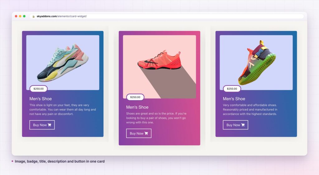
The Elementor card widget puts an image, badge, sub title, title, description and button in one element you can duplicate. Free in Sky Addons.
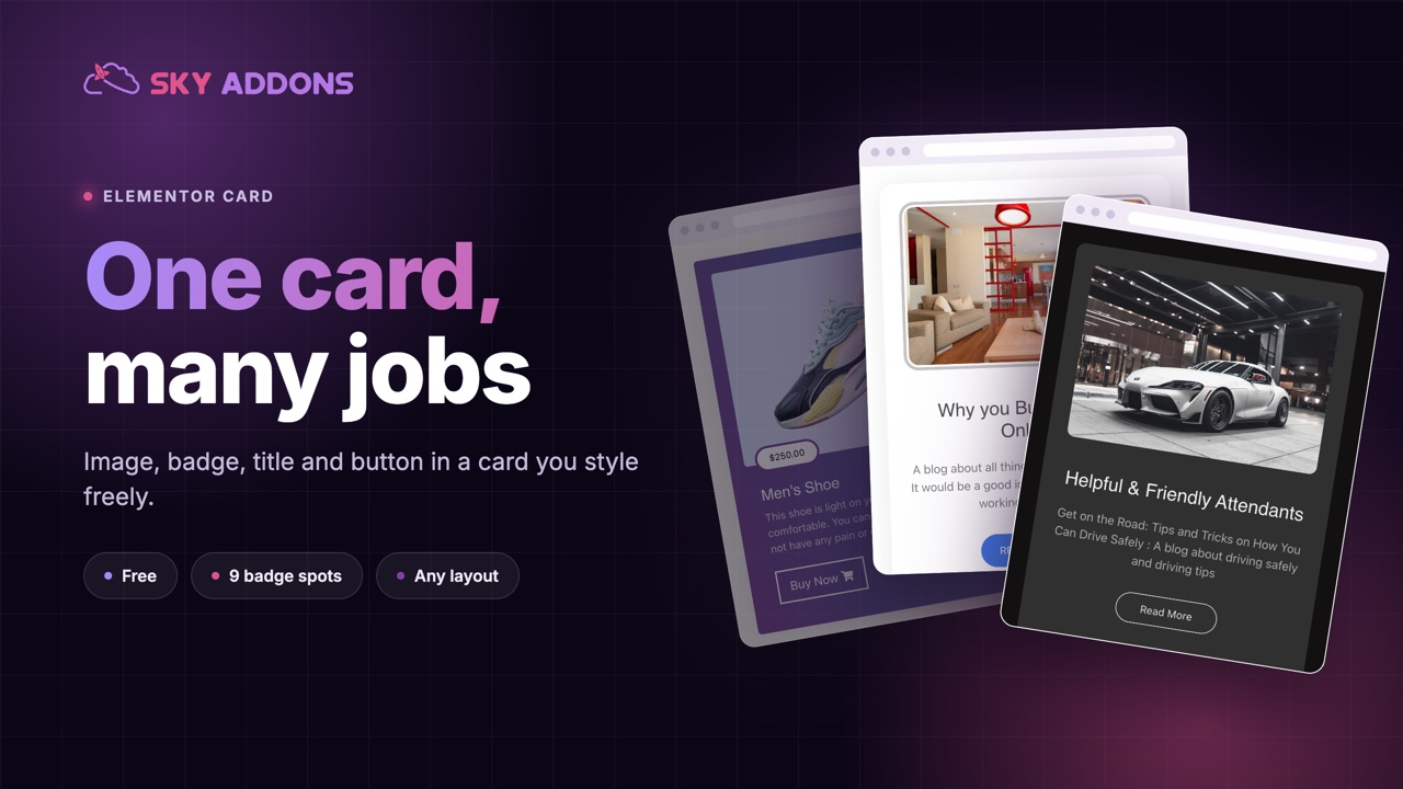
A page rarely needs one piece of content. It needs six or eight that look like a set: products, articles, courses, listings, services. The trouble is how they get built. An image widget, a heading, a text editor, a button and a badge sit inside a container, and the whole group has to be copied, aligned and fixed on mobile every time you change a word.
A card widget replaces that stack with one element. Sky Addons includes a free Card widget for Elementor that holds the image, a badge, a sub title, a title, a description and a button in a single unit, with layout and styling controls for each part. You build one card, duplicate it, and change the content. The result is a set that stays consistent because each card is the same widget.
This article covers where a card widget works, what separates it from an image box or a hand-built container, and how to design a set of cards that hold together across desktop and mobile.
A card is a good container for anything that has a picture, a name and a reason to click.
Both alternatives can produce a card. The table shows the cost of each.
| Elementor Image Box | Container built by hand | Sky Addons Card widget | |
|---|---|---|---|
| Elements to manage | One | Four or five | One |
| Badge on the image | No | Extra widget, positioned by hand | Built in, 9 positions |
| Sub title | No | Extra heading | Built in, with its own tag |
| Button | No | Extra widget | Built in |
| Image offset and rotation | No | Manual | Offset, rotate and object fit controls |
| Button colour on card hover | Manual | Manual | One switch |
| Duplicate a set | Easy | Fiddly | Easy |
Everything in one widget. The card holds the image, a badge, a sub title, a title, a description and a button. Turn each part on or off with a switch, so the same widget is a full product card in one place and a plain image-and-headline teaser in another.
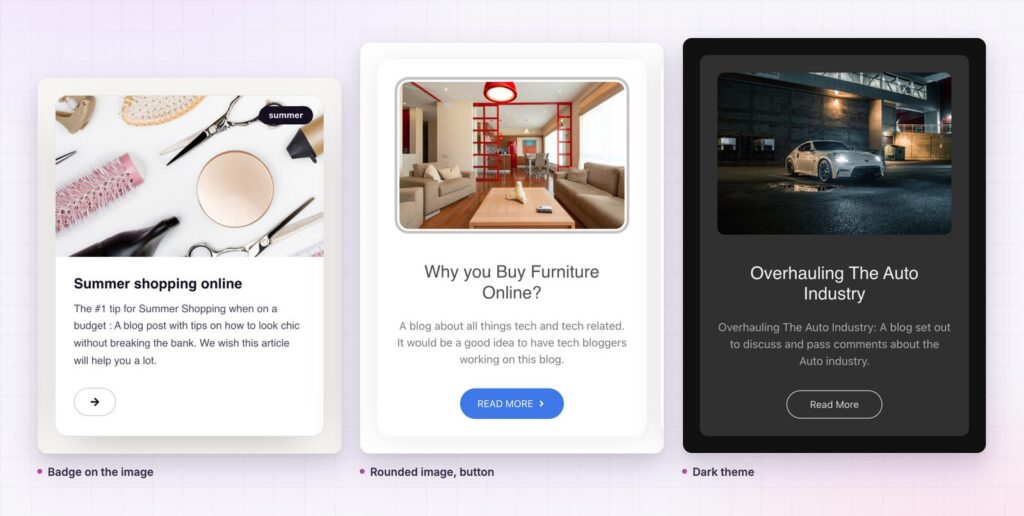
A badge you can place anywhere on the image. Choose from nine positions: top, middle or bottom, each left, centre or right. Use it for a price, “New”, “Sale” or a category. Then move it with the horizontal and vertical offset, rotate it, and set its padding, colour and radius.
Image control that goes beyond a crop. Set the width and the height, add padding and a radius, switch on Object-Fit Contain so a product photo is never cut off, and set the opacity and a hover animation. The image offset and rotation controls let a photo break out of the card for a more editorial look.
Three image positions. Place the image on the left, on top or on the right. A grid of tall cards suits a landing page. A single horizontal card with the image on the left suits a list of results.
One link that covers the image, the title and the button. Set a single link and the picture, the headline and the button all lead there, so a reader can click whichever they notice first. The button has its own label, icon and position, and you can make it full width or align it left, centre or right.
A colour change when the card is hovered. One switch changes the button colour on card hover, so the call to action responds when the pointer is anywhere on the card, not only on the button itself.
A set of cards works because it repeats. The eye learns the pattern after the first one and then only reads what changes: the picture, the name, the price. A page built from different content blocks makes the reader learn the layout again for every item.
Because the card is a single widget, the details stay together. The badge always sits on the same corner, the button always aligns to the same edge and the spacing is identical from card to card. When you change a colour or a radius you change it once and copy it, instead of editing five pieces in each of six containers.
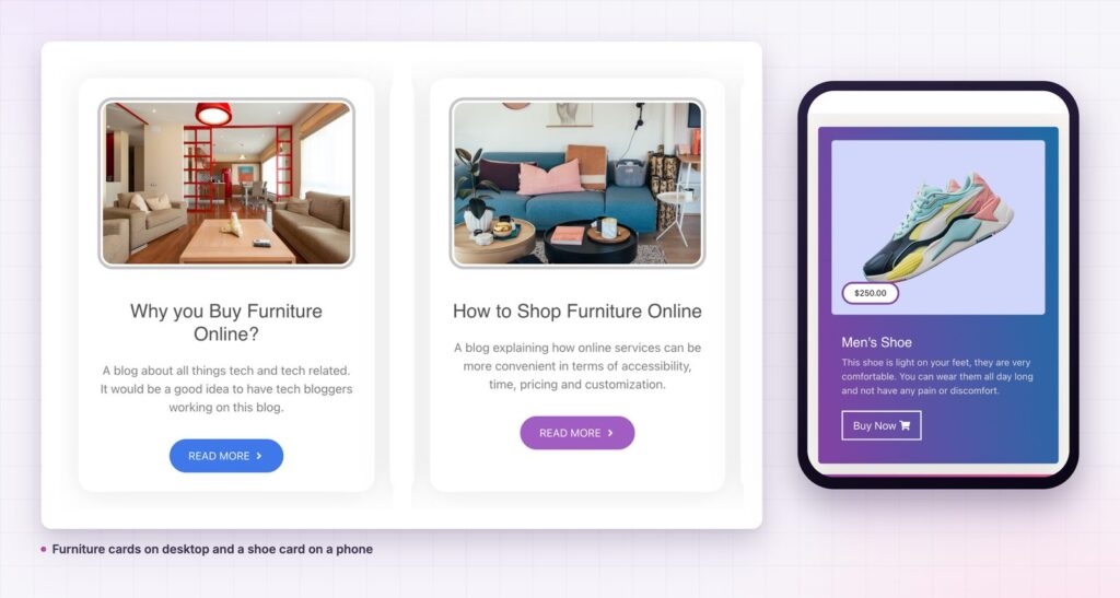
It also keeps mobile work small. The card stacks its content in a sensible order on a narrow screen, and you can adjust the image height, padding and alignment per breakpoint without rebuilding anything. For a broader look at cards as an interface pattern, the Nielsen Norman Group has a clear guide to cards.
A set of cards works because it repeats. The eye learns the pattern once, then reads only what changes.
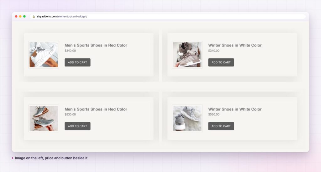
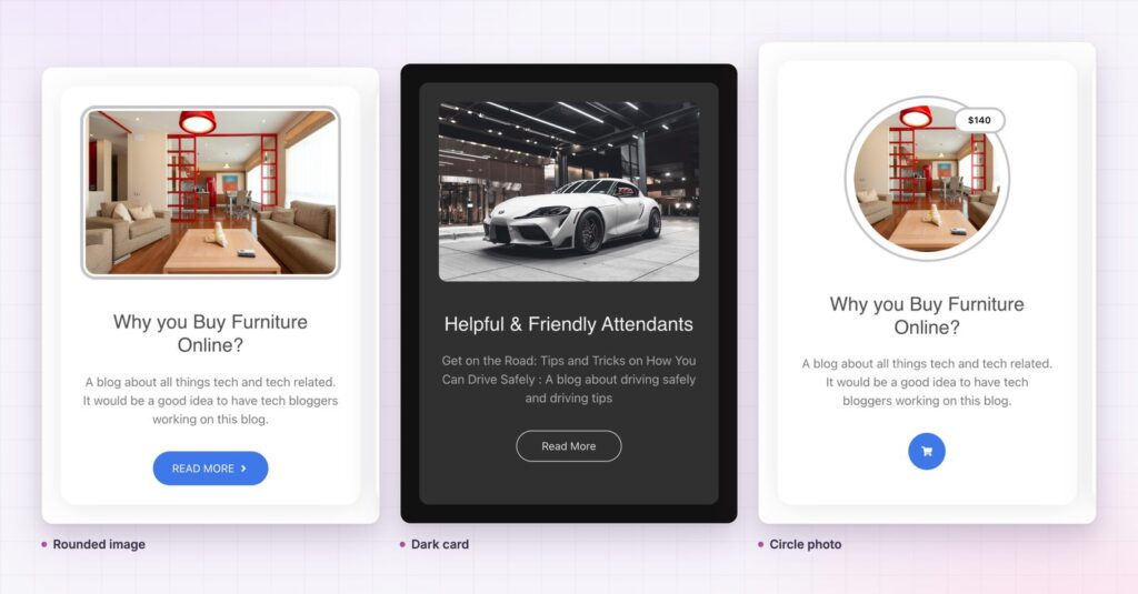
The same widget works for more than products. Turn off the button and the sub title for a clean article teaser, where the picture and the headline both lead to the story. Use the middle-centre badge position for a large label such as “Coming soon”. A circular photo with a price badge, as in the demo, makes a menu or a team-style card without any custom code.
Because each part has its own colour, hover colour and spacing, you can push the look a long way from the default. A soft white card with a blue button feels like a shop. A near-black card with a thin outline button feels like a studio. The widget stays the same and the character changes with the settings.
Yes. Card is part of the free Sky Addons plugin. Free vs Pro shows what the Pro plugin adds.
No. The card widget works with Elementor and Sky Addons alone. For a store with a large catalogue, a shop plugin is still the right tool, and the card is a good way to show a few featured items around it.
No. The card is plain markup with a stylesheet and loads no scripts. The main cost on any card page is the images, so use compressed files at the size you display.
Yes. It is responsive, and the image height, padding, alignment and offsets can be set per breakpoint. Set the container to one column on a phone and the cards stack neatly.
Almost. One link field covers the image, the title and the button, so all three lead to the same place. The link options let you open it in a new tab or add nofollow where it makes sense.
A card widget puts an image, a badge, a sub title, a title, a description and a button into one unit that you can duplicate and style. It is free, it stays consistent across a grid and it keeps mobile work small. Build one good card, then let it repeat.
Next steps: see the live demo, read the Card documentation, compare plans and pricing, or read how the testimonial widget shows customer words in the same kind of grid. For a list version of the same idea, see the list group widget.



Comments are closed.