
Elementor Polar Area Chart: Compare Categories in a Shape People Notice
The Elementor polar area chart widget draws equal wedges whose reach shows each value, in your colours, with ring ticks and a legend. No extra plugin.
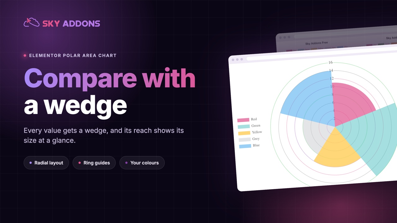
Most charts look like charts. Bars, lines and circles cut into slices are so familiar that a page full of them starts to blur. When one figure has to be noticed, a familiar chart can work against you.
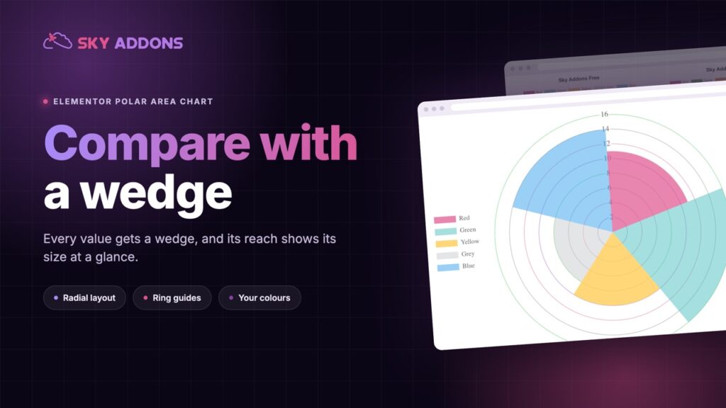
A polar area chart is the unfamiliar one that still makes sense at a glance. Every category gets an equal wedge of a circle, and the further the wedge reaches from the centre, the bigger the value. The eye compares reach, and reach is easy to compare.
The Elementor polar area chart widget draws it from a short list of values, and it is part of Sky Addons Pro.
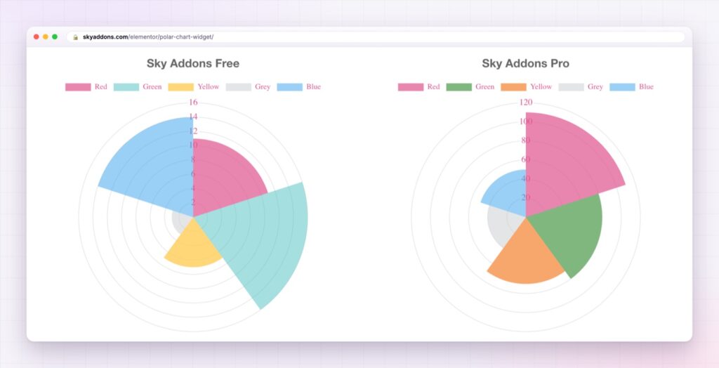
| A plain bar chart | An Elementor polar area chart |
|---|---|
| Familiar, so easy to skim past | A shape that stops the scroll |
| Categories in a row | Categories around a circle, all equal in weight |
| Size is height only | Size is how far each wedge reaches |
| Good for many categories | Best for five to eight, at a glance |
| One layout | Ring guides, ticks and colours you choose |
Every wedge is its own item. Add a wedge and give it a name, a value and its colours: fill, hover fill, border and hover border. There is no fixed number of wedges and no palette you are stuck with.
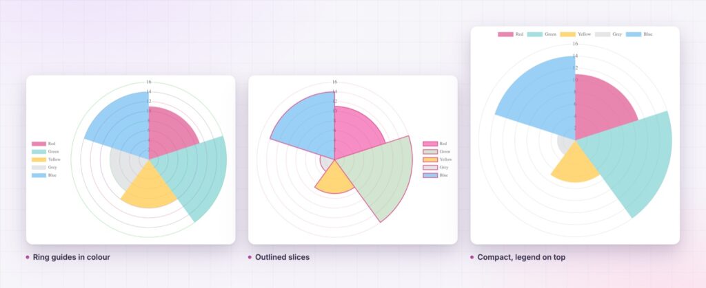
Ring guides that read like a scale. The circles behind the wedges carry the tick numbers, and the tick colour and text are yours to style. Set them quiet on a calm page or bold on a dark one.
Outlined or solid. Border width and colour turn soft filled wedges into crisp outlined ones, and the hover colours make each wedge respond to the pointer.
Cleaner or richer, your call. The title, legend and tooltips switch on and off. The legend can sit at the top, left, bottom or right, in reverse order if you like, and its colour boxes can be resized.
Motion that fits. Four animation curves, linear, ease in cubic, ease in circ and ease in bounce, and a duration of up to ten seconds. The wedges grow into place as the chart scrolls into view.
A height for each screen. Chart height is set separately for desktop, tablet and phone. For shares of a whole rather than categories on one scale, see the Elementor pie chart.
Use it when the shape is the point. If the reader needs to read exact values, a bar chart or a table beside it does that job better.
In a polar area chart every category gets the same angle, so the only thing that differs is how far each wedge reaches. That removes one of the ways a chart can mislead and leaves a single visual signal to read. The result is a shape a reader can describe in a sentence: strong here, weak there.
The widget draws on the open source Chart.js library, which ships inside Sky Addons Pro. The Chart.js polar area documentation describes how the library scales the wedges.
A chart is a picture of data, so say the takeaway in the text beside it for anybody who cannot see it. For more detailed data, the W3C guidance on complex images explains how to describe it.
No. The polar area chart widget is part of Sky Addons Pro.
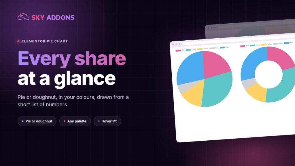
In a pie chart the angle of each slice shows its size. In a polar area chart every wedge has the same angle and its reach shows the size, so it suits comparing categories rather than shares of a whole.
Each wedge is one item in the widget’s list, so add as many as the chart can show clearly. Each gets its own name, value and colours.
No. You type the names and values into the widget, and the chart library is included.
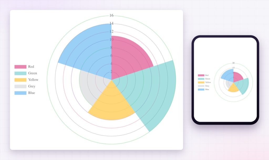
Yes. The chart resizes to its container, and its height can be set separately for desktop, tablet and mobile.
The Elementor polar area chart widget turns a short list of values into a set of wedges that stop the scroll. Every category gets equal weight, its reach shows its size, and every colour, tick and animation is yours to set. It is the chart to reach for when a familiar bar or pie would be skimmed past.
The Polar Chart demo runs five charts on one page, in different colours and scales. Every control is listed in the Polar Area Chart documentation.
To compare categories in plain columns, the Elementor bar chart is the matching widget.
The polar area chart is included in Sky Addons Pro, and the free versus Pro page shows where the line falls.

Comments are closed.