
Elementor Element Parallax: Let Each Piece Move at Its Own Speed
Elementor element parallax gives individual widgets their own scroll speed, so a section composes itself as the reader arrives instead of sitting still.

Background parallax moves the whole backdrop of a section. That is useful, and it is also a blunt instrument: everything behind the content shifts together, which reads as one big photograph sliding.
The effect designers actually want is finer. A picture that rises slightly faster than the paragraph beside it. A price card that lags half a beat behind the heading. Small differences that make a section feel composed rather than laid out.
Elementor element parallax in Sky Addons Pro 5.0 puts a scroll speed on individual widgets, so you set the pace element by element instead of section by section.

| Background parallax | Elementor element parallax |
|---|---|
| The whole backdrop moves as one | Each widget has its own speed |
| Needs a background image | Works with the elements you already have |
| One depth cue per section | As many as the composition needs |
| Content stays flat | The content itself has depth |
A speed per element. The single idea behind the extension. Set a value on each widget and the difference between them creates the depth, which is why two elements at slightly different speeds look better than one element moving a lot.
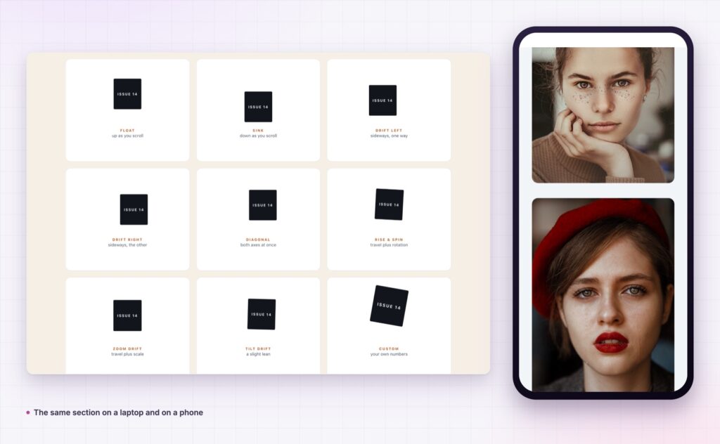
Direction, including sideways. Vertical drift suits most pages. A horizontal shift on one element in a wide layout is unexpected in a good way, and it works particularly well on captions and labels.
It applies to anything. Images, headings, cards, icons, containers. There is no special widget, so you can add it to a section you built months ago.
Start and end control. Where the movement begins and ends relative to the viewport, so the element does its travelling while it is actually on screen.
Sensible behaviour on phones. Reduced or off on small screens, because three elements moving at three speeds on a 390px screen is noise rather than depth.
No stacking conflicts. It runs as its own transform, so it does not fight Elementor’s entrance animations or your other effects.
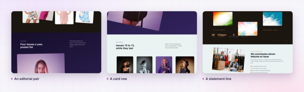
Two speeds make a composition. Five speeds make a mess. If you cannot say why an element moves differently, set it back to zero.
Depth on a flat screen is entirely about relative motion, and the smaller the difference, the more real it looks. Per-element speeds let you build that difference where it matters, in the content itself, rather than behind it.
There is a practical reason too: this is the cheapest way to make a plain two-column section look designed. No new imagery, no illustration budget, no rebuild. The same elements, arriving at slightly different times.
It changes how a page is read, too. When two elements arrive at slightly different moments, the eye follows the faster one first, which means you can decide the reading order of a section without moving anything or adding a single line of copy. That is a level of control most page builders never give you.
The risk is overuse. Motion is a limited currency on a page, and spending it on every element leaves nothing for the parts that matter.
Several pieces moving at once is a lot of motion, so it is worth knowing what prefers-reduced-motion asks you to do about it.
Background parallax moves a section’s backdrop. This gives individual widgets their own scroll speed.
Yes, including containers, images, headings and cards you have already built.
Yes, and a horizontal drift on one element is often more effective than vertical movement on several.
It is a transform, so the cost is negligible compared with the images on the page.
The effect is reduced or disabled, because small screens do not have the room for it.
Elementor element parallax gives each widget its own scroll speed, so a section composes itself as the reader arrives. Two elements at slightly different speeds is all it takes, it works on layouts you already built, and it is the cheapest depth you can add to a page.
The Element Parallax demo shows editorial pairs, product shots and card rows using different speeds, which is easier to judge by scrolling than by reading. Every setting is in the Element Parallax documentation.
For depth behind the content rather than in it, use Elementor background parallax. Both are part of the release described in Sky Addons 4.0 and Pro 5.0.
Element Parallax is a Pro extension, included in every Sky Addons Pro plan, and the free versus Pro page shows what the free plugin covers.



Comments are closed.