Sky Addons  ·  Elementor Widget
INTRODUCING

Mate List

A post list for Elementor: thumbnail, title and meta stacked in a vertical run, for sidebars and recent-article blocks.

Design 1

Mate List for Bloggers

Mate List lets you save your thoughts and ideas, so that when you have time,
all you have to do is use our simple interface to create blog posts.

Tomas and the honest version of a jawline

Tomas and the honest version of a jawline

Shot from slightly below, which every guide tells you not to do. The guides are describing flattery, not accuracy.
June, who refused the chair

June, who refused the chair

We put a chair out. June ignored it for forty minutes and was completely right to.
Selin, and the frame we nearly deleted

Selin, and the frame we nearly deleted

It was marked for deletion on the contact sheet. It ran on the cover.
Priya on the last roll

Priya on the last roll

Everybody relaxes on the last roll, because they know it is the last roll. There is no way to fake that and we have stopped trying.
Design 2

Blogs with Grid

It’s the perfect solution for bloggers who want to keep their blog post updated.
With Mate List’s beautiful, intuitive interface and Elementor compatibility,
you’ll be able to keep your blog post updated with ease.

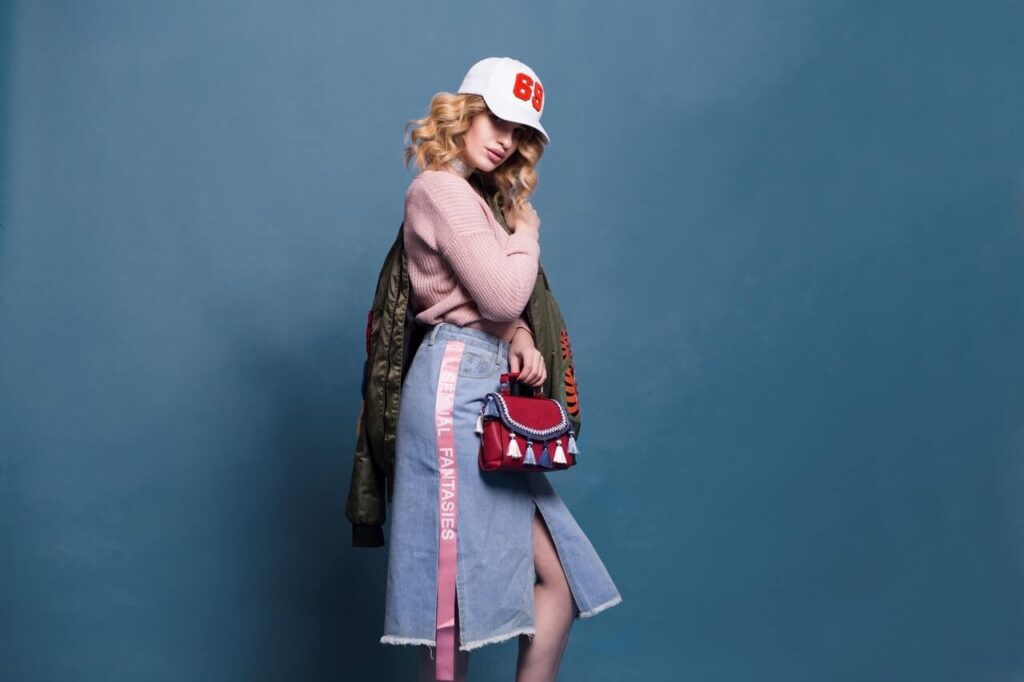
A place where all kinds of fashion design can be found.

A place where all kinds of fashion design can be found.

A Place for All Kinds of Fashion DesignThe breadth of

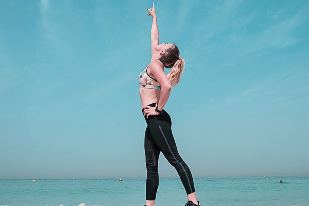
Beauty is subjective, as there is no universal standard of beauty.

Beauty is subjective, as there is no universal standard of beauty.

Look at this beautiful girl, she is so gorgeous. Her

A model for your photoshoots or want to look at some cute girls.

A model for your photoshoots or want to look at some cute girls.

Girls can be surprisingly beautiful sometimes, and sometimes you have
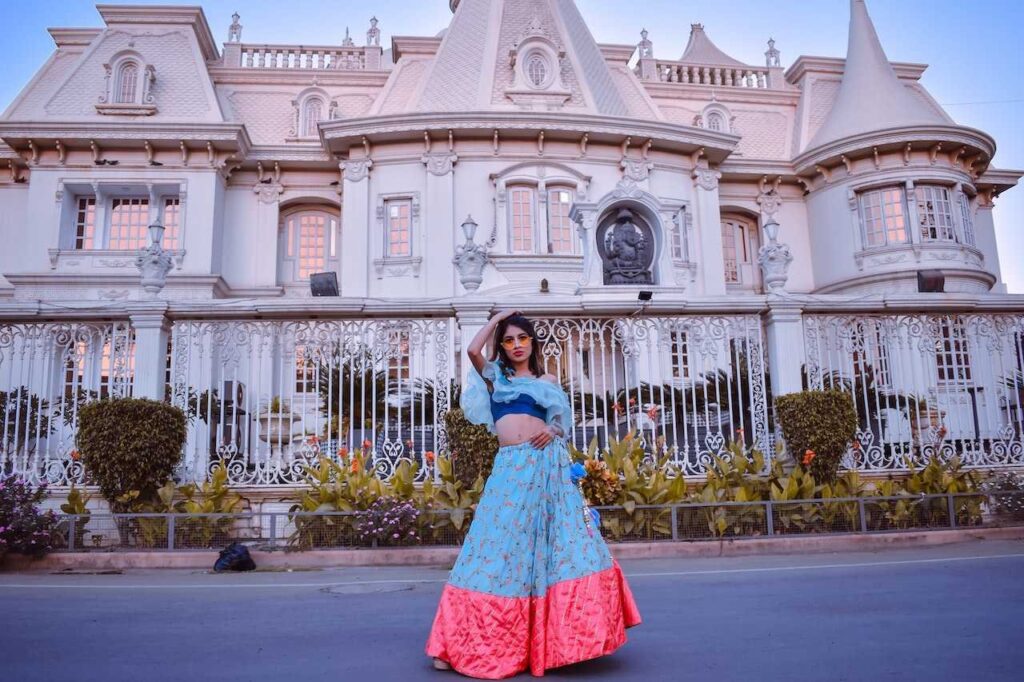
This article will talk about fashion in the time of Queen Elizabeth

This article will talk about fashion in the time of Queen Elizabeth

Fashion has a way of defining individuals and buying clothes

Design 3

Limitless Designs

You love sharing new content with your blog followers. Except for when you’ve done a
lot of work and have to get it onto the site.

The Model Blog design is created to help you get your blog started.

The Model Blog design is created to help you get your blog started.

The Model Blog Design: Help You Get StartedStarting a blog demands momentum — the first

Get your blog up and running with this awesome template!

Get your blog up and running with this awesome template!

Get Your Blog Up and Running with Sky Addons for ElementorThe gap between deciding to
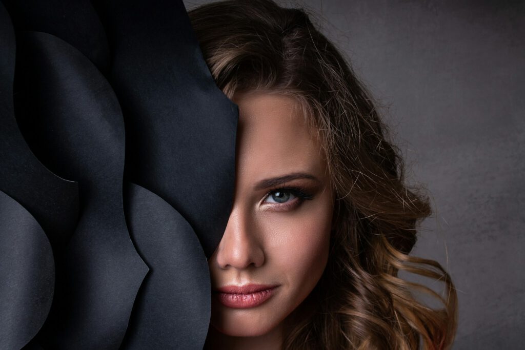
This blog design can be used for any type of blog you like.

This blog design can be used for any type of blog you like.

Sky Addons Blog Design for Any Blog TypeThe promise of a flexible page builder is

Get our gorgeous trendy & high-quality design for your blog!

Get our gorgeous trendy & high-quality design for your blog!

Gorgeous Trendy High-Quality Blog Design with Sky AddonsThe fashion and beauty blog niche is visually

Model Girl Blog is a popular blogger template for Elementor.

Model Girl Blog is a popular blogger template for Elementor.

Popular Blogger Template for Elementor: Model Girl BlogTemplate popularity is often driven by the same

Looking for awesome blog designs with beautiful models?

Looking for awesome blog designs with beautiful models?

Awesome Blog Designs with Beautiful ModelsThe photography-first blog format that features models and fashion editorial

Design 4

eXplore Creativity

Mate List is a perfect solution for bloggers who want to keep their blog post updated.
It’s so simple to use and works great with Elementor!

Model Girl Blog is a popular blogger template for Elementor.

Model Girl Blog is a popular blogger template for Elementor.

Popular Blogger Template for Elementor: Model Girl BlogTemplate popularity is often driven by the same

Get our gorgeous trendy & high-quality design for your blog!

Get our gorgeous trendy & high-quality design for your blog!

Gorgeous Trendy High-Quality Blog Design with Sky AddonsThe fashion and beauty blog niche is visually

FAQ
Frequently asked

Mate List

Straight answers about what this one does, where it fits in a real build, and what it costs you to ship.

Still stuck?

Read the documentation for this one, or write to us — a human answers inside a business day.

What is the Mate List widget for?

Reading rows rather than tiles. By default the Mate List in Sky Addons for Elementor runs a single column of wide rows, each splitting fifty-fifty between the featured image and the text, with a 34px headline, a fifteen-word excerpt and a circular author avatar with the date beneath the name. It suits a blog index or an author page more than a card wall.

Can the Mate List run more than one column?

Yes, one to four, and unlike the grid widgets it defaults to one column at every breakpoint because the rows are designed to be wide. Two columns with the stacked layout turns it into a conventional card grid; four columns only really works with the image-on-top layout and a short excerpt.

What do the three layout options actually change?

Where the picture goes. Default sets the image and the text side by side at half the row each with the large 34px headline; Layout 1 stacks the image above the text and drops the title to 22px; Layout 2 puts the image underneath. The setting is stored per breakpoint, so a side-by-side desktop row can become a stacked tablet card.

How do I control the spacing between rows?

Row Gap and Column Gap are separate responsive sliders. Column Gap starts at 36px, which is also the gap held between the picture and the text inside each row, so a single value keeps the vertical and horizontal rhythm consistent. Row Gap is left unset so the list starts tight and you open it out to taste.

Does the Mate List support pagination?

Yes. Show Pagination adds numbered page links below the last row, and they hide themselves when the query fits on a single page. They use WordPress’s standard paged variable, so each page is a real page load with its own URL — which is what you want for a blog index that search engines should be able to walk.

Why does my side-by-side row stack on mobile?

The Default layout is forced to a single column below 768px, with a 24px gap, because half of a phone screen is too narrow for a 34px headline and an excerpt. This applies only to the Default split — if you have chosen Layout 1 or Layout 2 the card is already stacked and keeps the order you picked all the way down.

Can I hide the byline and show a relative date?

Both are switches. Show Author removes the avatar chip and the name together; Show Date removes the dated line under it. With the date on, Show Human Diff Time turns it into “two days ago”, a second switch abbreviates that, and Show Time appends the clock time for anything published to a schedule.

Can I hand-pick which posts appear, in my own order?

You can hand-pick them, but not order them by hand. Setting Source to Manual Selection and searching for individual posts limits the list to exactly those items; they are then still sorted by whatever Order By says, so a hand-picked set comes back newest-first rather than in the order you added them. Use Menu Order if you need a fixed sequence you control.

Which thumbnail size should I pick for a wide row?

Large is the default and the right starting point, because at fifty-fifty the image occupies roughly half the content width — Medium will look soft on a wide screen. The Image Size list offers every size registered in WordPress up to 2048×2048 and Full, and posts with no featured image draw Elementor’s placeholder rather than collapsing the row.

How is this different from the Post List widget?

Scale. The Mate List gives each post a wide row with a half-width image, a 34px headline and an author photo; the Post List packs posts into a compact two-column run with a fixed 156px thumbnail beside the text. Choose the Mate List for a main blog index and the Post List for a sidebar or a footer block. Neither needs Elementor Pro.