
Image Accordion for Elementor: Six Pictures in the Width of One
Build an image accordion in Elementor: six pictures in the width of one, each panel opening on click or hover with its own title, category and button.
A room page needs six photographs. A grid gives each one a small square and the page grows by another screen. A carousel hides five of them behind an arrow nobody presses. Both answers cost something: space, or attention.
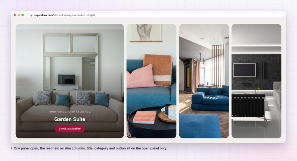
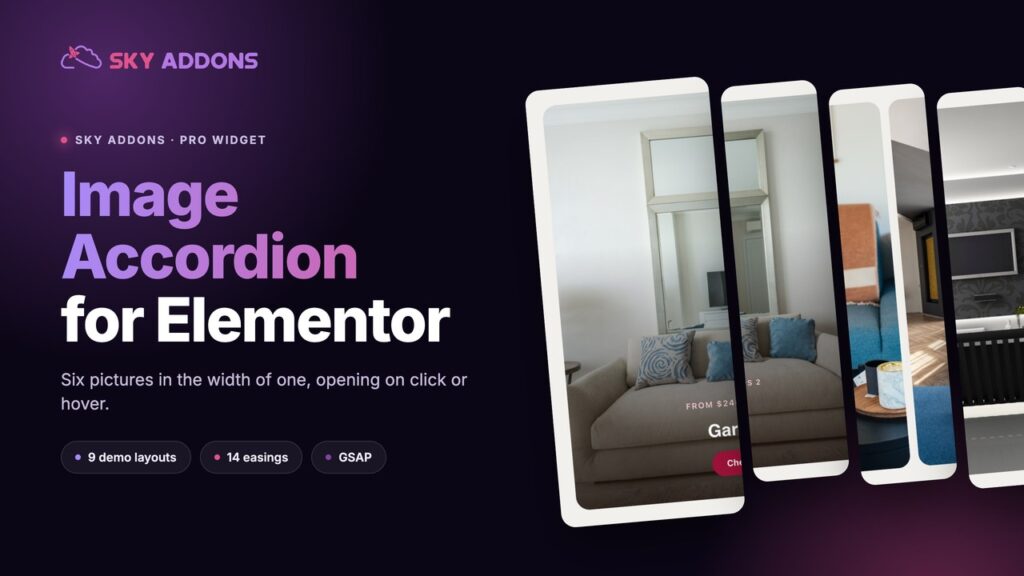
An image accordion takes the third route. Six pictures share the width of one, held as slim columns. The visitor points at a column, it opens, and the copy that belongs to that picture appears on top of it. Nothing below moves. The section is a fixed height whether the visitor interacts with it or not.
That last part is the reason to reach for it. A page that does not reflow is a page that does not push the buy button off screen halfway through a scroll.
The pattern suits any set where the picture does the selling and the words are a short label. It is a poor fit for long descriptions. If a panel needs a paragraph, put it in a card grid instead.
| Approach | Space used | Words visible | Movement on the page |
|---|---|---|---|
| Six-up image grid | Two or three screens | All captions at once | None, but the page is long |
| Carousel | One screen | One slide at a time | Slides change on a timer |
| Lightbox gallery | One screen | None until clicked | Opens a modal over the page |
| Image accordion | One screen, fixed height | Open panel only | Panels widen in place |
The grid is honest and slow. The carousel is compact and easily ignored. The image accordion keeps the grid’s honesty, because every panel is visible, and the carousel’s compactness, because only one is expanded.
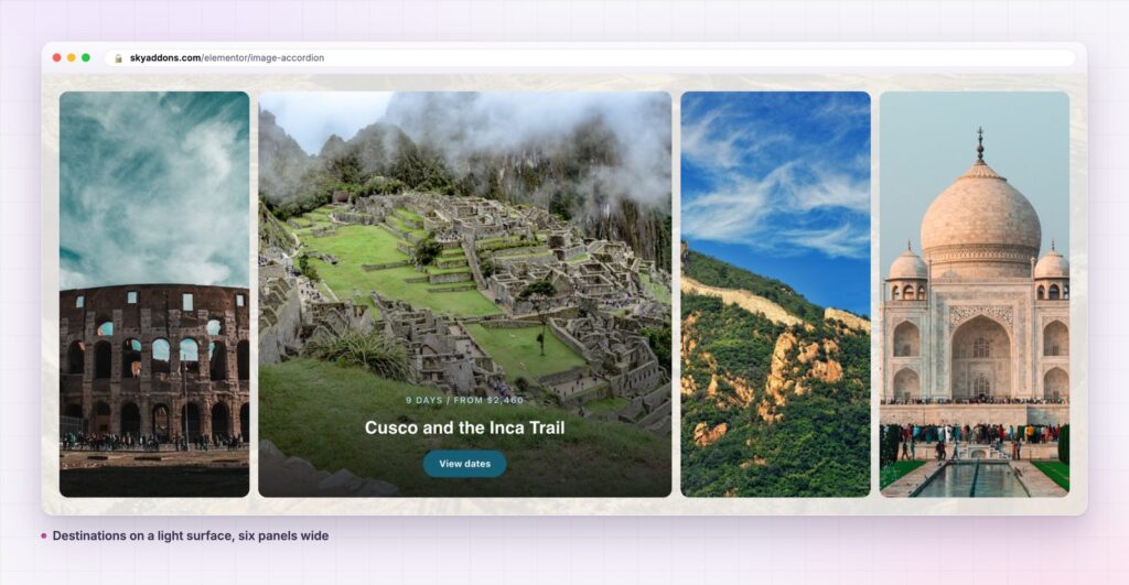
Three ways to fill it. The content source is a repeater you type into, an image gallery you pick in bulk, or Dynamic Posts, which pulls titles, images and links straight from a post type. The third one matters if the panels are rooms, products or case studies that already exist as posts.
Click or hover, your call. The Mouse Event control is Click or Mouse Over. Click is the default and the safer choice: hover opening on a page full of panels can feel twitchy, and it does nothing at all on a phone.
Fourteen easing curves. Animation Easing carries fourteen named GSAP easing curves, from Expo Scale through Slow Motion to Elastic and Bounce. The default is Slow Motion (0.9, 0.7, false), which opens firmly and settles without a wobble. Bounce and Elastic are there when a brand wants them, not because they are a good default.
An active panel on load. Active Item takes a number, so the section arrives with one panel already open rather than as a row of unread slivers. Pick the panel you would most like a visitor to read.
Title, sub title and button, each optional. Three switches decide what sits on the open panel. A gallery of work might show only the title. A room list wants all three. The title tag is selectable, so the panels can be h3 inside a section that already has an h2.
Style that reaches the open state. Spacing, border radius and content padding are controls, so the same widget reads as one unbroken wall or as six separate cards. Title, category and button each have a normal and a hover colour.
Build it with real photographs from the start. Placeholder greys hide the one problem this widget has, which is that a busy image and white type fight each other.
An image accordion is a fixed-height section. On a long page that is worth more than it sounds: the visitor can open three panels and the position of everything below stays exactly where it was. No jumping, no scroll hunting, no losing the call to action that was in view a second ago.
It also gives a section one job. Six grid cards ask a visitor to compare six things at once. Six accordion panels ask a much smaller question, which is which one of these do you want to look at, and answer it in place.
A section that answers one question at a time gets read. A section that asks for six comparisons at once gets scrolled past.
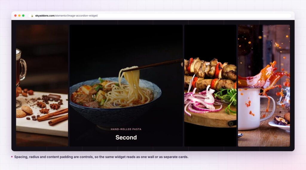
Nothing about the widget is fixed to photographs of rooms. The panels are a picture, a label and a link, which describes a surprising number of sections: service lines, team departments, course modules, venue spaces, product finishes. If the set has between four and eight members and each one has a strong image, the pattern holds.
A second use worth knowing: a two-panel accordion is a decent before-and-after or this-or-that section. The visitor opens one side, then the other, and the comparison happens without a page reload. It is not what the widget was built for, and it works.
No. Image Accordion is part of Sky Addons Pro. The free plugin carries Info Box, Advanced Slider, Animated Heading and more than fifty other widgets. The free versus Pro comparison lists what sits on each side of the line.
Only Elementor. The widget ships its animation with the plugin and loads GSAP, the animation library it is built on, on pages that use it.
One animation library and one small script, loaded only where the widget appears. That is the whole cost. Sky Addons loads widget assets per page rather than site-wide, so a page without an image accordion downloads none of it.
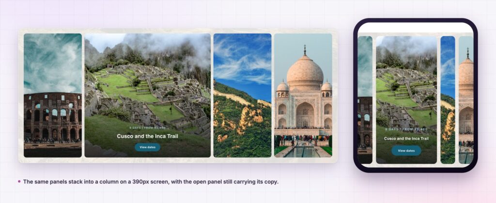
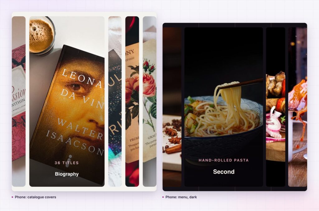
The panels stack into a column and the open panel keeps its title, category and button. Hover opening does nothing useful on touch, which is the practical reason to leave Mouse Event on Click.
Yes. Switch the content source to Dynamic Posts, choose the post type and the query builder handles the rest: limit, include and exclude by term or author, offset, order and date range.
An image accordion puts six pictures in the width of one and keeps the section at a fixed height, so nothing below it moves while a visitor looks around. Three content sources, click or hover opening, fourteen easing curves and an optional title, category and button cover the cases that matter. Use it where the photograph sells and the words are a label, and pick a panel to open on arrival so the section never looks like a row of closed doors.
See it running on the image accordion demo, read the Image Accordion documentation, or compare the plans on the pricing page. If the set is larger than eight, the showcase wall handles it better, and for a scrolling picture band there is the horizontal scroll widget.

Comments are closed.