
Elementor Radar Chart: Show Strengths and Gaps in a Single Shape
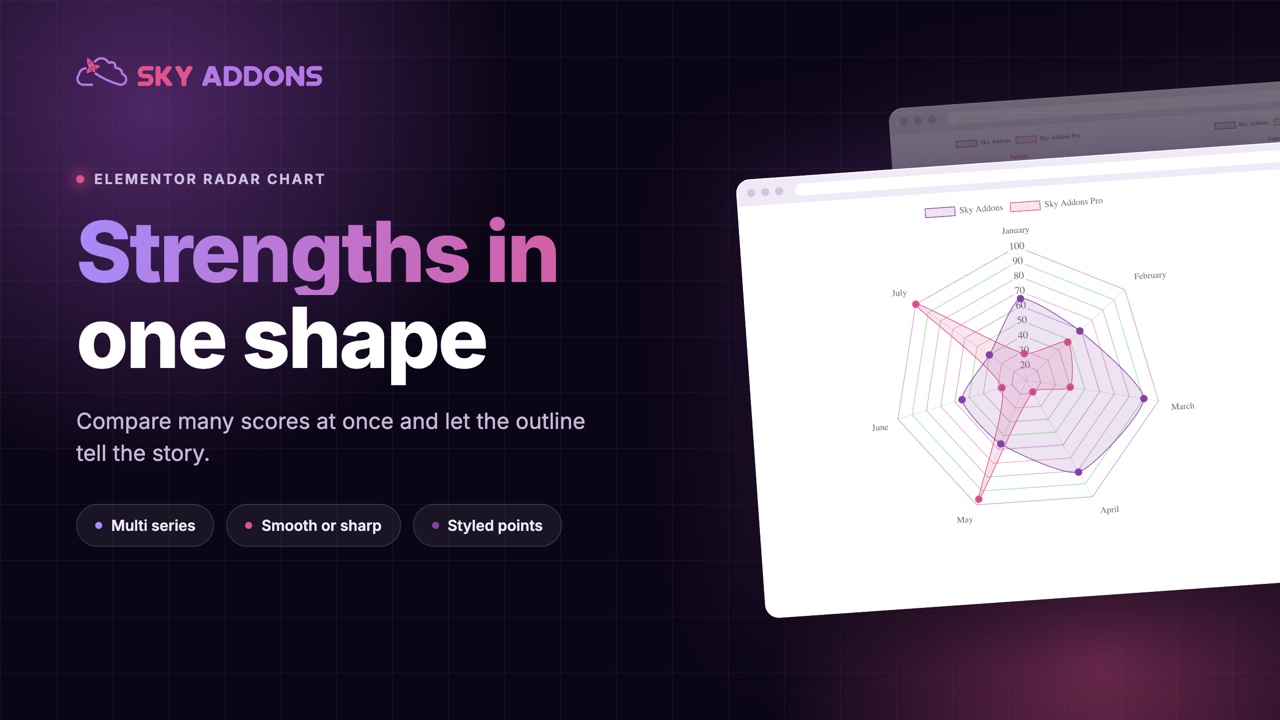
The Elementor radar chart widget compares several scores at once as one shape, with multiple series, styled points and smooth or sharp lines. No plugin.
Some things cannot be summed up in one number. A website audit scores speed, accessibility, design and search separately. A candidate has skills, not a skill. A product has strengths in some areas and gaps in others, and an average hides exactly the part a reader wants to see.
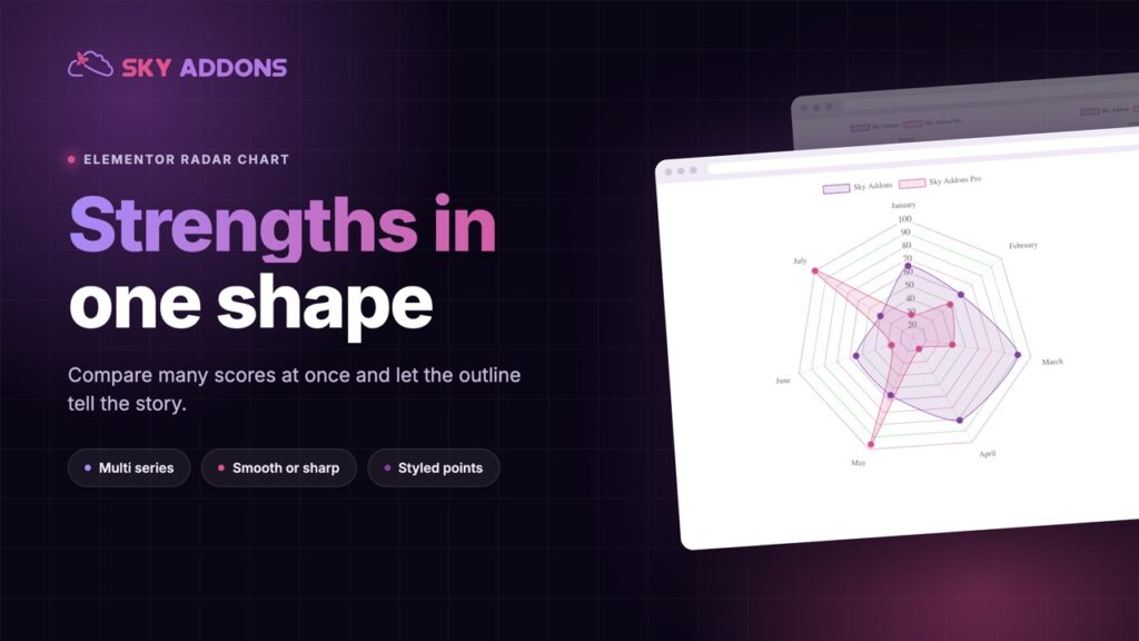
A radar chart shows all of it at once. Each score sits on its own spoke, the points are joined into a shape, and the shape is the profile: full and even, or spiky with one strong corner.
The Elementor radar chart widget draws that shape from a list of labels and a list of values, and it is part of Sky Addons Pro.
| A row of scores | An Elementor radar chart |
|---|---|
| Six numbers to read and compare | One shape to see |
| An average hides the weak spot | A gap shows as a dent in the outline |
| Comparing two people means two rows | Two shapes on the same axes |
| No sense of balance | A balanced profile looks balanced |
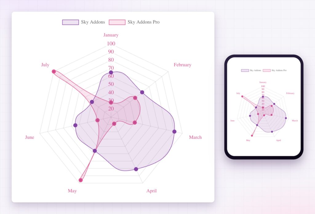
| Plain text on every screen | A chart height set for each device |
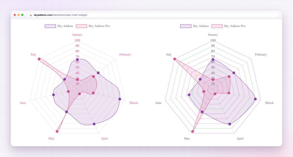
Labels you write once. The axes are a plain comma separated list, such as January, February, March. Add a label and the chart gains a spoke.
As many series as you need. Each series has its own name, values, fill colour and border colour, so two people, two products or before and after can share one chart. Add a series and the legend follows.
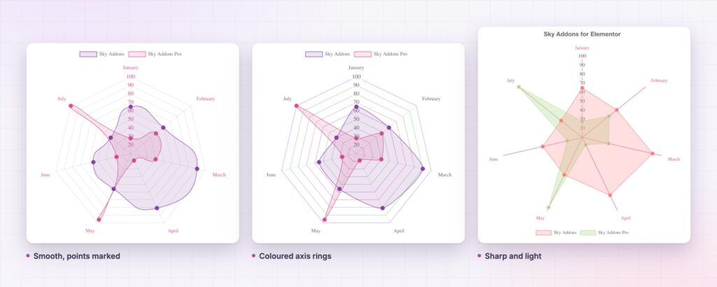
Points that show where the data sits. Point fill and point border each have a colour and a hover colour, and the point border width is adjustable. The measured values stand out from the outline between them.
Smooth or sharp. Line tension runs from straight edges to a soft, rounded outline. Sharp edges look precise. Soft ones look friendly.
A scale you can style. The spokes, the tick numbers and the axis labels each have their own colour, so the scale can sit quietly behind the shape or stand out on a dark page.
Motion and height. Four animation curves and a duration of up to ten seconds draw the shape as it scrolls into view, and the chart height is set separately for desktop, tablet and phone. To compare categories as plain columns, the Elementor bar chart shares the same controls.
A radar chart works when the axes belong together. Six unrelated measures on one wheel make a shape that means nothing.
People read shapes faster than lists. A radar chart turns a set of scores into one outline, so a reader sees balance, gaps and strengths without doing any arithmetic. Put two outlines on the same axes and the comparison becomes a matter of which one is bigger where.
The widget draws on the open source Chart.js library, which ships inside Sky Addons Pro. The Chart.js radar chart documentation describes how the library draws the axes and the fill.
A chart is a picture of data, so say the takeaway in the text beside it for anybody who cannot see it. For more detailed data, the W3C guidance on complex images explains how to describe it.
No. The radar chart widget is part of Sky Addons Pro.
One for each label in the list, so add as many as the chart can show clearly. Five to eight reads best.
Yes. Add a series for each, with its own name, values and colours, and the legend labels them.
No. You type the labels and values into the widget, and the chart library is included.
Yes. The chart resizes to its container, and its height can be set separately for desktop, tablet and mobile.
The Elementor radar chart widget turns a set of scores into a single shape your visitors can read at a glance. It holds as many series as you add, with styled points, smooth or sharp outlines and a scale you control. It is the clearest way to show a profile instead of a single number.
The Radar Chart demo runs four charts on one page, in different colours and scales. Every control is listed in the Radar Chart documentation.
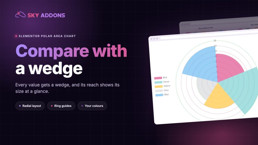
For values compared by reach rather than by outline, the Elementor polar area chart is the matching widget.
The radar chart is included in Sky Addons Pro, and the free versus Pro page shows where the line falls.

Comments are closed.