How to use Line Chart Widget of Sky Addons for Elementor
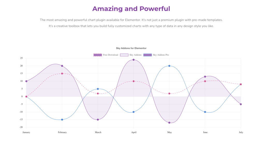
The Line Chart widget is an advanced data visualizations tool that helps you present trends, progress, or comparisons clearly and interactively. Built using the Chart.js library, this widget integrates seamlessly with Elementor and offers complete flexibility in styling, layout, and data control. Whether you want to display sales growth, traffic stats, or analytical reports — Line Chart lets you do it all visually with precision and ease.
Features:
- Based on lightweight and flexible Chart.js 4.x
- Interactive chart with smooth lines and data points
- Multiple dataset support with customizable styles
- Responsive and mobile-friendly design
- Tooltips, grid lines, and axis controls
- Full customization using Elementor’s live editor
Insert Line Chart Widget
- Open Elementor Editor. In the Elementor panel, search for “Line Chart” under Sky Addons.
- Drag and Drop the Widget to the desired location on your page / editor.
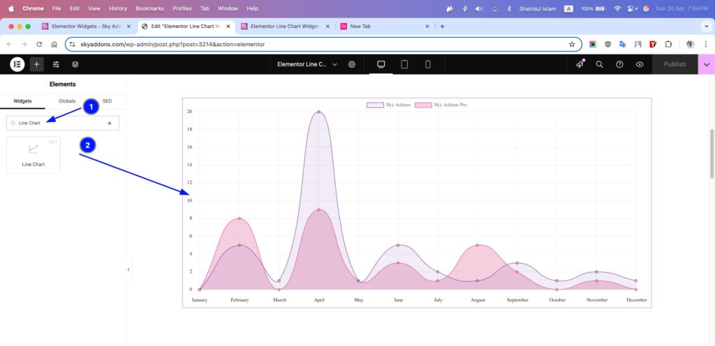
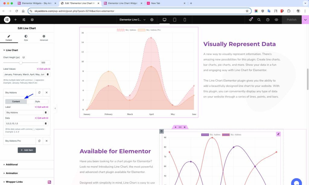
Chart Layout
- Chart Height – Define the height of the chart in pixels.
- Label Values – Enter labels separated by commas (e.g., January, February, March).
- Add Repeater (Dataset) – Add one or more datasets with the following:
- Label – Name of the dataset.
- Data – Comma-separated values for each bar.
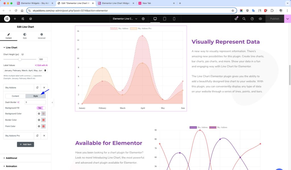
- Background Color – Main color of bars.
- Background Hover Color – Color on hover.
- Border Color – Border color for each bar.
- Hover Border Color – Border color on hover.
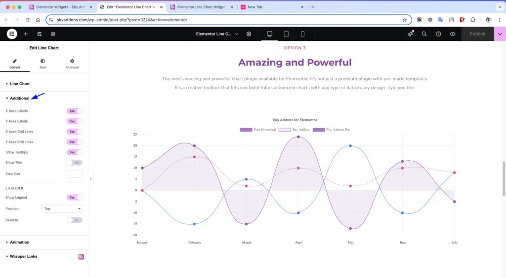
Additional Settings
- X Axes Labels – Toggle X-axis labels.
- Y Axes Labels – Toggle Y-axis labels.
- X Axes Grid Lines – Show/hide grid lines on the X axis.
- Y Axes Grid Lines – Show/hide grid lines on the Y axis.
- Show Tooltips – Enable data tooltips on hover.
- Show Title – Display a chart title.
- Step Size – Define step increments on Y axis.
Legend Settings
- Show Legend – Toggle the legend display.
- Position – Select position: Top, Bottom, Left, or Right.
- Reverse – Reverse the order of legend items.
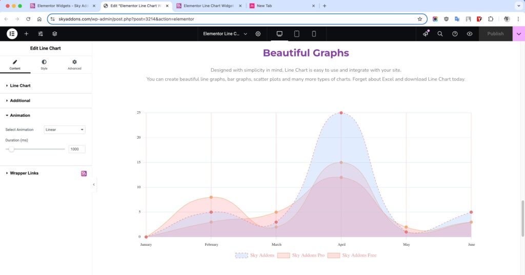
Animation Settings
- Select Animation – Choose animation style.
- Duration – Set animation duration in milliseconds.
Style Customization
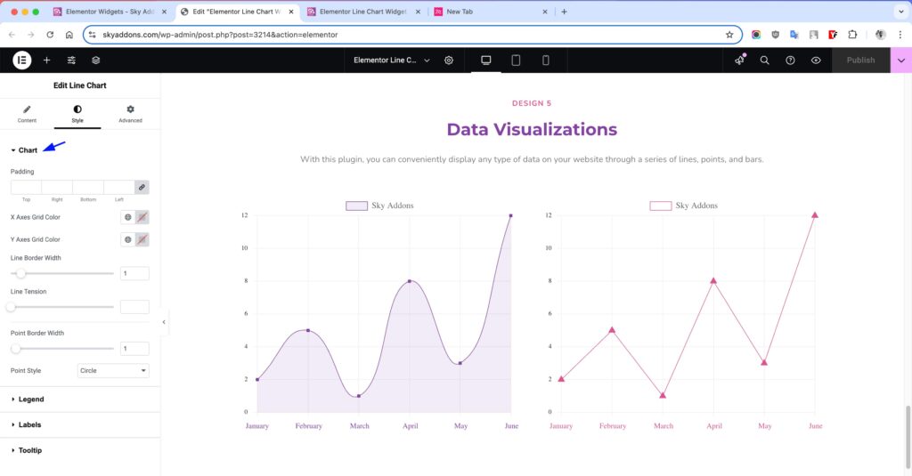
Chart Section
Customize the main chart area to align with your website’s layout and design.
- Padding – Adjust space around the chart to prevent overflow or tight layout.
- X Axes Grid Color – Change the horizontal grid line color to match your theme.
- Y Axes Grid Color – Style the vertical grid lines for better visual hierarchy.
- Line Border Width – Define the thickness of the data line.
- Line Tension – Smooth out the lines between points by adjusting the curve.
- Point Border Width – Set the outline thickness for each point.
- Point Style – Choose from various point shapes like circle, triangle, cross, rect, etc.
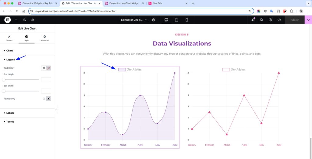
Legend Section
Style the legend that displays dataset labels for better readability and aesthetics.
- Text Color – Modify the color of the legend text to enhance visibility.
- Box Height / Width – Adjust the size of the colored legend markers beside each label.
- Typography – Fully control font family, size, weight, spacing, and style of legend text.
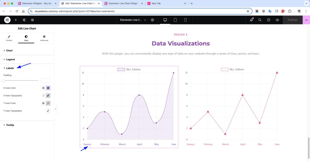
Labels Section
Design the axes labels to improve clarity and fit your site’s branding.
- Padding – Manage space around label areas for clean layout.
- X Axes Color / Typography – Change font and color for bottom axis labels (e.g., months).
- Y Axes Color / Typography – Style the left axis labels (e.g., numbers/values) to improve contrast and legibility.
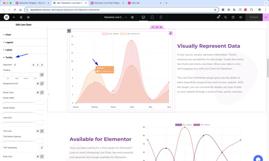
Tooltip Section
- Alignment – Set how tooltip content aligns inside the box (left/center/right).
- Padding – Add inner spacing so the content doesn’t feel cramped.
- Background Color – Set a custom background to match or contrast your site.
- Border Color / Width / Radius – Fine-tune the outline of the tooltip box.
- Caret Size – Adjust the size of the little arrow pointing to the bar.
- Title Color / Typography – Style the heading inside the tooltip.
- Title Bottom Spacing – Add space between the title and body.
- Body Color / Typography – Control the appearance of the detailed info shown in the tooltip.
Save and Preview
- Once you’ve customized and styled your accordion, click “Publish” or “Update” to save your changes.
- Preview the page to ensure the widget looks and functions as desired.
Troubleshooting
- If chart doesn’t display: ensure label values and datasets match in count.
- Check console for Chart.js related errors.
- Make sure there are no conflicting scripts or caching issues.
Conclusion
The Line Chart widget gives you everything you need to display data in a professional, interactive, and visually appealing format. With full customization options and smooth integration with Elementor, it’s perfect for websites needing clear data representation — from business dashboards to educational platforms. Just insert your data, style it your way, and publish effortlessly!