How to use Step Flow Widget of Sky Addons for Elementor
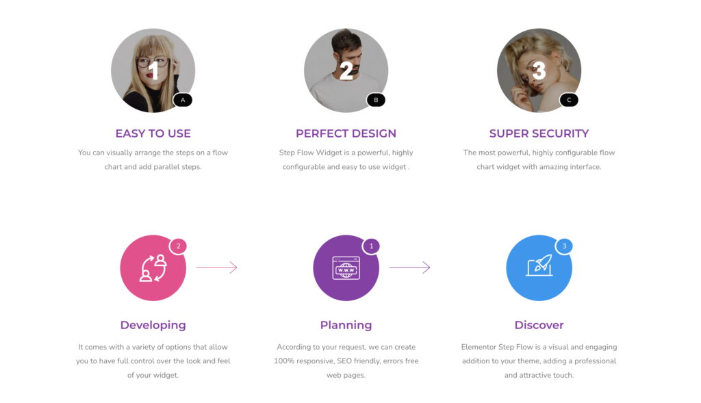
The Sky Addons Step Flow Widget is a versatile Elementor widget that enables users to create visually appealing step-by-step flows effortlessly. With its drag-and-drop functionality, customizable options, and responsive design, this widget is perfect for showcasing processes, tutorials, or multi-step guides. Its intuitive interface ensures a seamless user experience, making it an essential tool for web designers. Perfect for showcasing sequential procedures, project timelines, or customer journeys, this widget combines attractive design elements with functional navigation cues that guide your visitors through multi-step content.
Features:
- Drag-and-Drop Interface: Easily create step flows without coding.
- Customizable Icons: Choose from a library of icons or upload your own.
- Dynamic Content Support: Add dynamic titles, descriptions, and links.
- Badge Options: Display badges with customizable text and positions.
- Direction Indicators: Add arrows or lines to indicate flow direction.
- Responsive Design: Fully optimized for desktop, tablet, and mobile.
- Advanced Styling: Control typography, colors, spacing, and more.
Insert Step Flow Widget
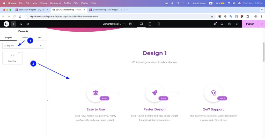
- Open Elementor Editor. In the Elementor panel, search for “Step Flow” under Sky Addons.
- Drag and Drop the Widget to the desired location on your page / editor.
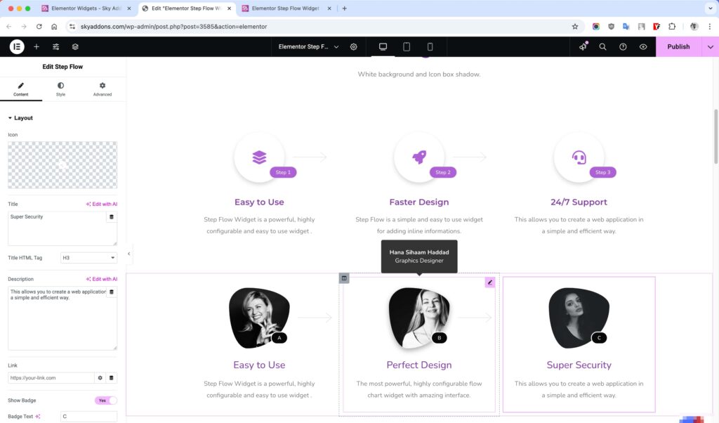
Layout Section
Configure the core content elements of your Step Flow widget.
- Icon – Select from hundreds of icons to represent each step.
- Title – Add a heading for your step (supports HTML tags).
- Title HTML Tag – Choose the appropriate heading tag (H1-H6, div, span, p).
- Description – Add explanatory text about the step.
- Link – Add an optional URL to make the step clickable.
- Show Badge – Toggle to display a step badge (like “Step 1”).
- Badge Text – Customize the text shown in the badge.
- Badge Position – Choose from 6 placement options for the badge.
- Show Direction – Toggle to display flow indicators between steps.
- Direction Type – Choose between arrow or line indicators.
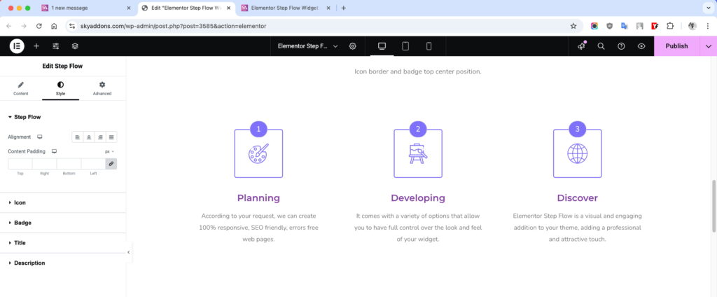
Style Customization
The Step Flow widget offers extensive styling options for each element, allowing you to create unique, branded step processes that match your website’s design.
Step Flow Section
Control the overall appearance and layout of the Step Flow widget.
- Alignment – Set content alignment (left, center, right, justified).
- Content Padding – Adjust padding around the content area.
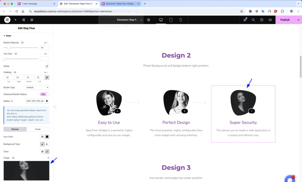
Icon Section
Customize the appearance of the step icon.
- Bottom Spacing – Control space between icon and content.
- Icon Size – Adjust the size of the icon.
- Offset – Fine-tune icon positioning with horizontal/vertical offset and rotation.
- Padding – Add space around the icon.
- Border – Customize the icon’s border style, width, and color.
- Border Radius – Round the corners of the icon container.
- Advanced Border Radius – Create unique shapes with custom border radius values.
- Normal/Hover – Set different styles for normal and hover states.
- SVG Options – Special controls for SVG icons including fill and stroke colors.
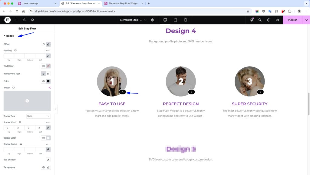
Badge Section
Style the step badges for better visual hierarchy.
- Offset – Position the badge with precision using offset controls.
- Padding – Add space inside the badge.
- Text Color – Change the badge text color.
- Background – Add solid or gradient backgrounds.
- Border – Customize the badge border.
- Border Radius – Round the corners of the badge.
- Typography – Adjust font family, size, weight, and style.
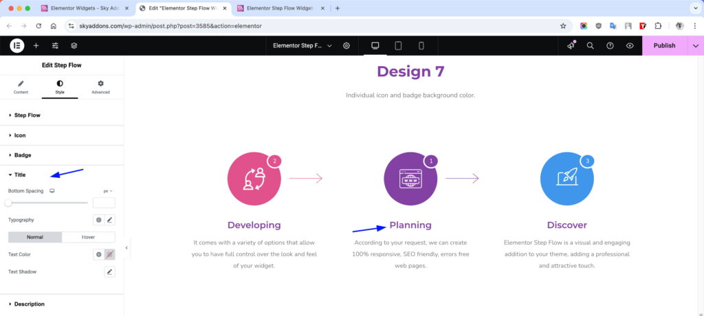
Title Section
Style the step title for maximum impact.
- Bottom Spacing – Control space below the title.
- Typography – Customize font appearance.
- Normal/Hover Colors – Different colors for normal and hover states.
- Text Shadow – Add depth with text shadows.
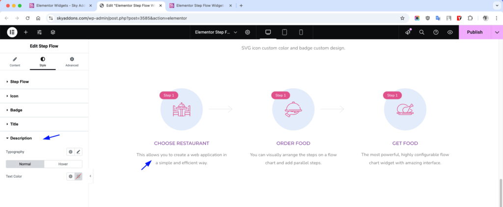
Description Section
Fine-tune the description text styling.
- Typography – Control font settings for the description.
- Normal/Hover Colors – Set different text colors for normal and hover states.
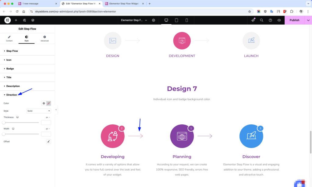
Direction Section
Customize the appearance of flow indicators.
- Color – Change the color of arrows or lines.
- Style – Choose between solid, dotted, or dashed styles.
- Thickness – Adjust the weight of direction indicators.
- Width – Control the length of direction indicators.
- Offset – Fine-tune positioning and rotation.
Save and Preview
- Once you’ve customized and styled your step flow, click “Publish” or “Update” to save your changes.
- Preview the page to ensure the widget looks and functions as desired.
Troubleshooting
- Direction indicators not appearing – Ensure “Show Direction” is enabled and check that you have multiple Step Flow widgets positioned properly in your layout.
- Icons appear distorted – If using SVG icons, try enabling the “SVG Using?” option in the Icon settings.
- Badge not visible – Verify that “Show Badge” is enabled and that you’ve entered badge text.
- Responsive issues – Check responsive mode in Elementor and adjust spacing/sizing for different devices.
Conclusion
The Step Flow widget is an excellent solution for visually guiding users through processes, procedures, or journeys on your website. By combining attractive design with logical flow indicators, you can create intuitive step-by-step content that improves user understanding and engagement. Experiment with different styling options to create step flows that perfectly match your brand aesthetics and content requirements.
If you have any questions or encounter any challenges while using, please don’t hesitate to reach out to our dedicated support team at http://wowdevslive.bdkoder/support/ where our expert team is ready to provide prompt and helpful assistance.
Your feedback and questions help us continuously improve our products, so please don’t hesitate to get in touch!