How to use List Group Widget of Sky Addons for Elementor
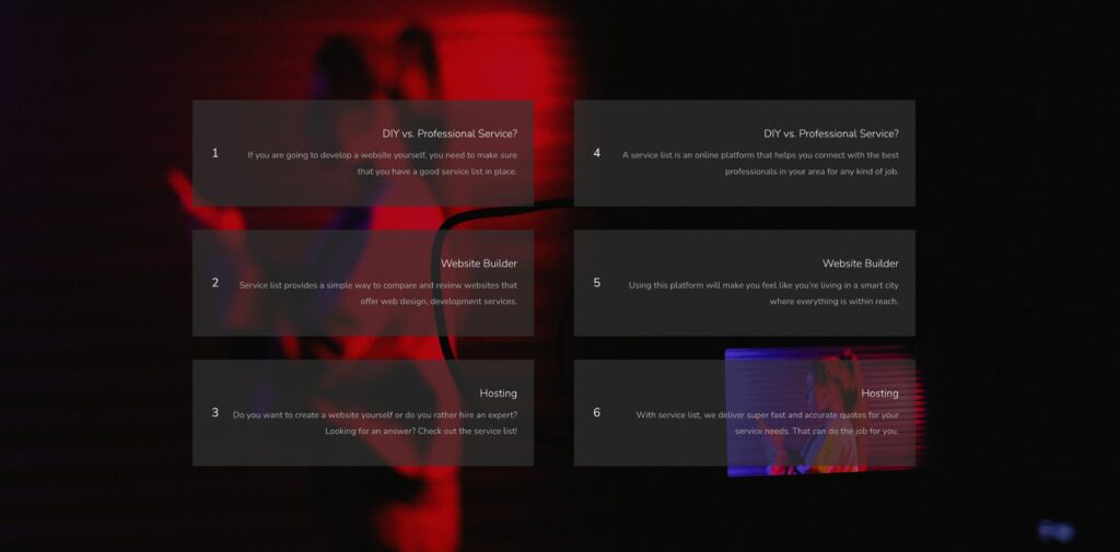
The List Group Widget allows you to display stylish and structured item lists with media elements like icons, images, or numbers. Perfect for showcasing features, checklists, processes, or steps — all while staying fully customizable and user-friendly.
Features:
- Dynamic Repeater – Add unlimited, structured list items with full content control.
- Multiple Media Types – Use icons, numbers, or images for each item.
- Individual Item Styling – Style each list item differently for unique branding.
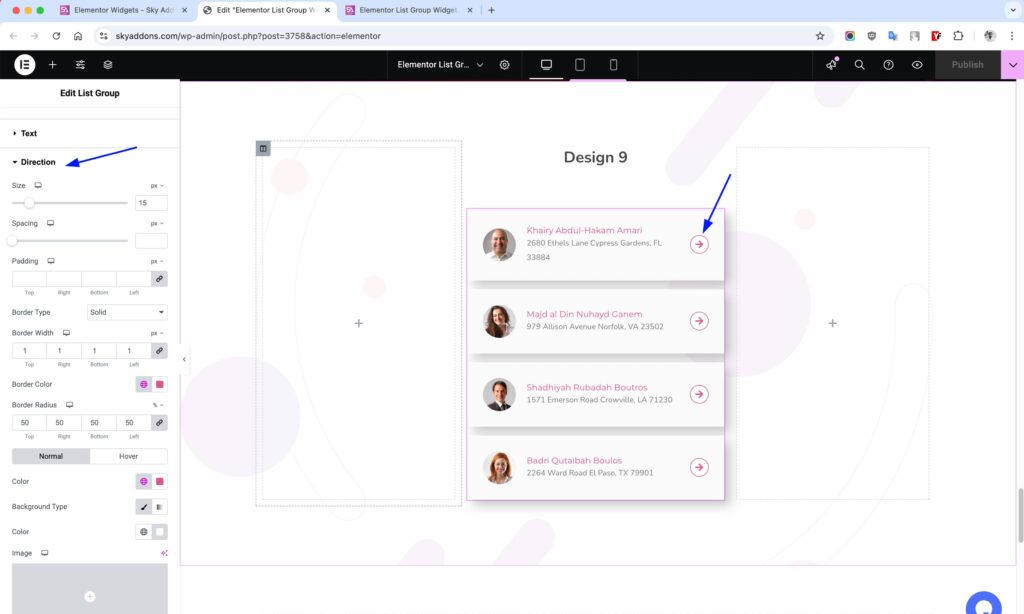
- Directional Icons – Use icons/arrows to create guided lists.
- Advanced Style Controls – Customize appearance on both normal and hover states.
Insert List Group Widget
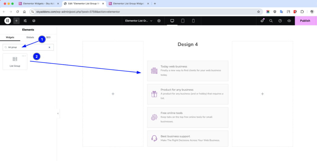
- Open Elementor Editor. In the Elementor panel, search for “List Group” under Sky Addons.
- Drag and Drop the Widget to the desired location on your page / editor.
Customize Layout
Layout Section
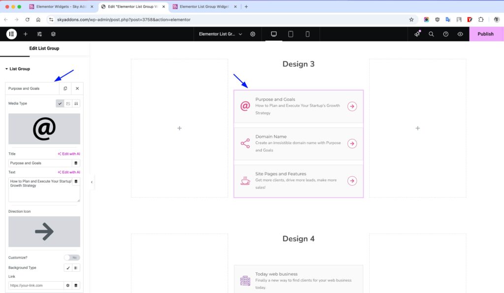
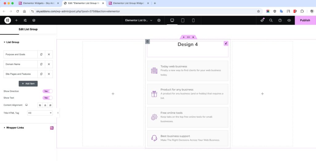
- Add Repeater – Add new list items and customize their content.
- Media Type – Choose between Icon, Image, or Number.
- Title – Set the label or heading for the list item.
- Direction Icon – Add directional icon to guide user flow.
- Customize? – Enable to style this item individually.
- Link – Add clickable link to the item.
- Show Direction – Toggle visibility of direction icon globally.
- Show Text – Toggle visibility of text/title in the list items.
- Content Alignment – Set text and media alignment (Left, Center, Right).
- Title HTML Tag – Choose heading level (H1–H6) for SEO & structure.
Style Customization
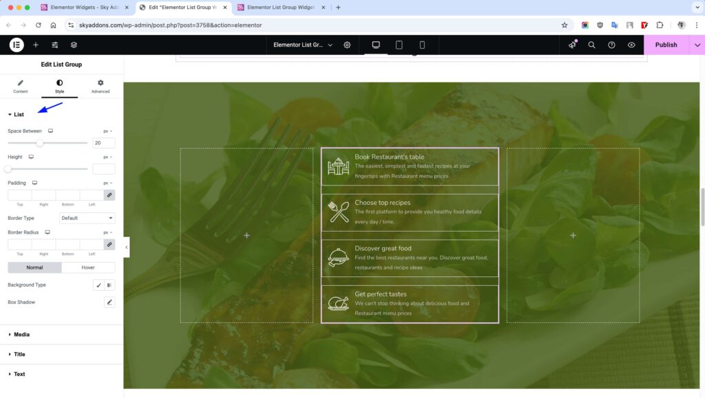
List Section
Control overall list container look and spacing.
- Space Between – Manage gap between items.
- Height – Set fixed height for list area.
- Padding – Adjust inner spacing.
- Border, Radius – Apply borders and rounded corners.
- Background – Set background color.
- Box Shadow – Add shadow for depth.
- (All in Normal & Hover)
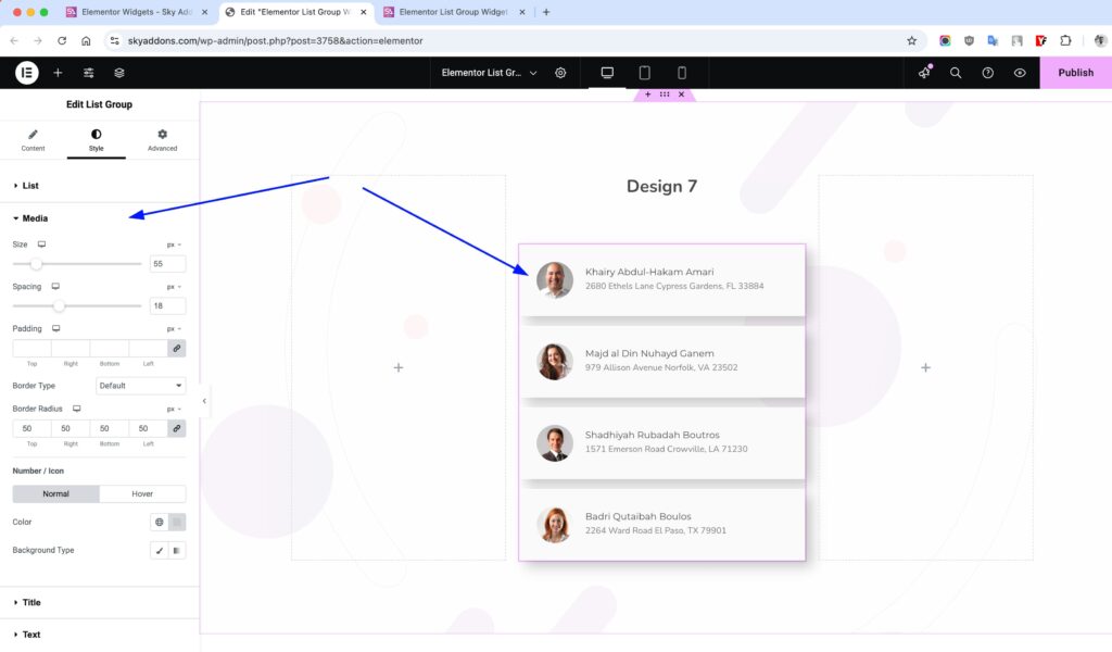
Media Section
Customize icons, images, or numbers.
- Size – Set media dimensions.
- Spacing – Space between media and text.
- Padding – Inner spacing inside media box.
- Border, Radius – Add borders and rounded edges.
- Color – Set icon or number color.
- Background – Set background color.
- (All in Normal & Hover)
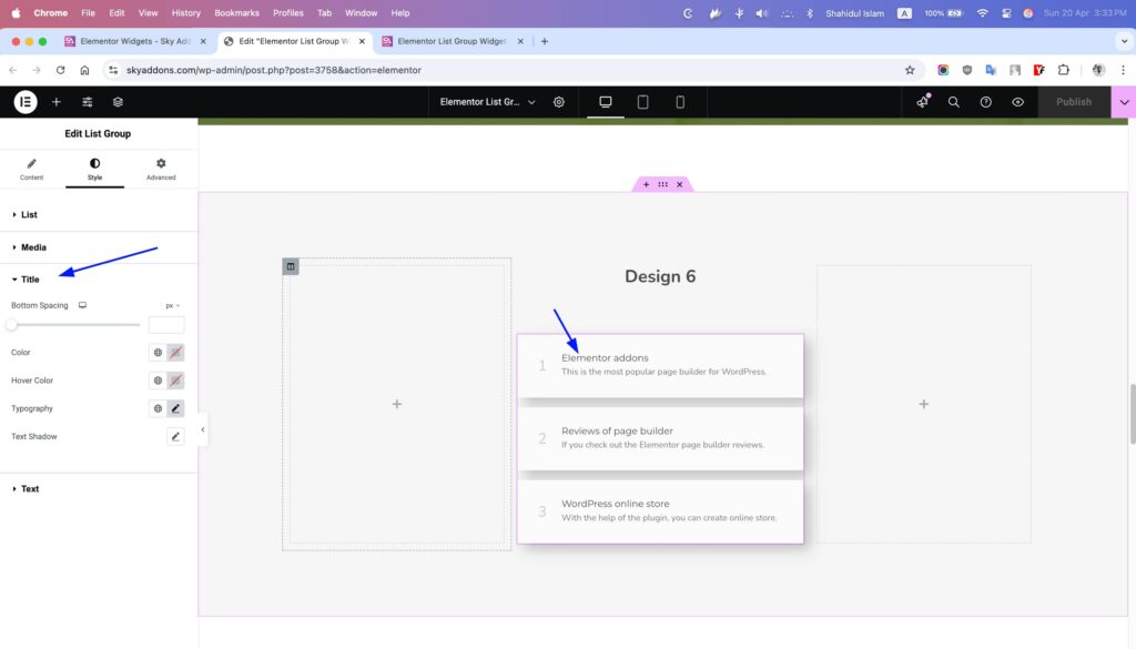
Title Section
Style the text of the list title.
- Spacing – Margin or padding around the title.
- Typography – Font family, size, weight, line height.
- Color – Set font color.
- Shadow – Add text shadow.
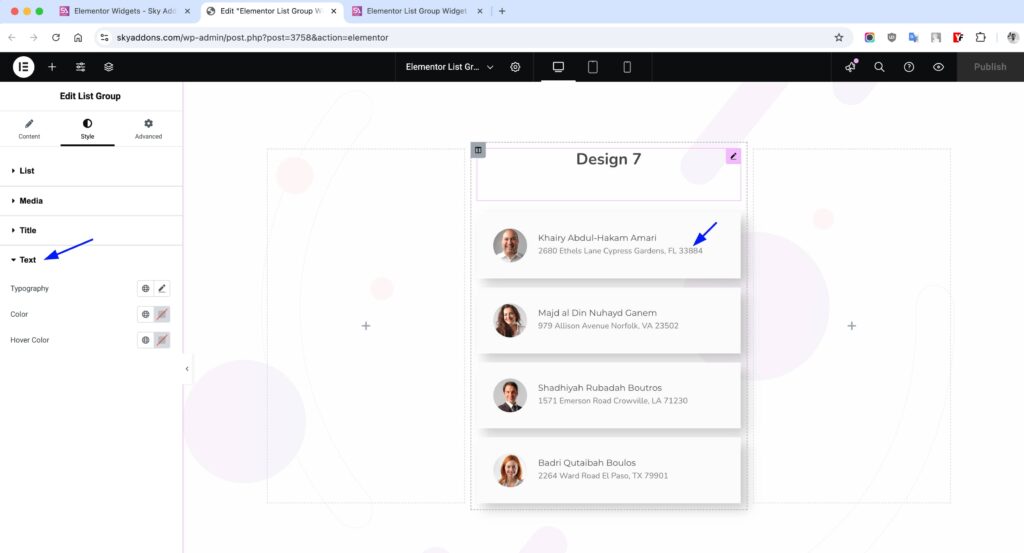
Description Section
Customize extra descriptive text.
- Color – Regular font color.
- Hover Color – Font color on hover.
- Typography – Set Font family, size, weight, line height.
Direction Section
Style directional icons beside each item.
- Size – Set icon size.
- Spacing – Space around the icon.
- Padding – Inner spacing.
- Typography – Set Font family, size, weight, line height.
- Color – Icon color.
- Bg – Background color.
- Border, Radius – Add border and curves.
- Text Shadow – Shadow for text/icon.
- Box Shadow – Adds outer shadow.
- (All in Normal & Hover)
Save and Preview
- Once you’ve customized and styled your accordion, click “Publish” or “Update” to save your changes.
- Preview the page to ensure the widget looks and functions as desired.
Troubleshooting
- Items not showing? Ensure each repeater item has content.
- Icons misaligned? Adjust spacing and padding in media settings.
- Hover effects not working? Check if hover styles are properly set.
Conclusion
The List Group Widget by Sky Addons offers powerful list-building features with full flexibility in design and structure. Use it to craft attractive, responsive, and clickable lists that enhance user engagement.