How to use Dual Button Widget of Sky Addons for Elementor
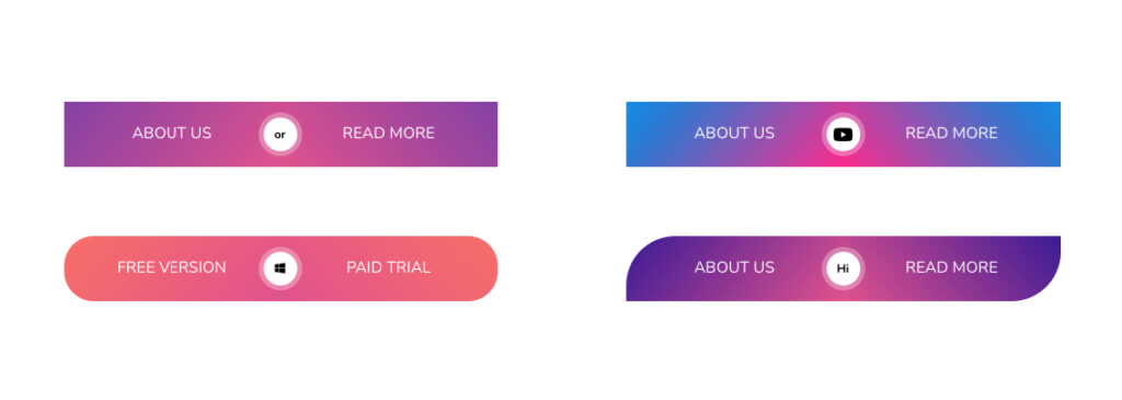
The Dual Button Widget is an elementor widget that has two custom buttons for WordPress users. Clicking on one of the buttons will trigger a custom action you have assigned to it. It’s perfect for call-to-actions, pricing sections, downloads, and more.
Features:
- Two Fully Customizable Buttons : Each button (A & B) has its own text, link, icon, and individual style settings — giving you full creative control.
- Responsive Alignment & Spacing : Easily align the button group (left, center, right), adjust spacing between buttons, and set custom widths for different screen sizes.
- Optional Separator with Styling : Add a stylish separator between the buttons with full control over its size, color, border, and typography.
- Show Separator: Optionally enable a separator between the buttons.
- Hover Interactions: Create modern and interactive button groups that enhance user engagement with smooth hover transitions.
Insert Dual Button Widget
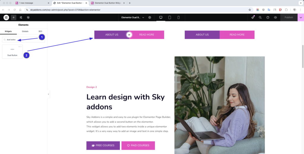
- Open Elementor Editor. In the Elementor panel, search for “Dual Button“ under Sky Addons.
- Drag and Drop the Widget to the desired location on your page / editor.
Layout Section
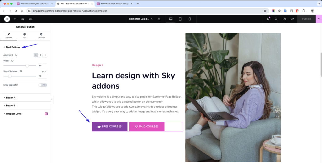
Dual Buttons Section
- Alignment: Position both buttons — Left, Center, or Right.
- Width: Control the total width of the button group.
- Space Between: Customize the spacing between the two buttons.
- Show Separator: Optionally enable a separator between the buttons.
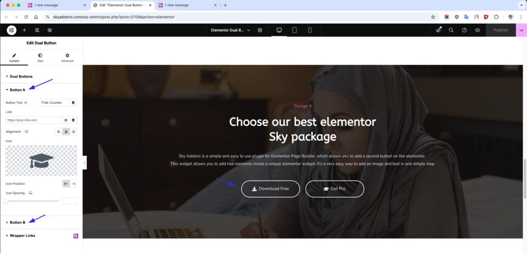
Button A & B Options
Both Buttons are allowing full individual customization.
- Text: Set the button label.
- Link: Add a custom URL or page link.
- Alignment: Align icon and text within the button.
- Icon: Choose an icon from the Elementor icon library.
Style Your Slider
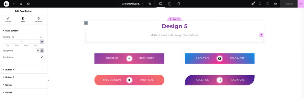
Dual Buttons Section
- Padding: Add space around the button group.
- Typography: Customize font size, family, weight, and more.
- Shadow: Add a shadow effect to the whole section.
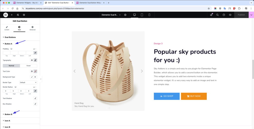
Button A & B Styling
All the same style settings as Button A & B, independently configurable.
- Padding & Typography: Customize spacing and text styles.
- Colors: Set text, background, and icon colors.
- Border & Radius: Control the border style and roundness.
- Shadow: Apply box-shadow for depth.
- Hover Mode: Customize hover colors, borders, and transitions.
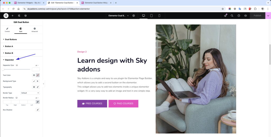
Separator Styling (Optional)
- Size: Set width and height of the separator.
- Color & Background: Define solid or gradient color styles.
- Typography (if text-based): Control font styles.
- Border, Radius, Shadow: Design the separator to match your layout.
Save and Preview
- Once you’ve customized and styled your accordion, click “Publish” or “Update” to save your changes.
- Preview the page to ensure the widget looks and functions as desired.
Troubleshooting
- Buttons not aligning correctly: Check your section/container layout and alignment settings inside Elementor.
- Icon not showing: Make sure the icon is selected and Elementor’s icon library is loaded correctly.
- Hover styles not applying: Double-check that you’re editing the correct hover state under the Style tab.
Conclusion
The Dual Button Widget from Sky Addons is a powerful and flexible tool that gives you two independently styled buttons in one widget. Whether you want to direct users to multiple actions or highlight pricing options, this widget keeps your UI clean, modern, and effective.