How to use Content Switcher of Sky Addons for Elementor
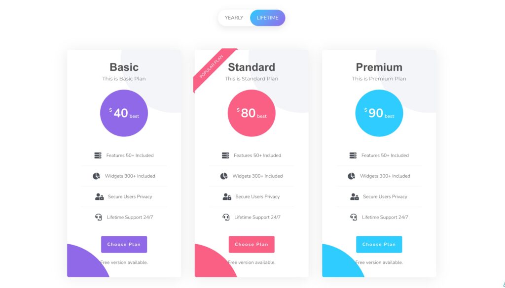
The Content Switcher Widget from Sky Addons for Elementor is an innovative tool that allows you to display different types of content or sources in a single compact layout. By offering a switch-based interface, users can easily toggle between various content panels. This feature is ideal for showcasing information like pricing plans, product specifications, or any grouped data in a clean and efficient manner.
Features:
- Repeater Functionality: Easily add multiple content items using the repeater feature, which simplifies the process of configuring content sections.
- Switcher & Tabs Creation: Generate interactive tabs that allow users to switch between different content views with ease.
- Responsive and Adaptive: Automatically adjusts to various screen sizes to ensure usability on all devices, including desktops and smartphones.
- Customizable Appearance: Customize the look and feel of the switcher, including colors, fonts, and layout styles to align with your brand.
Insert Content Switcher Widget
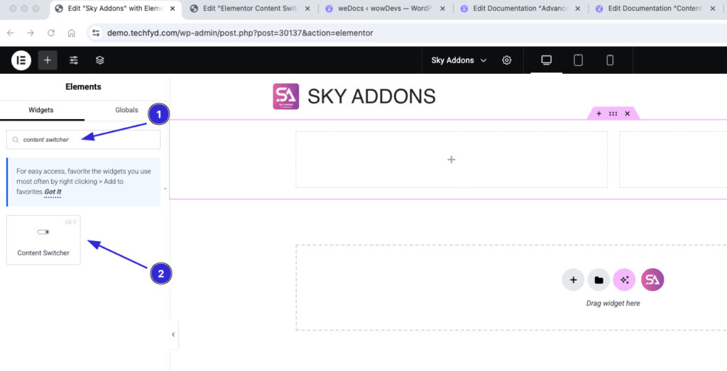
- Open Elementor Editor. In the Elementor panel, search for “Content Switcher” under Sky Addons.
- Drag and Drop the Widget to the desired location on your page / editor.
Configure Content
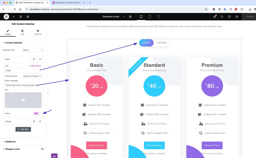
The Content Switcher widget in Sky Addons for Elementor allows you to create interactive toggle sections where users can switch between different content views effortlessly. This feature is perfect for pricing tables, feature comparisons, before/after displays, and more!
- Title – Set a title for the switcher to provide context for users.
- Choose Source – Select the content source from: Elementor Templates / AE Templates / Custom Content.
- Icon – Add an icon for a more intuitive user experience.
- Active – Enable or disable the switcher functionality (Yes/No).
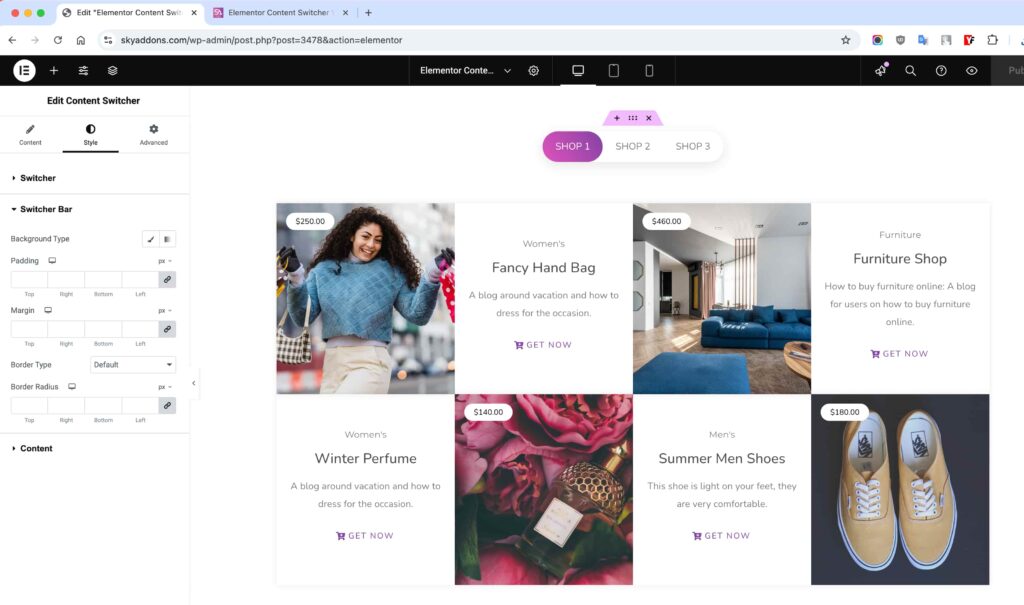
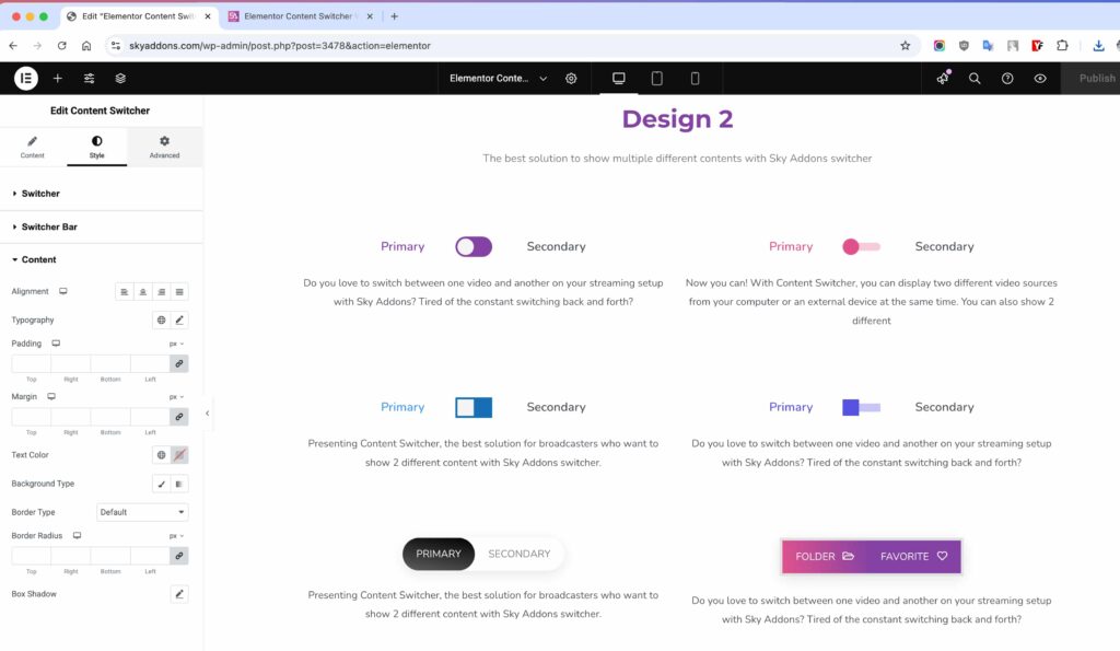
Style Your Content Switcher
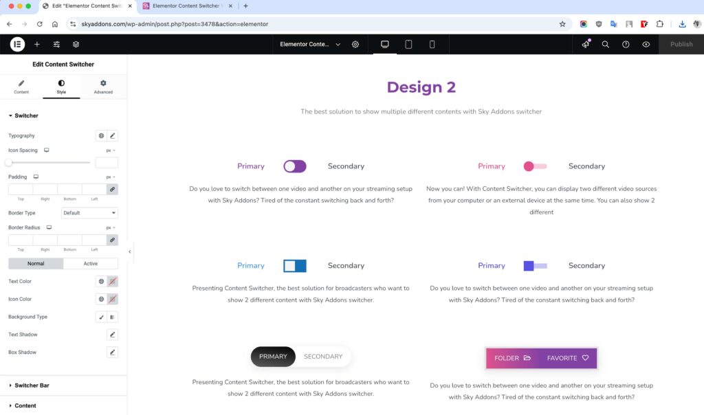
The Content Switcher widget in Sky Addons for Elementor gives you full control over its design, allowing you to customize every aspect for a seamless and engaging user experience.
Switcher Styling
- Typography – Adjust font style, size, and weight for better readability.
- Icon Spacing – Control the spacing between the switcher icon and text.
- Padding & Margin – Fine-tune the spacing for a clean layout.
- Border & Shadow – Add depth and contrast with customizable borders and shadows.
- Colors – Set colors for text, icons, and backgrounds in both normal and hover states.
Switcher Bar Styling
- Background – Customize the switcher bar’s background for a sleek look.
- Padding & Margin – Adjust spacing to ensure proper alignment.
- Border – Modify border style, thickness, and radius for smooth edges.
Content Styling
- Alignment – Position content perfectly within the switcher.
- Typography – Enhance text readability with customizable font settings.
- Spacing – Adjust padding and margins for a balanced layout.
- Colors & Backgrounds – Set custom text, background, and border colors.
- Shadows & Borders – Create eye-catching designs with shadow and border effects.
Save and Preview
- Once you’ve customized and styled your accordion, click “Publish” or “Update” to save your changes.
- Preview the page to ensure the widget looks and functions as desired.
Conclusion
The Content Switcher from Sky Addons is the ultimate tool for showcasing multiple content variations seamlessly. Whether you’re toggling between Elementor Templates or AE Templates, this powerful feature allows users to switch between different content sources effortlessly. With extensive customization options—including typography, icons, borders, colors, and shadows—you can style the switcher to match your brand aesthetics perfectly.
Enhance your website’s user experience and engagement with Sky Addons’ Content Switcher, making content navigation intuitive, dynamic, and visually appealing! 🚀