How to use Card Widget of Sky Addons for Elementor
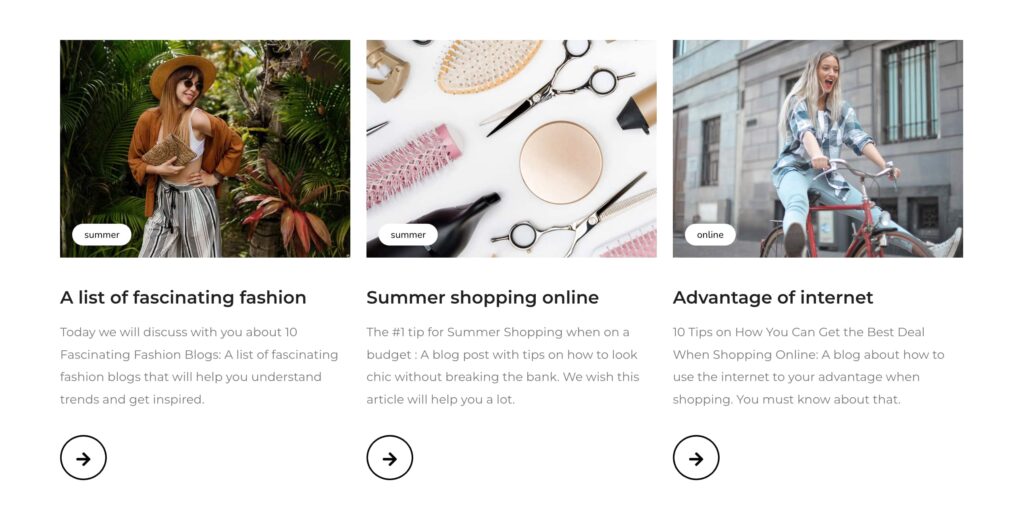
The Card Widget from Sky Addons for Elementor is a versatile and stylish component that allows you to create visually appealing cards to showcase various types of content, such as services, team members, products, or blog posts. Cards can enhance the presentation of information and facilitate user interaction, making them ideal for engaging website layouts. With customizable designs, you can effectively communicate key messages in a concise format.
Features
- Flexible Layouts: Easily create cards in various layouts to fit your content needs (horizontal, vertical, etc.).
- Custom Images and Icons: Upload images or choose icons to enhance the visual appeal of each card.
- Text Formatting Options: Customize headers, descriptions, and buttons with multiple typography and alignment settings.
- Hover Effects: Add interactive hover effects to cards, such as animations and color changes, improving user engagement.
- Responsive Design: Cards automatically adjust their layout for desktops, tablets, and mobiles, maintaining usability across all devices.
Insert Card Widget
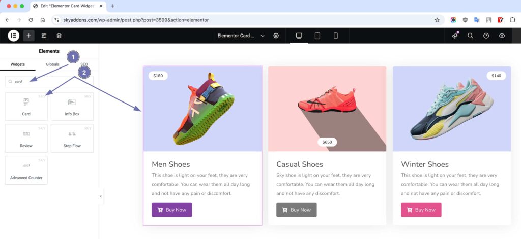
- Open Elementor Editor. In the Elementor panel, search for “Card” under Sky Addons.
- Drag and Drop the Widget to the desired location on your page / editor.
Configure Card Content
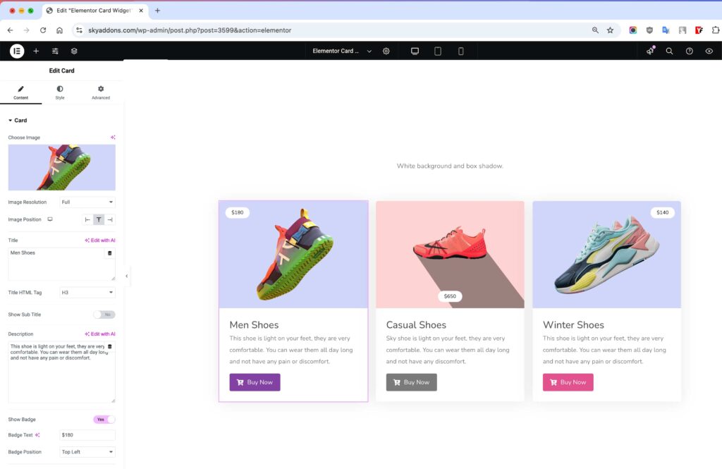
The Elementor Card Widget from Sky Addons is a simple yet powerful way to present products, creative posts, news, or any single piece of information in a sleek and stylish manner. Whether you’re highlighting a featured service, a blog post, or a product, the Card Widget provides a versatile and customizable layout to enhance your content presentation.
Card Content Section
- Choose Image – Upload an image to make your card visually engaging.
- Image Position – Control the image placement for an optimized design.
- Title Text & HTML Tag – Set a custom title with appropriate HTML heading tags (H1, H2, H3, etc.) for SEO benefits.
- Show Subtitle & Subtitle Text – Add a subtitle to provide more context.
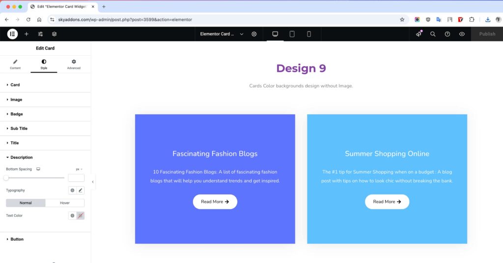
- Description – Write a short yet compelling description for your card.
- Badge Text – Display a badge label (e.g., “New,” “Hot,” “Featured”).
- Show Buttons – Enable action buttons for better engagement.
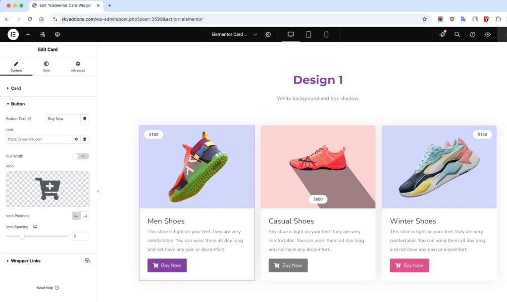
Button / Link Section
- Button Text & Link – Set the button text and link it to the desired page.
- Full Width? – Choose whether the button should span the full width.
- Icon Select & Position – Add an icon to the button and define its placement.
- Icon Spacing – Adjust spacing to ensure a balanced look.
Card Style Customization
With Sky Addons’ Card Widget for Elementor, you have full control over styling to match your brand identity and website aesthetics. Fine-tune the alignment, colors, typography, shadows, and more to create stunning and engaging cards. 💡 With full styling control, the Sky Addons Card Widget helps you create eye-catching, professional, and engaging cards that captivate visitors and boost conversions! 🚀🔥
Card Style Section
- Card Alignment – Adjust the card’s position for a well-balanced layout.
- Content Padding – Control spacing around the card content for a polished look.
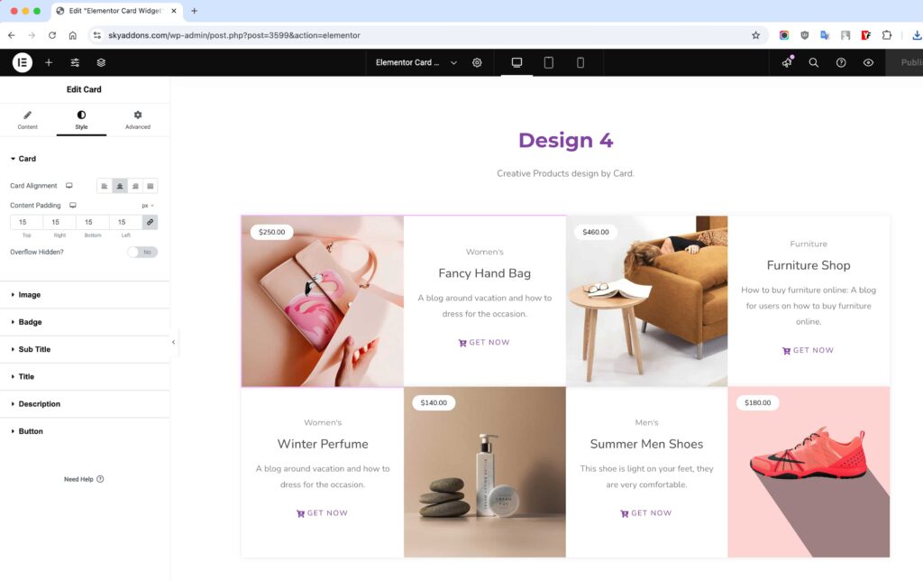
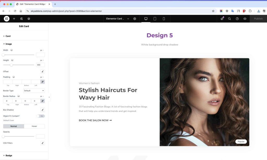
Image Styling
- Width & Height – Set custom image dimensions.
- Offset & Padding – Adjust spacing and positioning for a unique layout.
- Border Type & Box Shadow – Add depth and separation with borders and shadows.
- Opacity & CSS Filters – Apply creative effects like blur, brightness, and contrast.
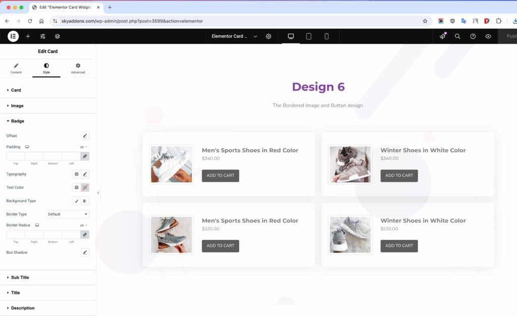
Badge Styling – Highlight Key Info
- Offset & Padding – Position the badge perfectly.
- Typography & Color – Customize text style and color for better readability.
- Background & Border – Style the badge to make it stand out.
- Box Shadow – Add depth for a premium feel.
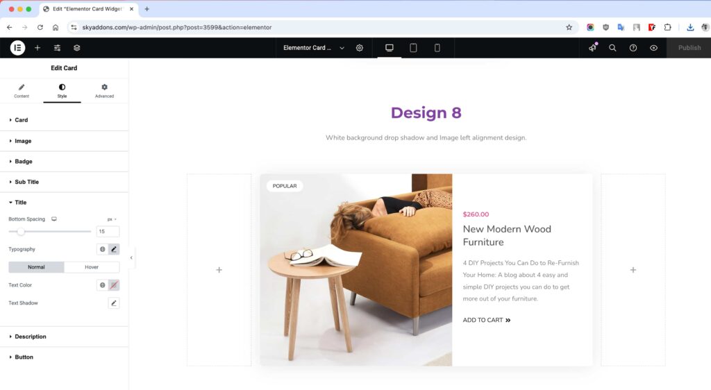
Title Styling – Make It Catchy
- Spacing & Typography – Adjust font size, weight, and spacing for readability.
- Color – Customize the text color for both normal and hover states.
Description Styling – Keep It Engaging
- Bottom Spacing – Define the gap between the description and other elements.
- Typography & Color – Style the text and set hover effects for dynamic interaction.
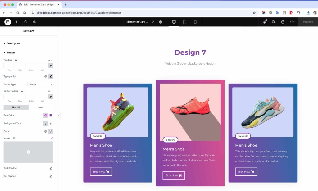
Button / Link Styling – Drive More Actions
- Padding – Control spacing inside the button.
- Typography – Set font style and size.
- Border – Add and style borders.
- Radius – Round the corners of the button.
- Text Color – Define button text color.
- Background Type – Set solid or gradient background.
- Text Shadow – Add a shadow to text.
- Box Shadow – Apply a shadow around the button.
- Hover Animation – Animate the button on hover.
Save and Preview
- Once you’ve customized and styled your accordion, click “Publish” or “Update” to save your changes.
- Preview the page to ensure the widget looks and functions as desired.
Troubleshooting
- Card Not Displaying: If the card fails to appear, ensure the widget is placed correctly on the Elementor canvas and check for plugin conflicts.
- Style Issues: If your custom styles are not showing, try refreshing your browser or clearing your site’s cache.
- Responsiveness Problems: If the card does not adjust well on mobile, check Elementor’s responsive settings to ensure proper mobile layout adjustments.
Conclusion
The Card Widget by Sky Addons for Elementor is a powerful way to present content engagingly and informatively. By following this guide, you can effectively create and customize cards that resonate with your audience. For further questions or support, feel free to reach out to the Sky Addons support team or engage with community forums. Enjoy building fantastic card layouts!