How to use Stellar Blog Slider Widget of Sky Addons for Elementor
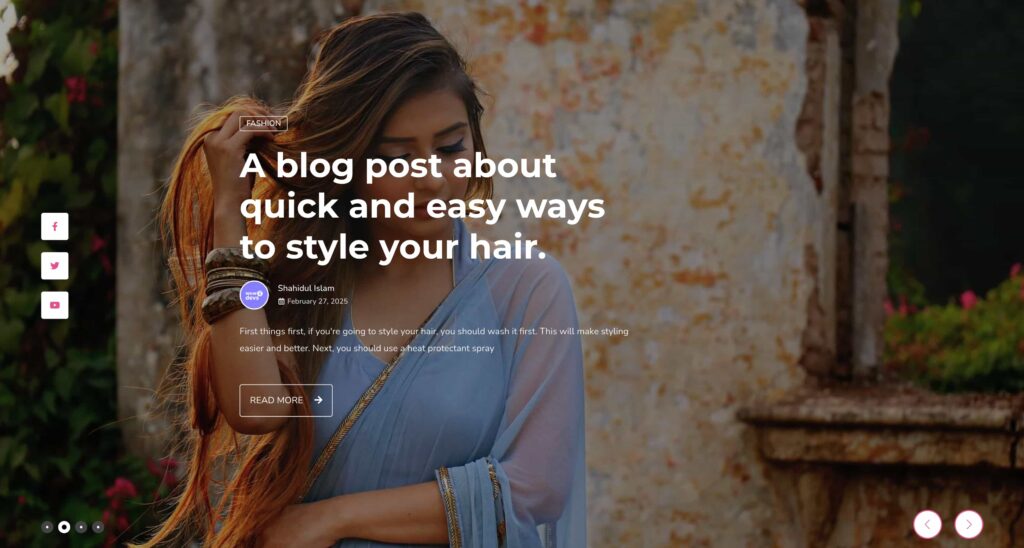
Sky Addons Stellar Blog Slider Widget is a dynamic content slider that showcases your blog posts in an elegant, interactive display. With smooth transitions, customizable layouts, and rich media integration, this widget helps you feature your most important content with style and sophistication. Perfect for homepages, landing pages, or any section where you want to highlight your blog content effectively.
Key Features List
- Dynamic blog post slider with smooth transitions and effects
- Customizable height, aspect ratio, and responsive design
- Social media icons integration with hover animations
- Advanced post query system to display exactly the content you need
- Video support with lightbox integration for media-rich presentations
- Comprehensive styling options for all elements (colors, typography, spacing)
- Navigation and pagination with multiple display styles
Stellar Blog Slider Widget
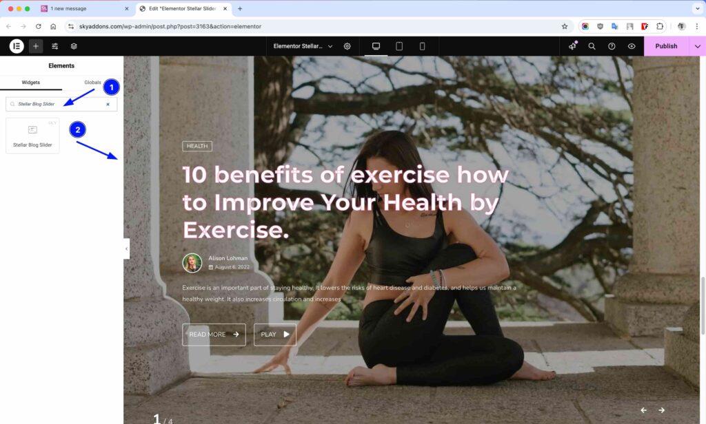
- Open Elementor Editor. In the Elementor panel, search for “Stellar Blog Slider”
- Drag and Drop the Widget to the desired location on your page / editor.
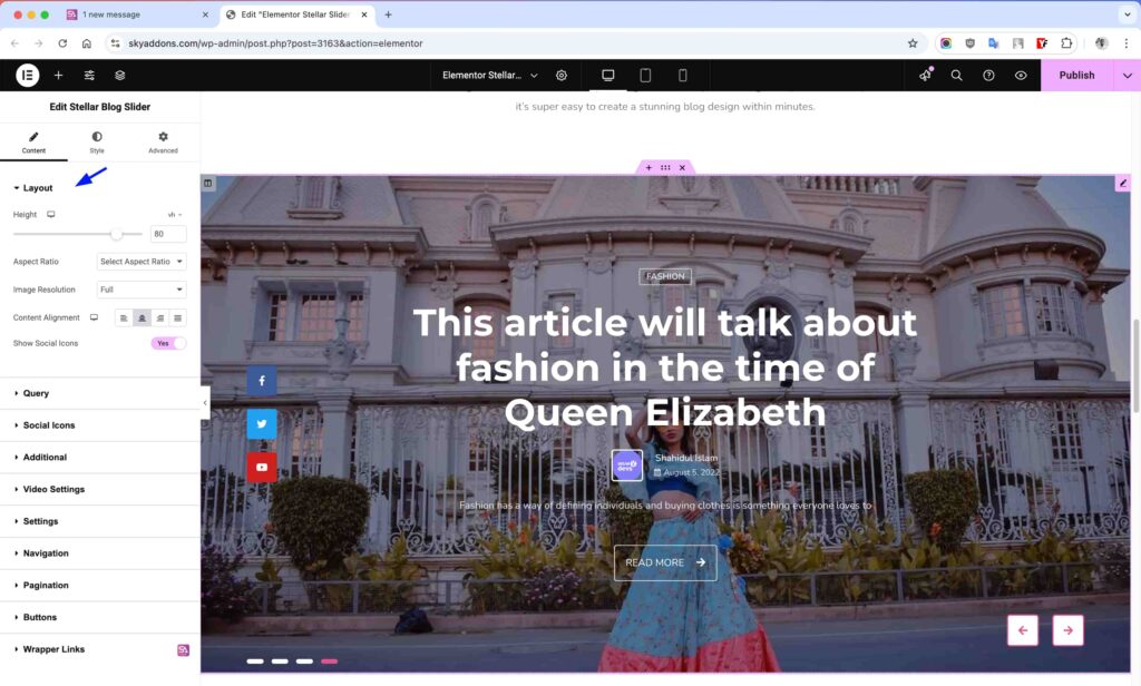
Layout Section
Configure the fundamental appearance of your slider with these essential settings.
- Height – Set the slider height using px, em, or vh units for perfect fit in your layout.
- Aspect Ratio – Choose predefined aspect ratios (16:9, 4:3, etc.) for consistent display across devices.
- Image Size – Select the appropriate image size for optimal performance and appearance.
- Content Alignment – Position your content left, center, right, or justified within the slide.
- Social Icons – Toggle to show/hide social media icons on your slides.
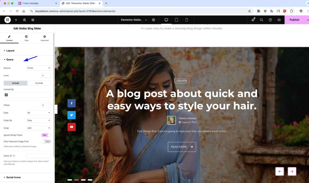
Query Section
Control exactly which posts appear in your slider with the powerful query builder.
- Source – Select posts, custom post types, or manual selection as your content source.
- Categories/Tags – Filter posts by taxonomies to display specific content.
- Posts Per Page – Set how many posts to display in your slider.
- Include/Exclude – Specifically include or exclude posts by ID.
- Order By – Sort your posts by date, title, popularity, or other parameters.
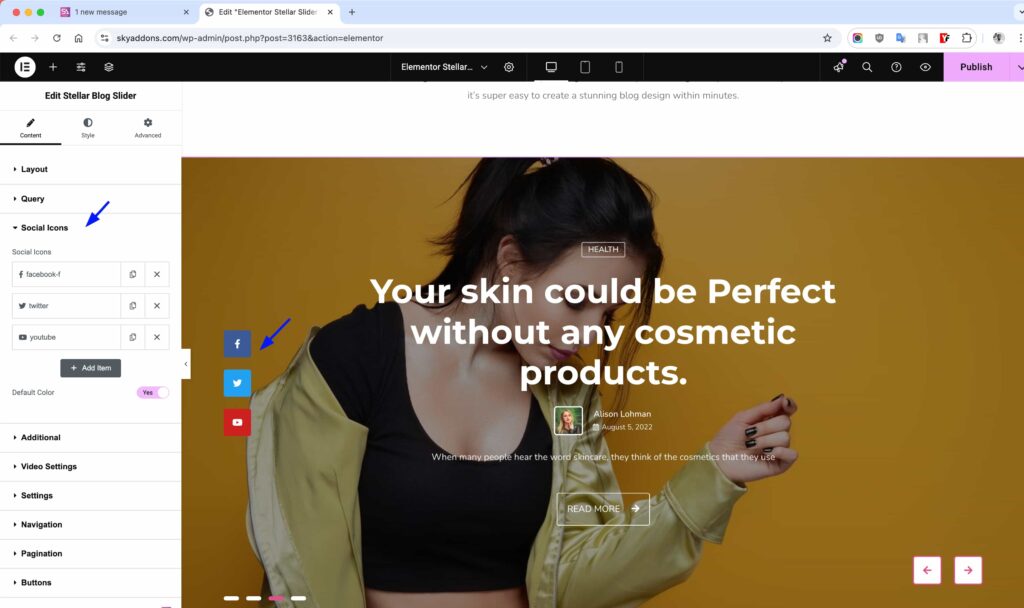
Social Icons Section
Add social sharing functionality to your slider with customizable icons.
- Icon Selection – Choose from a comprehensive library of brand and general icons.
- Link Settings – Configure URL, open in new tab, and other link behaviors.
- Default Colors – Option to use brand colors or custom color schemes.
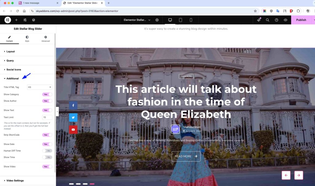
Additional Section
Fine-tune what content elements appear in your slider display.
- Title HTML Tag – Select the appropriate heading tag (H1-H6) for SEO optimization.
- Category Display – Toggle to show/hide post categories with custom styling.
- Author Display – Show/hide author information with optional author image.
- Text Display – Control excerpt visibility and length for optimal readability.
- Date Display – Configure date format and visibility options.
- Video Display – Enable/disable video features for posts with video content.
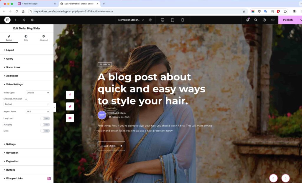
Video Settings Section
Control how videos are displayed and behave within your slider with these professional media settings.
- Video Open – Choose how videos will display when clicked:
- Default: Opens according to widget’s default behavior
- Lightbox: Displays video in an elegant popup overlay
- Media File: Opens the direct video file URL
- File Open in New Tab – When using Media File option, toggle whether videos open in a new browser tab or the current window.
- Entrance Animation – Select an animation effect for how videos appear when opened in lightbox mode for added visual interest.
- Aspect Ratio – Set the video’s proportional dimensions using standard ratios (16:9, 4:3, etc.) to maintain consistent video display.
- Lazy Load – Enable to defer loading videos until they’re needed, improving page load speed and performance.
- Autoplay – Toggle whether videos begin playing automatically when the lightbox opens or when scrolled into view.
- Mute – Start videos with sound muted by default, ideal for environments where unexpected audio might disrupt users.
When using videos in your Stellar Slider, these settings provide precise control over how media content behaves, ensuring a professional and user-friendly experience for your visitors. The lightbox feature is particularly useful for creating immersive video experiences without navigating away from your current page.
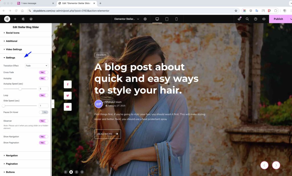
Settings Section
Configure how your slider behaves and navigates with these essential controls for optimal performance and user experience.
- Transition Effect – Choose between smooth Fade or dynamic Slide transitions between content items.
- Cross Fade – Enable to create a blending effect between slides for more elegant transitions (works with Fade effect).
- Coverflow Rotate – Set rotation degree for images when using coverflow effect for a more dynamic presentation.
- Slide Shadows – Add subtle shadows to slides for depth and visual separation (available for coverflow, flip, and cube effects).
- Autoplay – Enable automatic advancement between slides to showcase all your content without user interaction.
- Autoplay Speed – Control how long each slide appears before transitioning to the next (in seconds).
- Loop – Enable continuous looping so your slider returns to the first slide after reaching the end.
- Slide Speed – Adjust the transition duration between slides for smoother or more dramatic effects.
- Pause On Hover – Temporarily pause autoplay when users hover over the slider for better content consumption.
- Observer – Special rendering mode for when your slider is initially hidden (in tabs or accordion elements).
- Show Navigation – Display previous/next arrows for manual navigation through slider content.
- Show Pagination – Display bullet points or fraction indicators showing current position and total slides.
These settings work together to create the perfect slider experience for your visitors. Experiment with different combinations to find the most engaging presentation for your specific content. For content-heavy slides, consider slower autoplay speeds to give readers enough time to consume the information.
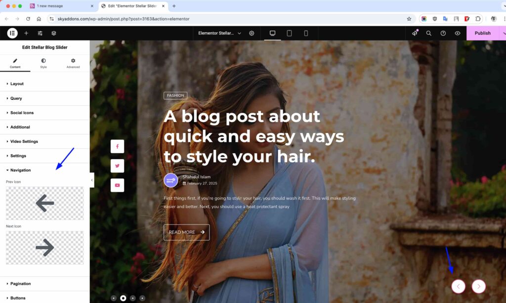
Navigation Section
The Navigation section allows you to control the appearance and behavior of your carousel’s navigation arrows.
- Show Navigation – Enable or disable the navigation arrows that allow users to manually navigate between slides. Turned on by default.
- Prev Icon – Select a custom icon for the “Previous” navigation arrow. Click the icon picker to choose from Elementor’s extensive icon library or upload your own SVG.
- Next Icon – Select a custom icon for the “Next” navigation arrow. Same options as the Prev Icon control.
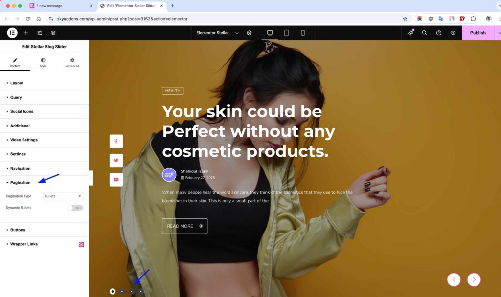
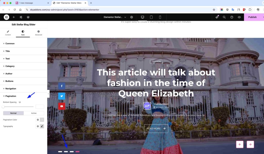
Pagination Section
Control the carousel pagination indicators.
- Show Pagination – Toggle pagination dots display.
- Pagination Type – Choose between bullets, fraction, or progress bar.
- Pagination Position – Set where pagination indicators appear.
- Dynamic Bullets – Enable dynamic bullet sizing for active states.
Buttons Section
Configure the action buttons that appear on your slides, providing clear calls-to-action for your visitors.
- Read More Button Text – Customize the label that appears on the button linking to the full post content (default: “READ MORE”).
- Play Button Text – Set the text that appears on the video play button when video content is available (default: “PLAY”).

These buttons serve as primary interaction points for your slider content, encouraging visitors to engage further with your posts. The Read More button drives traffic to your full articles, while the Play button gives users immediate access to video content when available.
Each button can be fully styled in the Buttons Style section, with separate controls for colors, backgrounds, borders, and hover states. Creating visually distinctive buttons helps increase click-through rates and improves the overall user experience of your slider.
Style Customization
The widget offers extensive styling controls for every element, allowing you to create a perfectly branded slider experience that matches your website design.
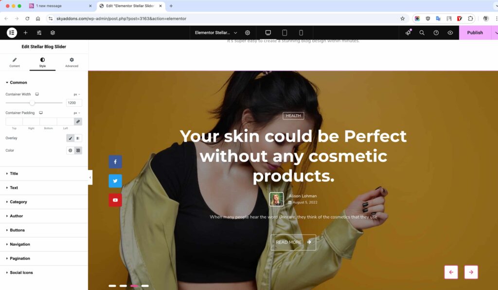
Common Style Section
Adjust the overall appearance of your slider with these foundational styling options.
- Container Width – Set maximum width for content container to control layout density.
- Container Padding – Add space around content for better visual hierarchy.
- Overlay Background – Configure gradient or solid color overlays for improved text legibility.
Title Style Section
Customize the appearance of your post titles for maximum impact.
- Spacing – Control margin below titles for proper element separation.
- Text Color – Set normal and hover colors for title text.
- Typography – Adjust font family, size, weight, and other text properties.
- Text Shadow – Add subtle shadows for depth and improved readability.
- Text Stroke – Create outline effects for more dramatic title styling.

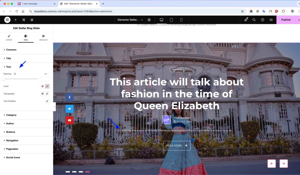
Text Style Section
Style your post excerpts to complement your titles and enhance readability.
- Spacing – Set margin below text for proper content spacing.
- Text Color – Define color for excerpt text.
- Typography – Control font properties for optimal readability.
- Text Stroke – Add outline effects to your excerpt text.
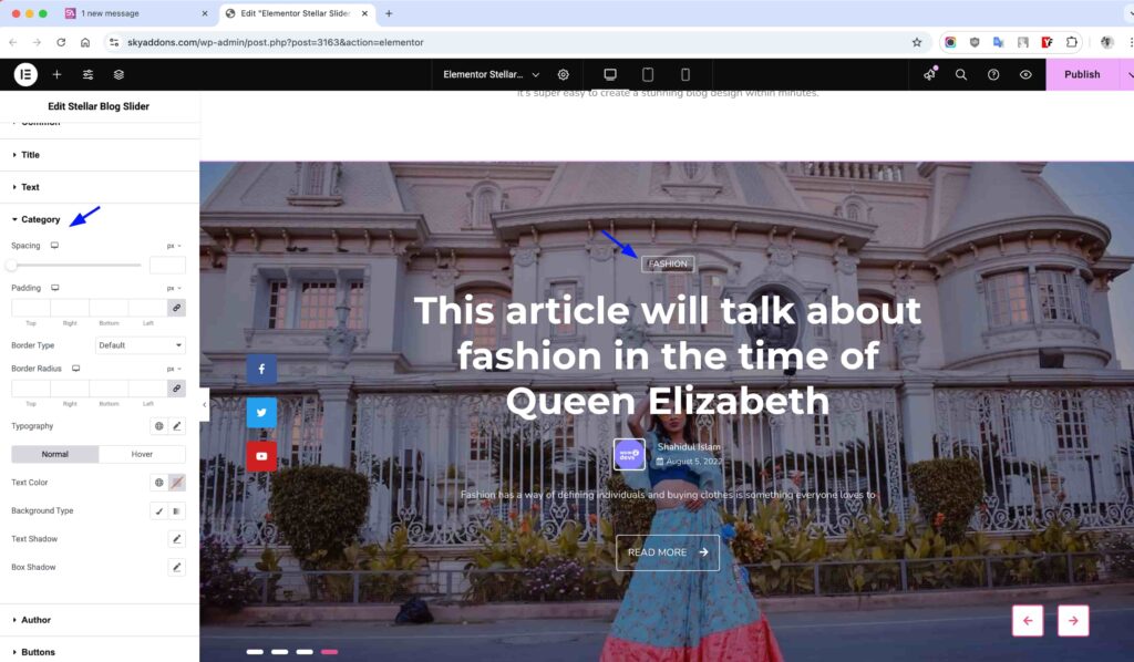
Category Style Section
Customize the appearance of post categories to highlight content types.
- Spacing – Control margin below categories for visual separation.
- Color – Set background and text colors for category display.
- Typography – Adjust font properties for category labels.
- Border – Add borders with customizable style, width, and color.
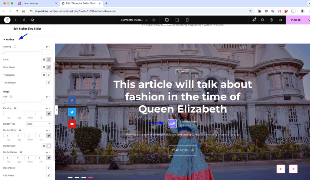
Author Style Section
Style author information to build credibility and connection with readers.
- Spacing – Control margin below author information.
- Text Color – Set colors for author name in normal and hover states.
- Typography – Adjust font properties for author text.
- Image Size – Control the dimensions of author avatars.
- Border – Style the author image border with various options.
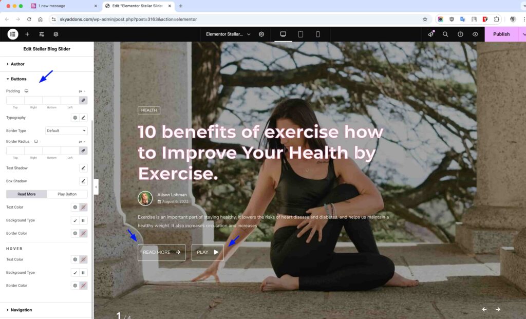
Buttons Style Section
Design attractive call-to-action buttons to encourage reader engagement.
- Padding – Control internal spacing for proper button sizing.
- Typography – Set font properties for button text.
- Border – Add and style button borders for enhanced appearance.
- Colors – Configure text and background colors for normal and hover states.
- Box Shadow – Add depth and emphasis with customizable shadow effects.
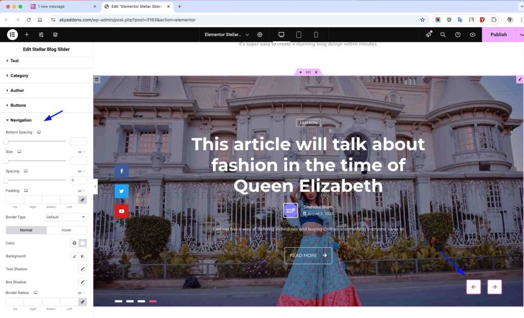
Navigation Style Section
Style the slider navigation controls for intuitive user interaction.
- Position – Control bottom spacing for optimal placement.
- Size – Adjust the dimensions of navigation buttons.
- Spacing – Set distance between navigation elements.
- Colors – Configure icon and background colors for normal and hover states.
- Border – Style navigation button borders with various options.
Pagination Style Section
Customize the slider pagination indicators for better user experience.
- Position – Adjust bottom spacing for optimal placement.
- Size – Control the dimensions of pagination bullets or numbers.
- Spacing – Set distance between pagination elements.
- Colors – Configure active and inactive states with custom colors.
- Border – Add and style borders around pagination elements.
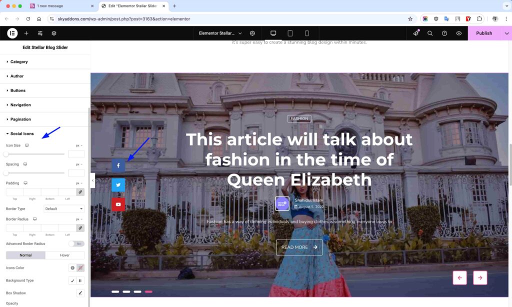
Social Icons Style Section
Style your social sharing buttons to match your brand and encourage sharing.
- Icon Size – Adjust the dimensions of social icons.
- Spacing – Control distance between social buttons.
- Colors – Set icon and background colors for normal and hover states.
- Border – Add and customize borders around social icons.
- Hover Animation – Choose from various hover effects for engaging interaction.
Save and Preview
- Once you’ve customized and styled your slider, click “Publish” or “Update” to save your changes.
- Preview the page to ensure the widget looks and functions as desired.
Troubleshooting
- Slider Not Displaying – Check if you’ve selected posts in the Query section and ensure your filters aren’t too restrictive.
- Images Appear Distorted – Try adjusting the aspect ratio or image size settings for better visual results.
- Navigation Not Working – Ensure the “Show Navigation” option is enabled and check for any CSS conflicts.
- Videos Not Playing – Verify your video URL format and check if the “Show Video” option is enabled.
- Mobile Display Issues – Use responsive controls to optimize appearance on different devices.
Conclusion
The Stellar Blog Slider Widget offers a powerful way to showcase your blog content with professional animations and extensive customization options. By properly configuring the layout, query, and style options, you can create engaging sliders that highlight your best content and encourage visitor interaction. The widget’s responsive design ensures your slider looks great on all devices, making it a versatile tool for any WordPress website.
If you have any questions or encounter any challenges while using, please don’t hesitate to reach out to our dedicated support team at http://wowdevslive.bdkoder/support/ where our expert team is ready to provide prompt and helpful assistance.