How to use Review Carousel Widget of Sky Addons for Elementor
Sky Addons Review Carousel Widget is an advanced, feature-rich solution for showcasing customer testimonials and reviews in an elegant sliding carousel format. With extensive customization options, it allows you to display client feedback with profile photos, ratings, names, and designations in a professionally designed, responsive layout that adapts seamlessly to any screen size.

Key Features
- Fully responsive carousel layout with customizable columns for different devices
- Interactive star rating system with multiple style options
- Customizable reviewer details including photo, name, and designation
- Advanced styling controls for every element of the review display
- Integrated navigation and pagination options with multiple style variations
Insert Review Carousel Widget
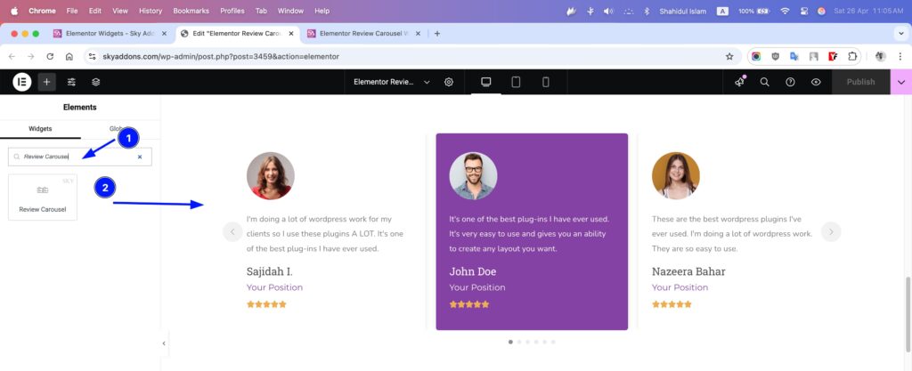
- Open Elementor Editor. In the Elementor panel, search for “Review Carousel”
- Drag and Drop the Widget to the desired location on your page / editor.
Layout Section
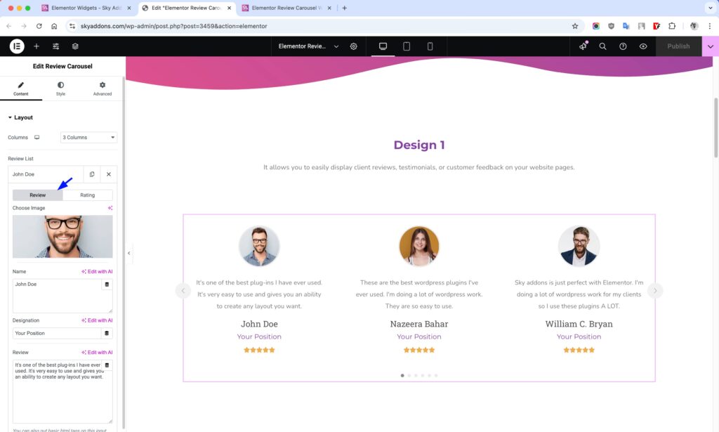
This section controls the core structure and content of your review carousel. The Review List repeater is the core component of the Review Carousel widget, allowing you to add and manage multiple customer testimonials through an intuitive interface. Each review entry contains comprehensive customization options organized in a tabbed interface for better usability.
- Columns – Set the number of review columns to display across different devices (1-6 columns).
- Review List – Add and manage multiple reviews through a repeater interface.
Review Tab
The Review tab contains all the basic information about your reviewer:
- Profile Image – Upload a photo of the reviewer that appears alongside their testimonial
- Name – Add the reviewer’s full name using a flexible text area that supports formatting
- Designation – Enter the reviewer’s job title, position, or company in a dedicated field
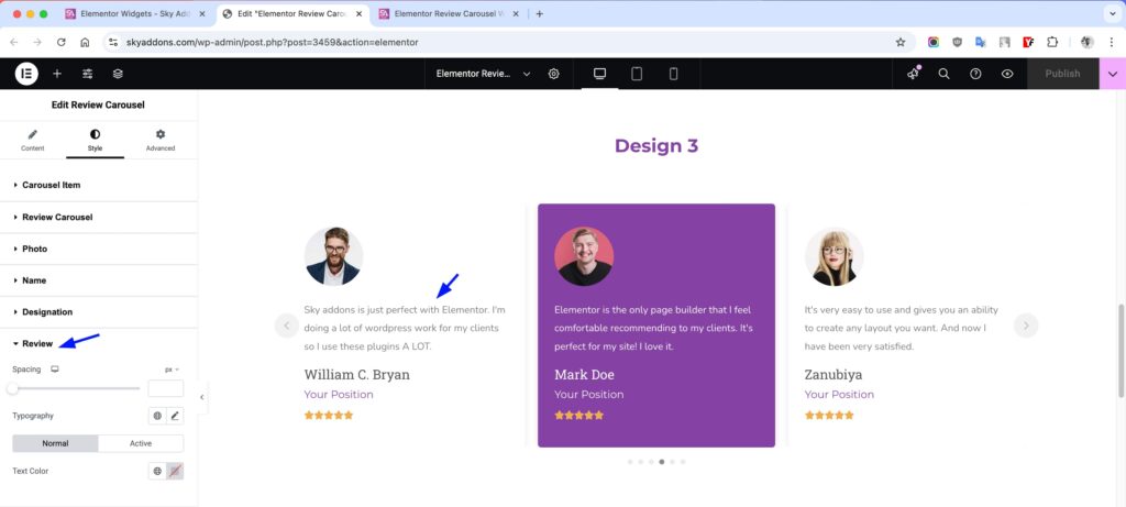
- Review Text – A spacious text area for the actual testimonial content with support for basic HTML formatting
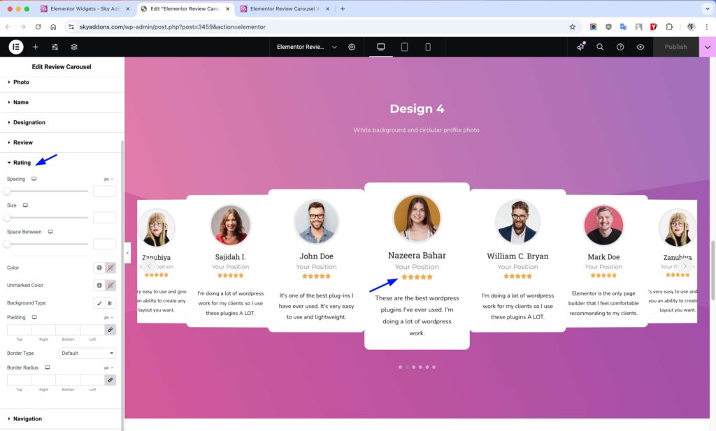
Rating Tab
The Rating tab provides detailed control over the star rating display:
- Rating Scale – Choose between a 5-star (0-5) or 10-star (0-10) rating system
- Rating Value – Set the exact rating with decimal precision (e.g., 4.5 stars)
- Star Style – Select between Font Awesome icons or Unicode symbols for the stars
- Unmarked Style – Choose whether unfilled stars appear as outlines or solid shapes
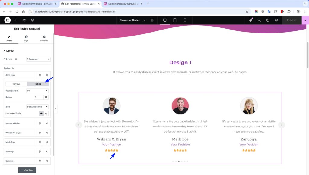
The repeater comes pre-populated with four sample reviews to help you get started quickly. You can easily add more entries, reorder them by dragging, or remove unwanted reviews as needed.
Each review entry displays in a professionally styled card within the carousel, with options to control the layout, appearance, and position of each element through the various customization sections of the widget.
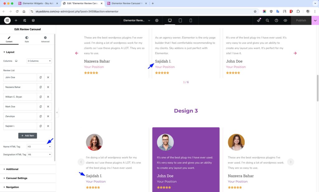
- Name HTML Tag – Select the HTML tag to use for reviewer names (h1-h6, div, span, p).
- Designation HTML Tag – Choose the HTML tag for the reviewer’s designation/position.
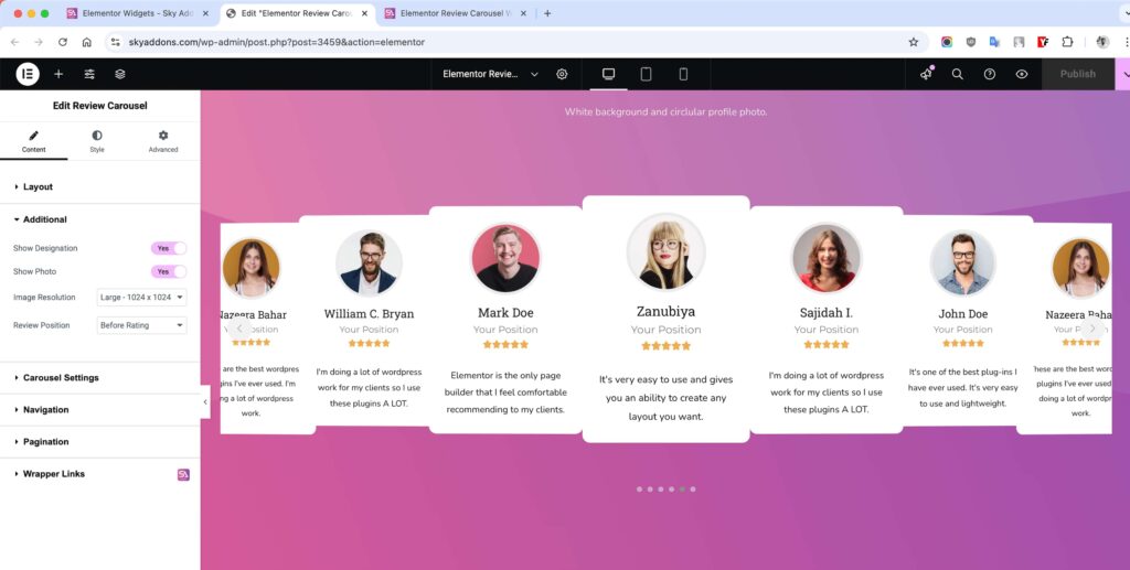
Additional Layout Section
Fine-tune the display of reviewer information elements.
- Show Designation – Toggle the display of reviewer’s job title or position.
- Show Photo – Enable or disable the reviewer’s profile photo.
- Image Size – Select the appropriate image size for reviewer photos.
- Review Position – Choose whether to display review text before or after the rating.
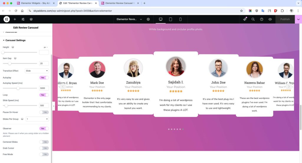
Carousel Settings Section
The Carousel Settings section gives you complete control over the behavior and animation of your review carousel, allowing you to create a smooth and engaging user experience.
- Height – Set a specific height for your carousel.
- Item Gap – Set the space between individual review items in the carousel. Responsive settings let you adjust spacing for different devices.
- Transition Effect – Choose between smooth slide animation or an immersive coverflow effect for transitioning between reviews.
- Coverflow Effect – When using the coverflow transition, access advanced settings to customize the 3D effect’s depth, rotation, and stretching.
- Slide Shadows – Add subtle shadows to slides when using coverflow effect for enhanced visual depth.
- Autoplay – Enable automatic cycling through reviews without requiring user interaction.
- Autoplay Speed – Control how long each review remains visible before transitioning to the next (in milliseconds).
- Loop – Allow the carousel to loop continuously rather than stopping at the first or last review.
- Slide Speed – Set the transition speed between slides – lower values create faster transitions.
- Pause On Hover – Stop the autoplay when a user hovers over the carousel, allowing them to read the current review.
- Slides Per Group – Determine how many slides move together with each navigation action or autoplay step.
- Observer – Ensures proper carousel initialization when placed within hidden elements (like tabs or accordions).
- Centered Slides – Position the active slide in the center of the viewport rather than aligned to the left.
- Grab Cursor – Display a “hand” cursor when hovering over the carousel to indicate it can be dragged.
- Free Mode – Enable momentum-based scrolling where slides move freely without snapping to fixed positions.
The carousel settings give you precise control over how your reviews are presented, allowing you to create anything from a traditional slideshow to an interactive, touch-friendly review showcase that perfectly matches your site’s user experience needs.
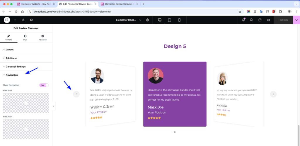
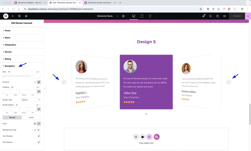
Navigation Section
The Navigation section allows you to control the appearance and behavior of your carousel’s navigation arrows.
- Show Navigation – Enable or disable the navigation arrows that allow users to manually navigate between slides. Turned on by default.
- Prev Icon – Select a custom icon for the “Previous” navigation arrow. Click the icon picker to choose from Elementor’s extensive icon library or upload your own SVG.
- Next Icon – Select a custom icon for the “Next” navigation arrow. Same options as the Prev Icon control.
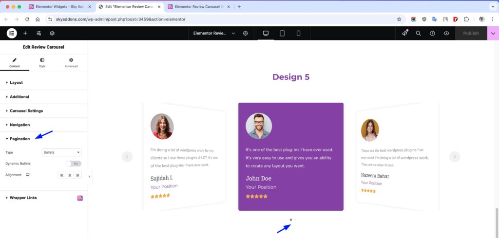
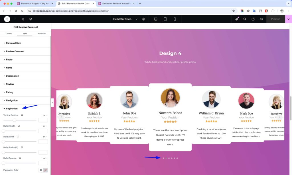
Pagination Section
Control the carousel pagination indicators.
- Show Pagination – Toggle pagination dots display.
- Pagination Type – Choose between bullets, fraction, or progress bar.
- Pagination Position – Set where pagination indicators appear.
- Dynamic Bullets – Enable dynamic bullet sizing for active states.
Style Customization
The Review Carousel widget offers extensive styling options for every element, allowing you to perfectly match your website’s design aesthetic while maintaining readability and user engagement.
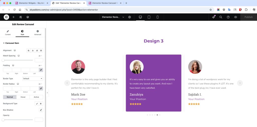
Carousel Item Style
Customize the appearance of individual review items in the carousel.
- Alignment – Set text alignment within each carousel item.
- Match Spacing – Adjust spacing between carousel items.
- Padding – Control internal spacing within each item.
- Border – Add and style borders around review items.
- Border Radius – Round the corners of review items.
- Background – Set background colors or gradients for review items.
- Box Shadow – Add shadow effects to create depth.
- Opacity – Control transparency for normal, hover, and active states.
Review Carousel Style
Style the overall review container.
- Text Box Padding – Adjust spacing within the review text container.
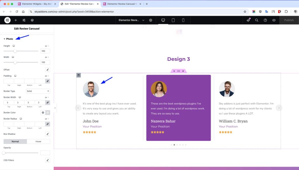
Photo Style
Customize the reviewer’s profile image appearance.
- Height/Width – Set dimensions for profile photos.
- Offset – Position photos with horizontal and vertical offsets.
- Padding – Add space around profile images.
- Border – Style the border around profile photos.
- Border Radius – Round photo corners or create circular images.
- Box Shadow – Add shadow effects to photos.
- Filters – Apply CSS filters like grayscale or brightness.
- Hover Animation – Add interactive effects when hovering over images.
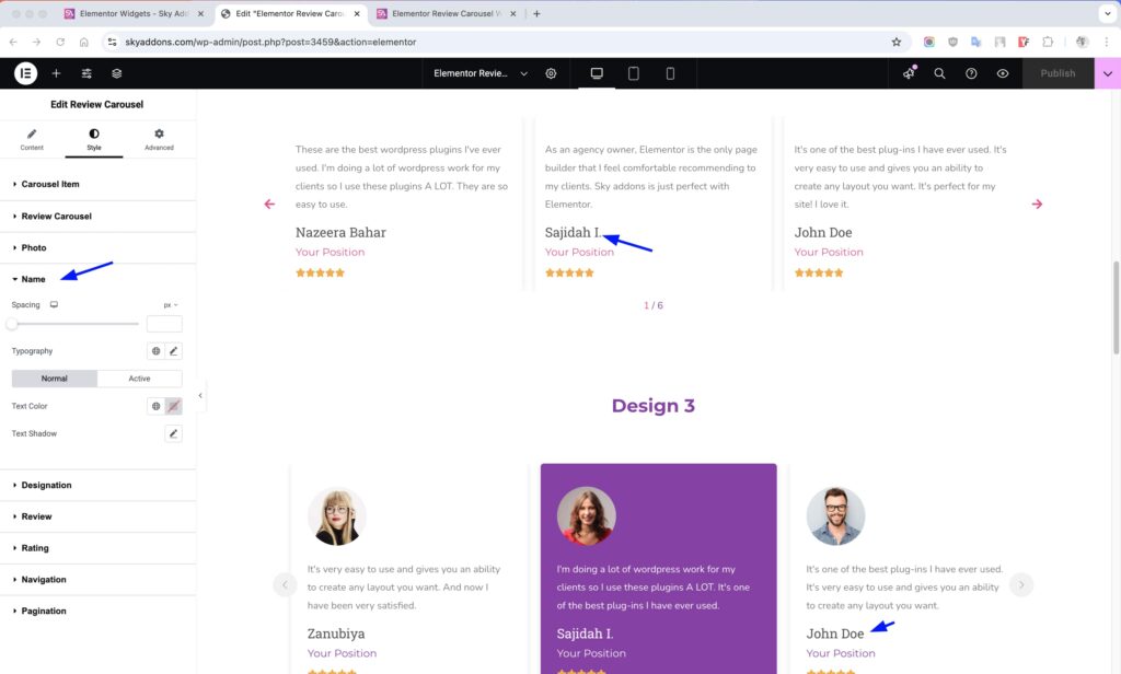
Name Style
Customize the reviewer name appearance.
- Spacing – Control space between name and other elements.
- Typography – Set font family, size, weight, and style.
- Text Color – Choose color for normal and active states.
- Text Shadow – Add shadow effects to the text.
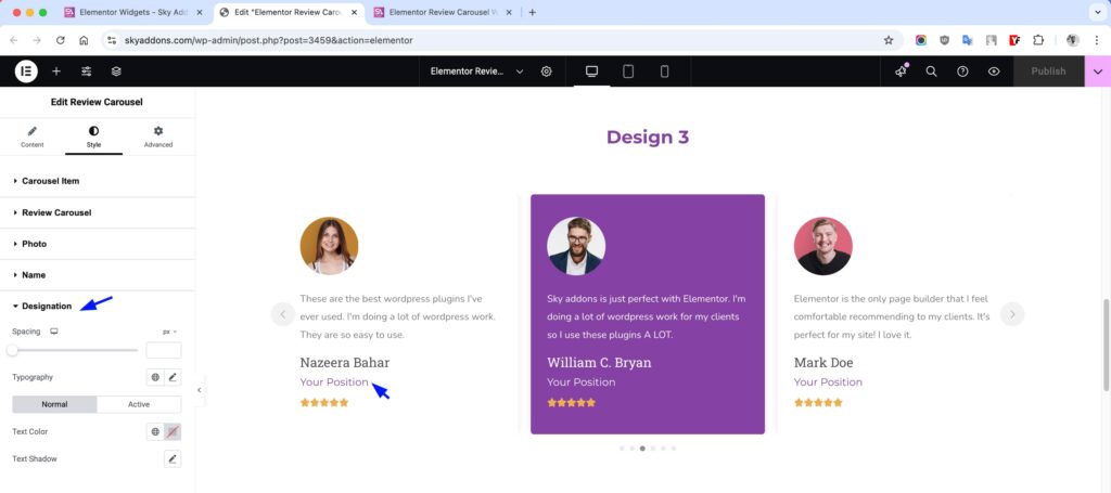
Designation Style
Style the reviewer’s job title or position.
- Spacing – Set space between designation and other elements.
- Typography – Customize font properties.
- Text Color – Set colors for normal and active states.
- Text Shadow – Add text shadow effects.
Review Text Style
Customize the appearance of the review content.
- Spacing – Control space around the review text.
- Typography – Set font properties for the review text.
- Text Color – Choose colors for normal and active states.
Rating Style
Style the star rating display.
- Spacing – Set spacing between rating and other elements.
- Size – Control the size of rating stars.
- Space Between – Adjust spacing between individual stars.
- Color – Set colors for marked and unmarked stars.
- Background – Add background behind the rating.
- Padding – Control internal spacing.
- Border – Add and style borders around ratings.
- Border Radius – Round the corners of the rating container.
Navigation Style Section
- Size & Spacing – Control dimensions of navigation elements.
- Colors – Customize colors for normal, hover, and active states.
- Background – Add backgrounds to navigation controls.
- Border – Style borders around navigation elements.
- Border Radius – Round corners of navigation controls.
- Shadow – Add shadow effects to navigation.
Pagination Style Section
The Pagination Style section provides extensive customization options for the carousel’s pagination indicators, allowing you to perfectly match them to your website’s design theme.
- Vertical Position – Adjust the vertical placement of pagination indicators relative to the carousel. Perfect for fine-tuning the visual balance of your layout.
- Bullet Height – Set the height of bullet pagination indicators when using the bullets pagination type.
- Bullet Width – Control the width of bullet pagination indicators, allowing for both circular and rectangular shapes.
- Bullet Radius – Adjust the roundness of bullet pagination indicators from square (0%) to fully rounded (100%).
- Bullet Spacing – Control the space between individual bullet pagination indicators for optimal spacing.
- Progress Size – Set the thickness of the progress bar when using the progressbar pagination type.
- Pagination Color – Choose the color for inactive pagination elements (unfilled bullets, progress bar background, etc.).
- Pagination Active Color – Set the color for active pagination elements (current slide bullet, progress bar fill, etc.).
- Typography – Customize the font appearance when using the fraction pagination type, including size, weight, and style.
These controls give you pixel-perfect control over the pagination indicators, allowing you to create a cohesive and professional look that enhances user navigation while complementing your overall design aesthetic.
Save and Preview
- Once you’ve customized and styled your review carousel, click “Publish” or “Update” to save your changes.
- Preview the page to ensure the widget looks and functions as desired.
Troubleshooting
- Images not displaying properly: Ensure you’ve uploaded high-quality images and selected the appropriate image size. Try regenerating thumbnails in WordPress if issues persist.
- Carousel not sliding smoothly: Check if you have set appropriate transition speed and slides per view. Reduce the number of slides for mobile devices.
- Rating stars misaligned: Verify your rating settings and try adjusting the space between stars or overall star size.
- Text overflowing: Adjust the carousel item height or consider limiting review text length for consistency.
Conclusion
The Sky Addons Review Carousel Widget provides a powerful and flexible solution for showcasing customer testimonials on your website. With its extensive customization options and responsive design, you can create professional-looking review displays that build trust and credibility with your audience. The intuitive interface makes it easy to add, arrange, and style reviews to match your brand identity perfectly.
If you have any questions or encounter any challenges while using, please don’t hesitate to reach out to our dedicated support team at http://wowdevslive.bdkoder/support/ where our expert team is ready to provide prompt and helpful assistance.