How to use Logo Grid Widget of Sky Addons for Elementor
The Logo Grid widget helps you showcase your clients, partners, sponsors, or brands in a clean, responsive grid layout. Whether you want to display logos with or without captions, the widget is fully customizable and integrates seamlessly with Elementor. It enhances your site’s trust and credibility while maintaining visual consistency and flexibility in design.
Features:
- Responsive grid layout with customizable columns.
- Add logos with optional brand name and description.
- Tooltip support for additional info on hover.
- Custom image resolution and hover effects.
- Multiple link options – media file, custom URL, or none.
- Boxed or minimal style selection.
- Tooltip placement and animation options.
Insert Logo Grid Widget
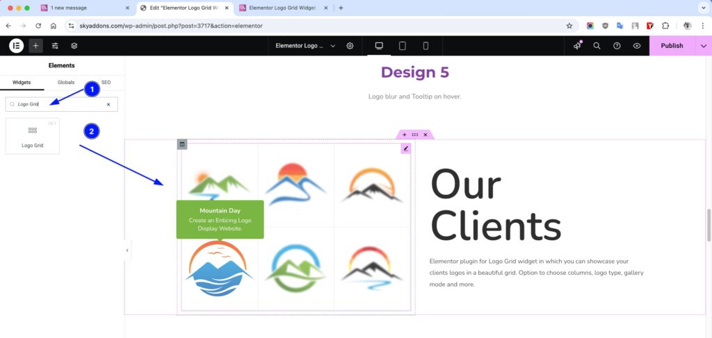
- Open Elementor Editor. In the Elementor panel, search for “Logo Grid” under Sky Addons.
- Drag and Drop the Widget to the desired location on your page / editor.
Layout Section
- Columns – Choose how many logos to show per row (1–6).
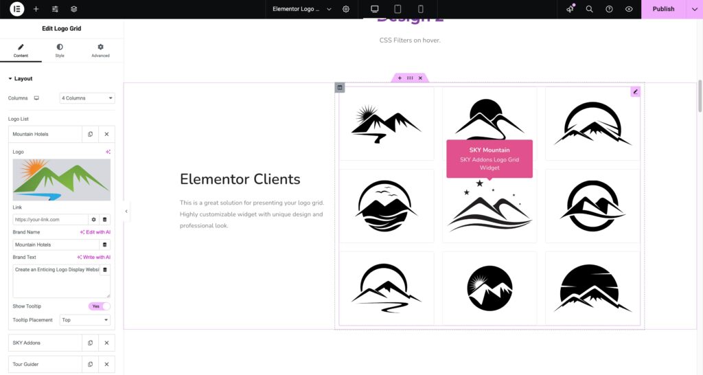
- Logo List – Add logos via repeater with full customization:
- Logo – Upload your logo image.
- Link – Add a custom or media file URL.
- Brand Name – Title for the logo.
- Brand Text – Description or tagline.
- Show Tooltip – Enable/disable tooltip on hover.
- Tooltip Placement – Choose top, bottom, left, or right.
Additional
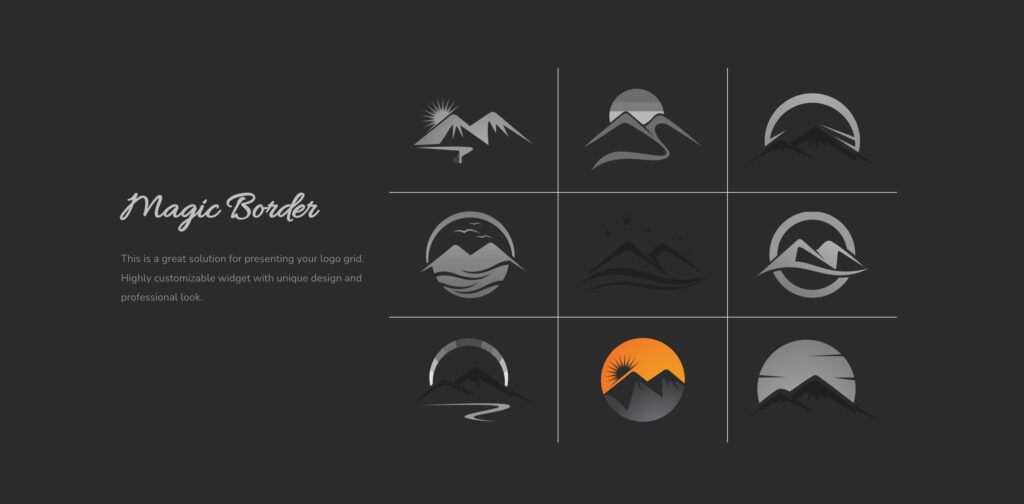
- Select Style – Choose between “None” or “Box” or “Border” or “Magic-Border” design.
- Image Resolution – Adjust resolution for quality control.
- Show Brand Name – Display the brand name below each logo, with a selectable HTML tag.
- Grayscale Effect – Show logos in grayscale and reveal color on hover, or the reverse (color to gray on hover).
- Lazy Load – Enable native lazy loading on logo images for better performance.
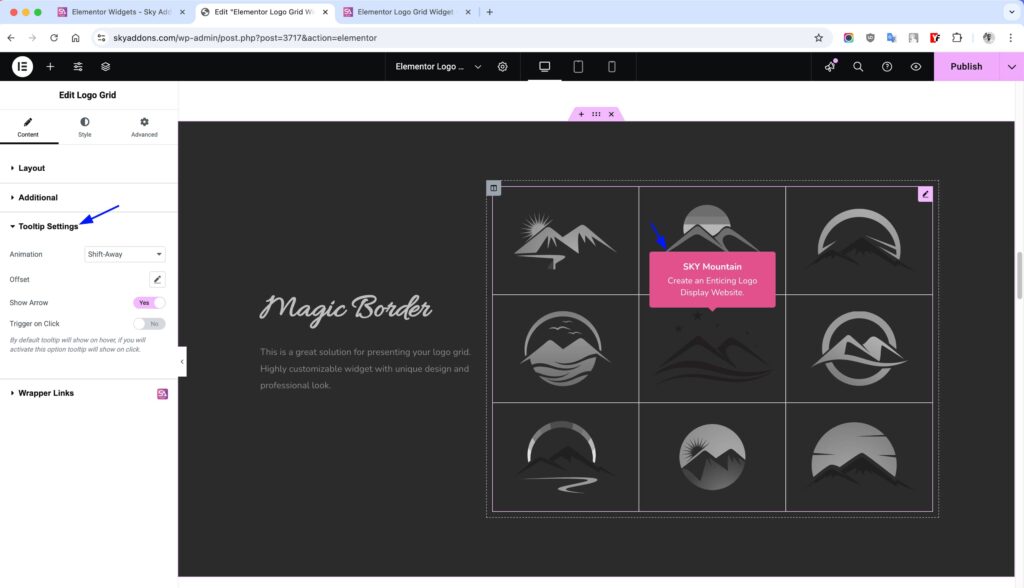
Tooltip Settings
- Animation – Choose from Scale, Shift-away, etc.
- Offset – Adjust spacing from the logo.
- Show Arrow – Enable/disable tooltip arrow.
- Trigger on Click – Show tooltip on click instead of hover.
Style Customizations
Logo Grid
- Row Spacing – Adjust the row space around the logo.
- Column Spacing – Adjust the Column space around the logo.
- Padding – Adjust inner space around the logo inside each item container.
- Border – Add or style border lines for logo boxes.
- Radius – Control corner roundness for logo containers.
- Background – Set custom background color or gradient.
- Shadow – Apply box shadow to give depth or highlight logos.
- Opacity – Control transparency for each logo item.
- CSS Filters – Apply effects like blur, brightness, contrast, etc.
- Hover Mode – Enable all above styles to change on hover interaction.
Brand Name
- Typography – Control font, size, weight, and spacing of the brand name.
- Color & Hover Color – Set the brand name color and its color on hover.
- Top Spacing – Adjust the gap between the logo and the brand name.
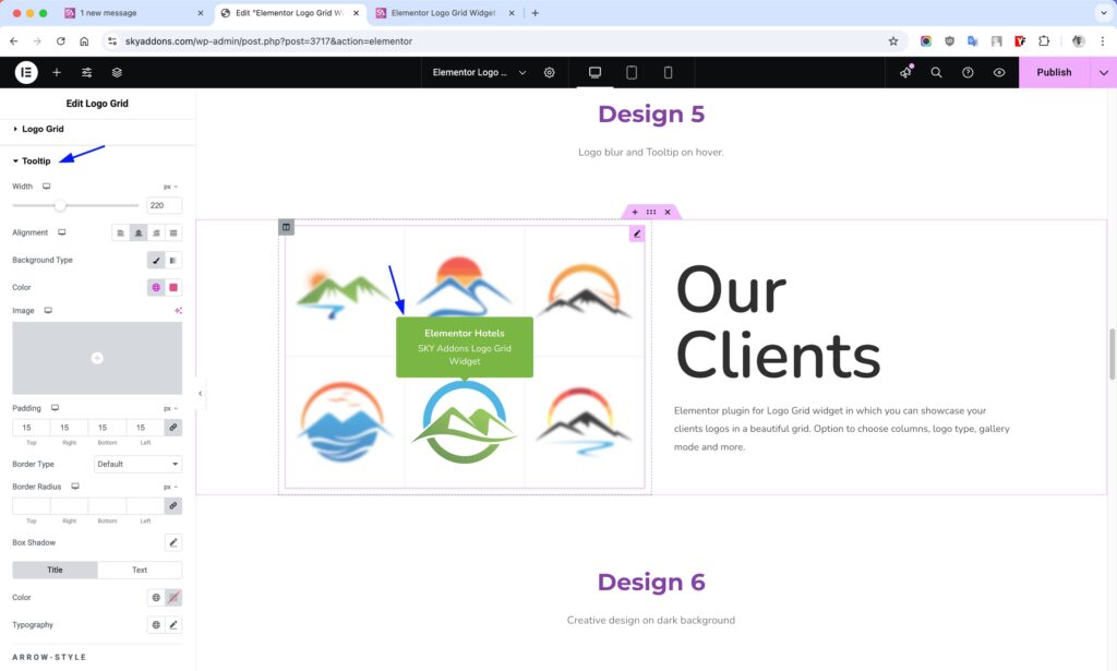
Tooltip
- Width – Set fixed width for tooltip boxes.
- Alignment – Align tooltip text: left, center, or right.
- Background – Set tooltip background color or gradient.
- Padding – Adjust inner space around tooltip content.
- Border – Add a border around the tooltip box.
- Radius – Round the corners of the tooltip.
- Box Shadow – Add shadows for a floating effect.
- Color – Set tooltip text color.
- Typography – Control font, size, weight, and spacing.
- Arrow Color – Set color of the tooltip arrow pointer.
- Title Style – Customize typography and color for title separately.
- Text Style – Set different styles for description text within tooltip.
Save and Preview
- Once you’ve customized and styled your accordion, click “Publish” or “Update” to save your changes.
- Preview the page to ensure the widget looks and functions as desired.
Troubleshooting
- Logos not showing: Ensure images are properly uploaded and not missing from media library.
- Tooltip not displaying: Check if tooltip is enabled and placed correctly.
- Grid alignment issues: Adjust column settings and spacing for responsiveness.
- Hover effects not working: Confirm that hover styles are defined in the Style tab.
Conclusion
The Logo Grid widget is a perfect solution for displaying brand logos professionally on your site. Its flexibility, tooltip options, and easy customization make it ideal for building brand trust and enhancing your website’s presentation.