
A post grid for Elementor with a light, airy card — blog and magazine layouts that keep plenty of white space around them.
Understory runs four desks and no news cycle. Pieces are commissioned in March, filed in May, and read whenever you get to them.
Nothing here is longer than it needs to be. The longest piece this issue runs 2,900 words; the shortest is a caption.
Every garment piece names the mill. If we cannot find out where a thing was made, we say that in print rather than leaving it out.
Editor Ines Karras
Files two per issue
Girls can be surprisingly beautiful sometimes, and sometimes you have to stop and appreciate
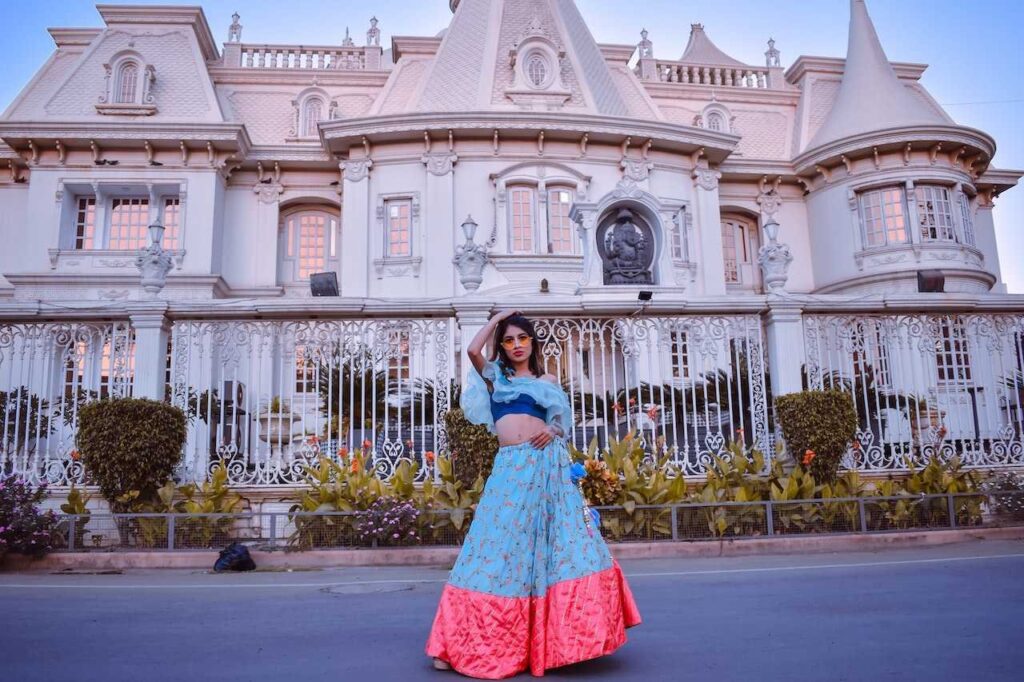
Fashion has a way of defining individuals and buying clothes is something everyone loves
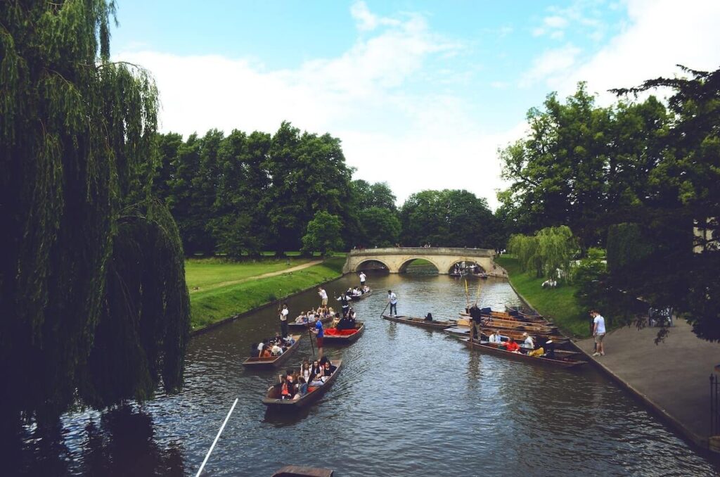
Claims get a source line at the foot of the piece. Where the evidence is thin we print the sample size in the standfirst, not the footnotes.
We pay sitters. It is a small amount and it changes the room — nobody is doing us a favour, so nobody has to smile through it.
9
routes walked for this issue
0
hotels comped, ever
Many students in the middle of school life, in the mind of a variety of problems, it is easy to become a jaded and

I was given a free nature tour by the local tourist board to promote my blog. The guide took me to a few spots

The tour was a nice one. We woke up at 6 in the morning. We drove for about 2 hours. When we were in

When people travel, they often become exposed to a variety of cultures and people. If you travel, you will have many opportunities to have

Four a year since 2019. Every issue stays online in full — no archive wall.
Corrections sit at the foot of the original piece with a date. We have printed nine of them and none have been quietly removed.
Printed in Stroud on uncoated stock. If an issue arrives damaged we send another without asking for a photograph.
Understory is made by six people in a room above a bike shop. Letters get answered, usually badly, always by a person.
Straight answers about what this one does, where it fits in a real build, and what it costs you to ship.
Read the documentation for this one, or write to us — a human answers inside a business day.
Three on desktop, two on tablet and one on mobile, and you can set anything from one to four at each breakpoint. What is unusual is the spacing: it ships with a 36px row gap against a 26px column gap, deliberately more air vertically than horizontally, which is what stops an airy card design from reading as a dense table.
Content Top is the default and gives the grid its signature — every card’s picture is the last element, so the images line up in bands across the row. The catch is that a two-line title on one card and a one-line title on the next will knock those bands out of alignment. If the titles vary a lot, Content Bottom is the safer choice.
Show Text ships off on the Sapling Grid, because the layout is built around white space rather than copy. Switch it on and you get 30 words per card — twice what the Sapling Carousel allows, since a static grid row can absorb the extra height that a fixed-width slide cannot.
Limit becomes the page size. Set Limit to 9 with 40 matching posts and Show Pagination on, and you get five numbered pages of nine, with the last one short. The links hide themselves entirely when the query fits in one page, so a grid pointed at a small category never shows a stray “1”.
Yes. Put any string in the Query ID field and the widget fires a matching action while building the query, passing the WP_Query object and the widget instance, so a snippet can add a meta query, change the post status or re-sort before anything renders. It is the escape hatch for the one filter the panel does not offer.
The Limit field has no ceiling, which is exactly why it deserves care. Every post in the grid is a real query result with a featured image, so a limit of 200 on one page is a slow page — keep it near what fits on screen and turn on pagination for the rest rather than raising the number.
Yes, because the cards print their thumbnails through WordPress’s own attachment function rather than a hand-built img tag. That means core’s native lazy loading and the full srcset of registered sizes come along automatically, and your chosen Image Size — Large by default — sets the baseline rather than the only file offered.
Because the play button is driven per post. Video Source names a custom field, and only posts that actually hold a video URL in that field get an overlay play button opening a lightbox; every other card links straight through to the article. A mixed grid of written and filmed posts is therefore the expected result, not a fault.
Any theme, and no Pro. The Sapling Grid is a standard Elementor widget from the free Sky Addons for Elementor plugin, and it brings its own stylesheet for the card, so the typography and spacing you set in the panel hold whether the theme is Hello, Astra, GeneratePress or something bespoke.
Tone, and three concrete things. Sapling puts the text above the image, uses a pale rounded uppercase category chip, and defaults to generous 36px rows. The Generic Grid centres its text, pins a date chip onto the image itself, and shows only the first of a post’s categories. Both offer one to four columns and pagination.
Elementor widgets and extensions by wowDevs — built for people who would rather ship than fight a page builder.
One short email when something ships. No drip sequence.