Equal height for Elementor — cards and columns matched to the tallest in their row, so no grid ever ends up ragged.
The extension gives complete control of the height of elements,
so you can set it to whatever you want, without any limits.

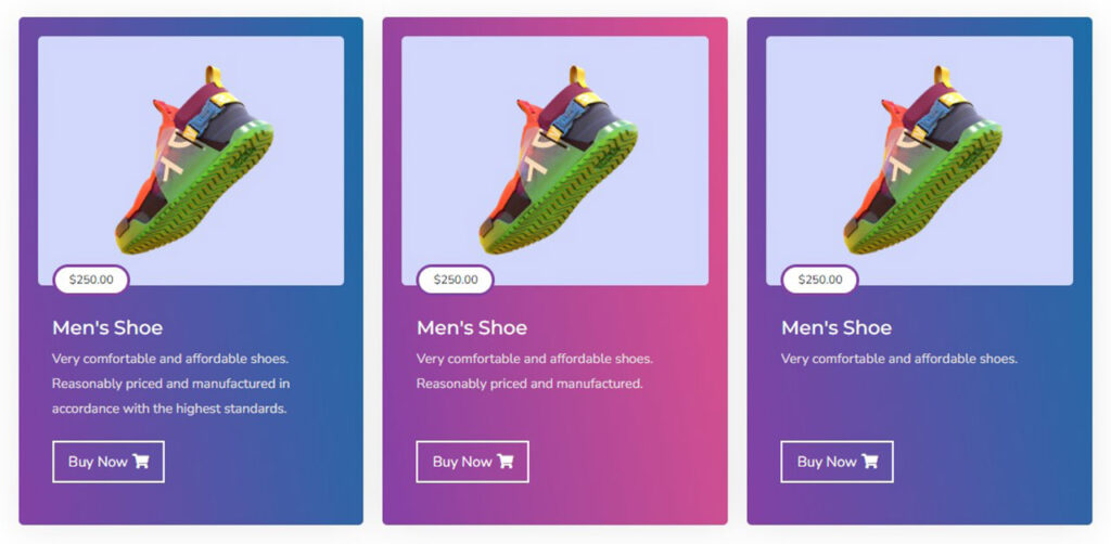
With the Equal Height, you’ll be able to create a website with perfect spacing and
without any accidental jumps in between pages.
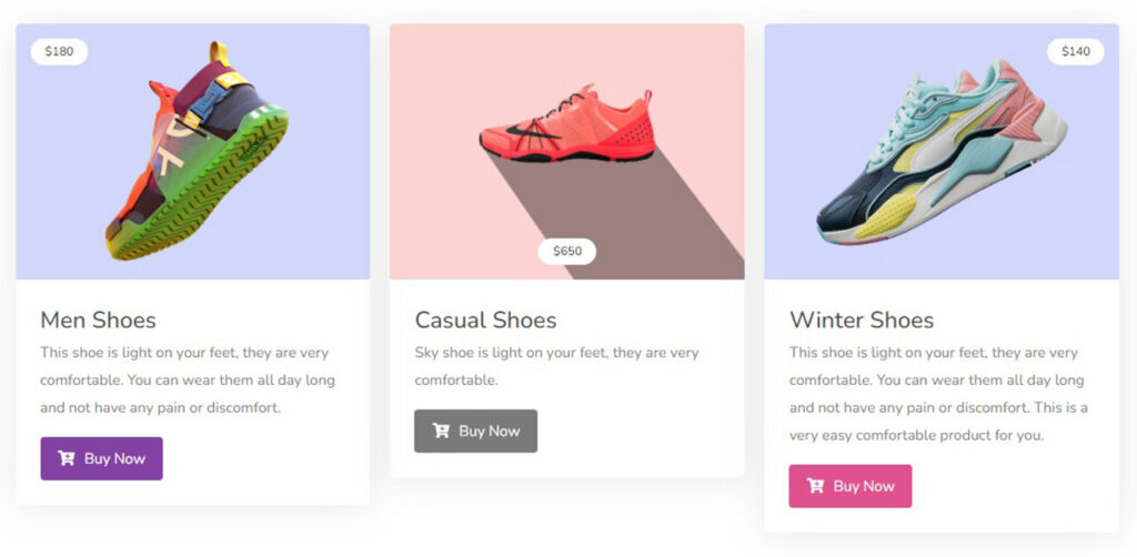
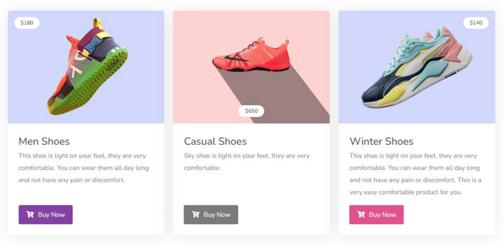
You’ll never feel uncomfortable scrolling through your website again.
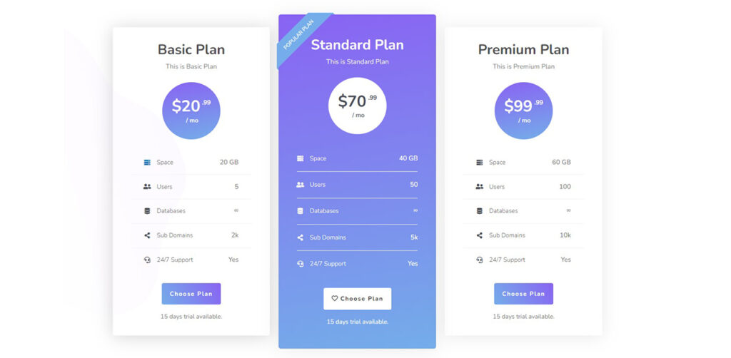
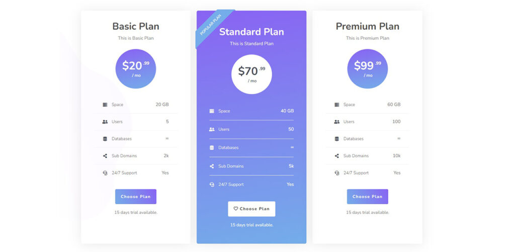
Page designs are automatically generated with the same height for all elements with just a few clicks.


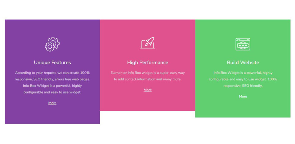
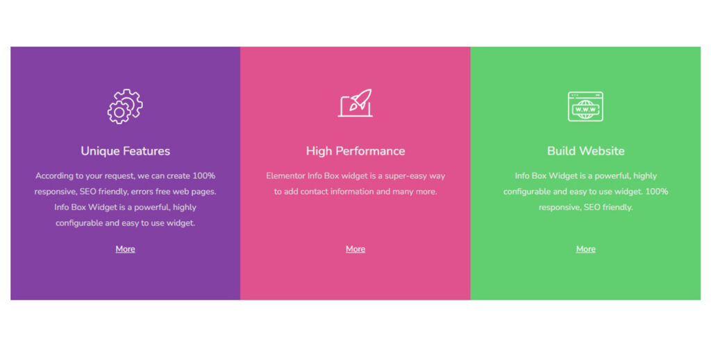
Straight answers about what this one does, where it fits in a real build, and what it costs you to ship.
Read the documentation for this one, or write to us — a human answers inside a business day.
Select the section or container holding them, open the Advanced tab, and switch on the Equal Height panel that Sky Addons for Elementor adds there. It measures the tallest item in the group and sets the rest to match, so three cards with different amounts of text end up level instead of ragged.
On the parent, never on the cards themselves. The setting appears on the Advanced tab of a section or a container, because equalising is a comparison between siblings — one card cannot know how tall its neighbour is. Columns and individual widgets do not carry the option.
Yes, and that is the mode to reach for. Select Widgets lets you pick widget types by name and equalises each type as its own group, so every card title matches every other title and the buttons underneath still line up, even when the descriptions differ in length.
It depends on the mode. The preset options work row by row, so a second row of cards gets its own height rather than inheriting a tall first row. Select Widgets mode equalises every matching item inside the element as one group, which is what you want for a strict grid.
Because Disable on Mobile is switched on by default. Cards stack into one column on a phone, where forcing a shared height only adds empty space. Turn it off if your mobile layout really is multi-column, and there is a separate switch for tablet, which starts off.
Min-Height is the safer choice. Height pins every item to exactly the tallest measurement, which can clip a card whose content grows later; Min-Height sets the same floor but lets an item exceed it. The CSS Property select offers both, and Height is the default for backward compatibility.
Yes. Besides matching whole widgets, Apply Elements can reach the first, second or third child inside each widget, or one level deeper again, which covers most card markup. The Custom option takes any CSS class of your own, such as .card-body, and equalises just those.
Flexbox stretches the outer boxes to match, which handles the card shells. It cannot align an element inside two separate cards, so a two-line title next to a one-line title still pushes the buttons out of line. This extension measures the real rendered heights and sets them, which flex alignment cannot do.
Yes, both. The controls are registered on the classic section and on the newer flexbox container, so pages built before Elementor introduced containers keep working and new layouts get the same option. Heights are recalculated when the window resizes, so a browser resize does not leave stale values.
No. It is part of the free Sky Addons plugin and works on free Elementor. It equalises whatever is inside the element, including third-party widgets, since it matches by rendered structure rather than by widget vendor — no custom CSS and no per-card fixed heights to maintain.
Elementor widgets and extensions by wowDevs — built for people who would rather ship than fight a page builder.
One short email when something ships. No drip sequence.