Sky Addons  ·  Elementor Widget
INTRODUCING

Showcase Wall

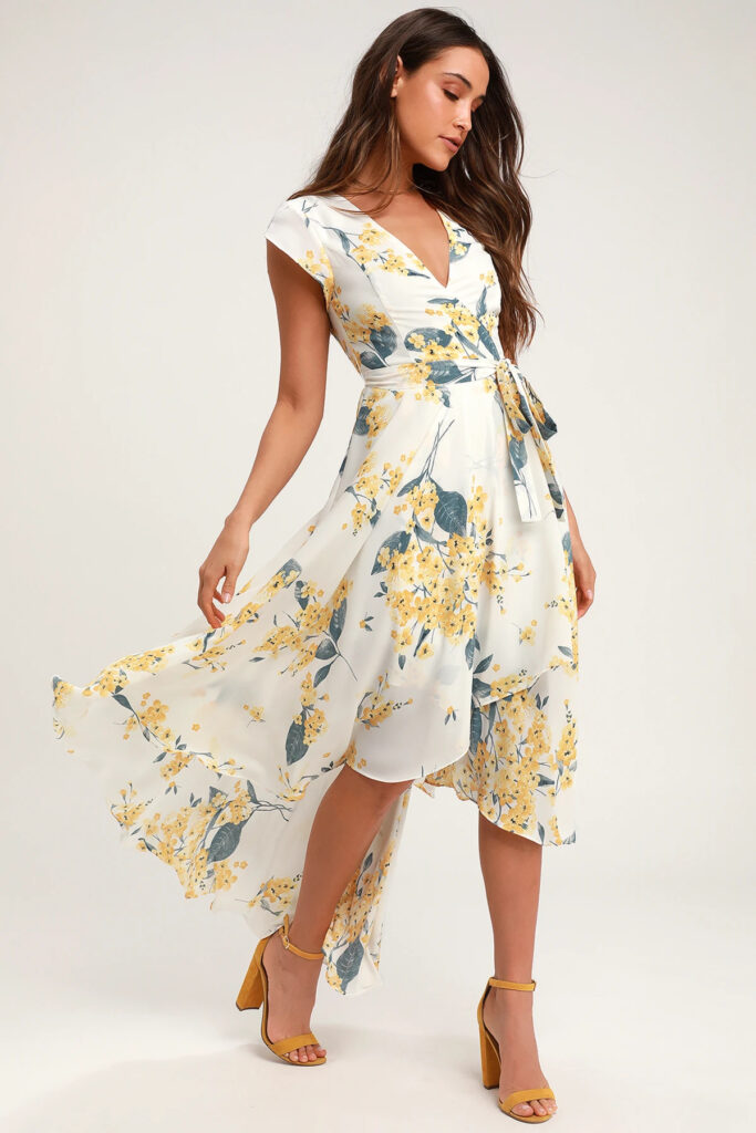
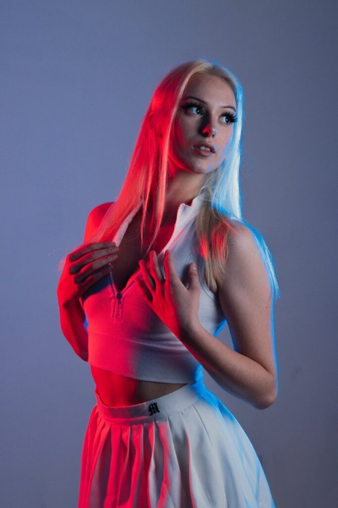
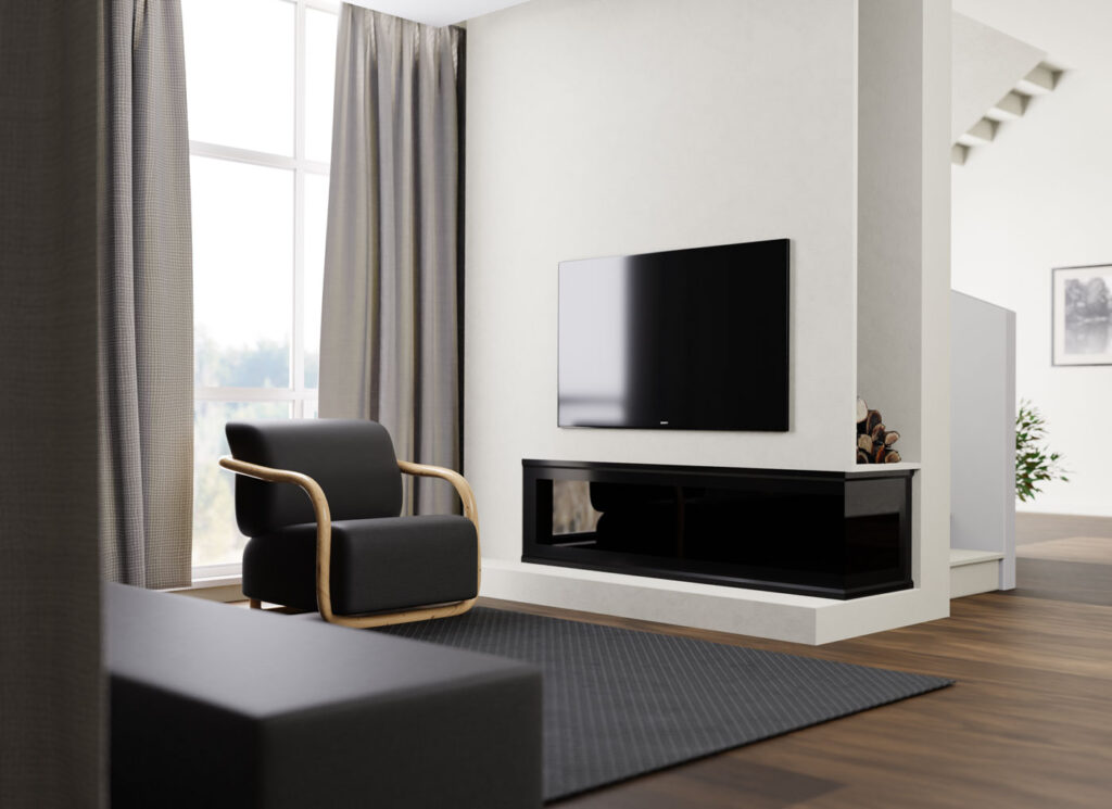
A showcase wall for Elementor: a dense grid of images that reacts as the visitor moves through it, for portfolio walls.

WALL

Six hundred collections,
one scroll

Forty thousand frames from two hundred and eleven photographers. Licensed per use, priced on the page, never by negotiation.

Open licence — 1,400 frames

Everything released under our simplest licence: one price, any use, no renewal. About a fifth of the archive sits here.

Commissioned, not stock

About a fifth of the archive was shot to a brief. If you need something that is not here, we will quote for making it rather than sell you the nearest thing.

The deep archive

Anything older than three years. Prices drop, the releases still stand, and nothing is ever quietly deleted.

Added this week

Between forty and ninety new frames land every Tuesday. Contributors are paid on upload, not on sale.

Long-running series

Sets a photographer has kept adding to for two years or more. They tend to be the ones people come back for.

Editors’ picks, March

Twenty-four frames chosen by whoever is on the desk that month. They write a paragraph on each one and we publish it whether or not it sells.

LICENSING

Priced on the page,
not on a phone call

Three licences, one price list, and no rights-managed haggling. If your use is not covered by one of them it is almost certainly cheaper than you think.

WEB & SOCIAL, PER FRAME
0
PRINT, UP TO 10,000
0
RIGHTS-MANAGED FEES
0
TAKEDOWN, IF YOU ASK
0 h
TWO HUNDRED AND ELEVEN CONTRIBUTORS

Paid on upload,
not on sale

Photographers are paid when a frame is accepted into the archive. Whether it licenses once or four hundred times after that is our problem, not theirs.

COMMISSIONS · OPEN FOR Q2

Briefs we would
rather shoot than sell

There are gaps in the archive we already know about. If your brief lands in one of them the commission is cheaper, because we keep the frames afterwards.

Straight from the contributor feed

Live from the upload queue, newest first. What you are looking at may have been shot this morning and is licensable the moment it appears.

Reza, and the case for standing still
Tomas and the honest version of a jawline
Nadia, three rolls and one usable smile
Model Girl Blog design is a clean and modern blog design for Elementor.
Marisol between takes
June, who refused the chair
A blog post about quick and easy ways to style your hair.
You can easily create visual page layouts and customize your blog,
Twenty minutes with Iris before the rain
Selin, and the frame we nearly deleted
Your skin could be Perfect without any cosmetic products.
You’ll get a bright color scheme and a beautiful layout.
Kaya, photographed at the end of a long shift
Priya on the last roll
Why WordPress is becoming more significant in 2023
It’s time to design your new website with Elementor Sky Addons!
NO ACCOUNT NEEDED TO BROWSE

Start a lightbox, share the link,
argue about it later

Lightboxes are public by default and never expire. Most of our licensing starts as somebody sending a link to somebody else.

40,000 frames
211 photographers
Every release on file
Demo Sky Addons
FAQ
Frequently asked

Showcase Wall

Straight answers about what this one does, where it fits in a real build, and what it costs you to ship.

Still stuck?

Read the documentation for this one, or write to us — a human answers inside a business day.

What does the Showcase Wall widget do?

It builds a dense grid of images that reacts as the visitor scrolls past it — columns drifting, converging or settling back from a push-in. The Showcase Wall widget in Sky Addons for Elementor is made for portfolio walls and archive pages, not for one-image-at-a-time sliding.

Do I have to configure the motion myself?

No. Six ready-made designs cover it: Editorial for a calm drift with a soft fade, Skyline shaped at both edges, Arc Reveal where the columns rise into line, Theater which zooms as you scroll, Stream which never stops, and Slant which is tilted and always moving. Custom opens every piece individually.

What motion types are available if I build my own?

Five: none, parallax drift where neighbouring columns pass each other, converge where outer columns rise into line, depth zoom that settles back from a push-in, and auto marquee that runs continuously and ignores the scroll entirely.

How many images does a wall need?

At least three per column, so twelve or more for the default four columns. A fixed-height wall crops whatever overflows, which is how the endless look is achieved — but with too few images that same crop leaves visible gaps at the bottom of a column.

Can the wall size itself to the images instead of cropping?

Yes. Height offers Fixed, which crops the wall to a set height, or Auto, which fits the images and never leaves a gap. Fixed gives the endless-wall effect; Auto is the safer choice when the number of images varies, such as on a query-driven wall.

Why do the columns start at different heights?

That is the Offset Pattern. Alternate flips between two starting rows, Wave resets every third column, and the two staircase patterns keep stepping in one direction — those suit three or four columns and start to look extreme beyond that. None lines every column up flush.

Can the images come from posts rather than a gallery?

Yes. Source switches between an image gallery picked in the panel and Dynamic Posts, which runs a query and uses each post featured image. Everything about the layout and motion stays the same; only where the pictures come from changes.

How do I make the wall blend into the section behind it?

With Fade Style, which offers ten edge treatments — none, bottom, top, top and bottom, sides, a full frame, a bright-centre spotlight, diagonal and a curved horizon, plus the design own default — with a fade size to match. The edge dissolves into the section background, so set that colour first.


Can I tilt the wall without breaking the layout?

Yes — use the Tilt control rather than Elementor transform. It rotates the grid inside the wall between minus 15 and 15 degrees and clips it to the widget own frame, so nothing bleeds outside the section. Four to twelve degrees reads best.

What happens on a device that asks for reduced motion?

The wall renders as a still grid. The motion runs through GSAP ScrollTrigger, and both a reduced-motion preference and a missing animation library drop the effect while leaving the images, columns, offsets and fade exactly as designed — the layout never depends on the animation.

How many columns show on a phone?

Two, against three on tablet and four on desktop, and Columns is a per-device select running from two to six. Gap and the fixed height are also per device, which matters because a four-column wall at 390px would reduce each image to a thumbnail.

Do the images all have to be the same shape?

No. Image Ratio offers Original, which keeps every picture at its own height, plus portrait 3:4, tall 9:16, square, wide 16:9 and a 1:2.4 page-preview crop. Any fixed ratio crops from the top, which is what full-page screenshots need. The widget requires Sky Addons Pro but no Elementor Pro licence.